JHDD Packaging Report — 2026.06.21
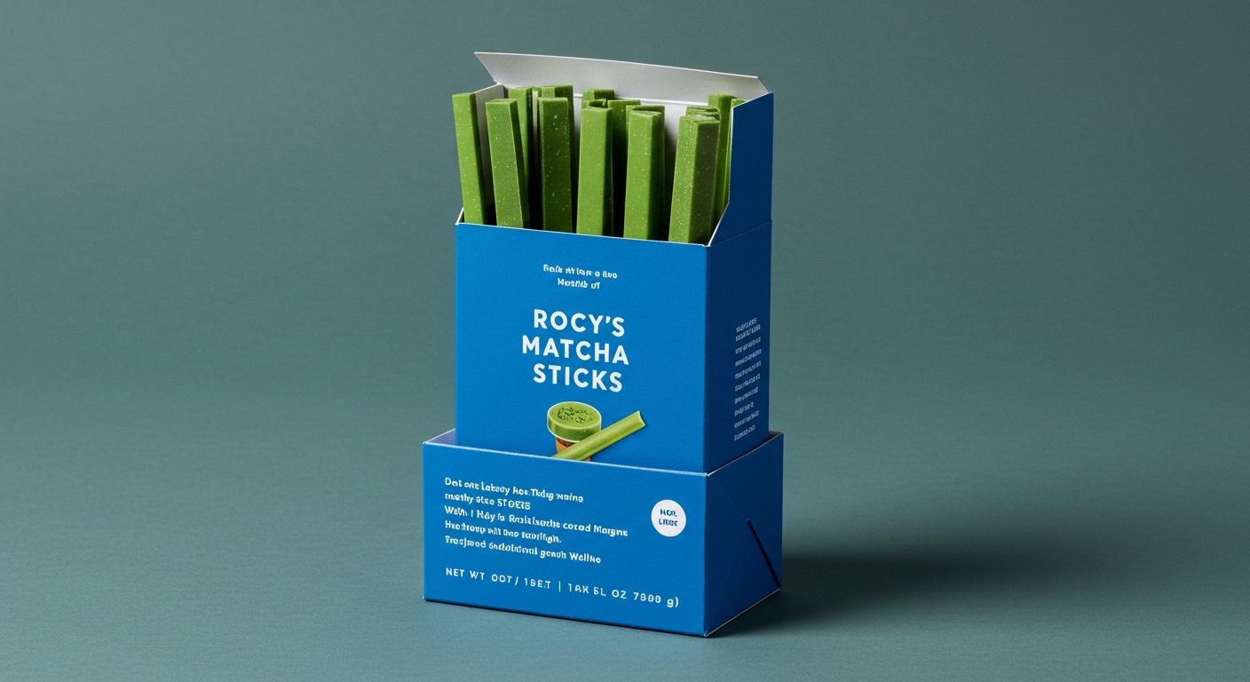
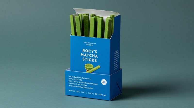
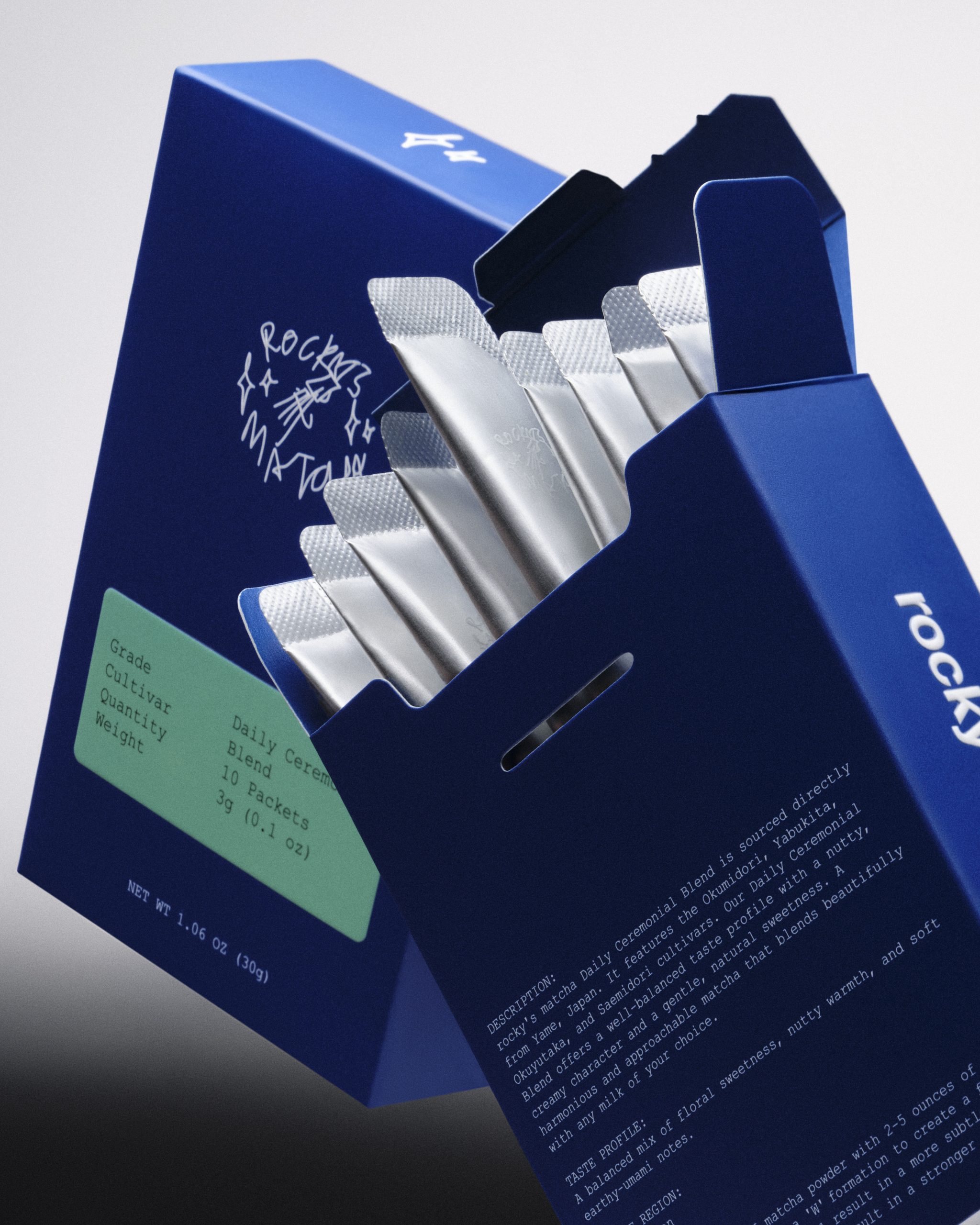
Rocky’s Matcha Sticks, presented in a cobalt blue flip-top box, exemplifies a calculated rejection of traditional wellness aesthetics.
This is not merely an aesthetic shift; it reflects a deeper strategic move where packaging becomes the primary brand narrator, shedding superfluous messaging to embody cultural resonance or aspirational identity. This strategy embraces tactile experiences and visual shorthand, allowing brands to communicate complex narratives with an understated precision. The result is packaging that feels less like a container and more like an artifact, designed for specific interactions and shelf impact.
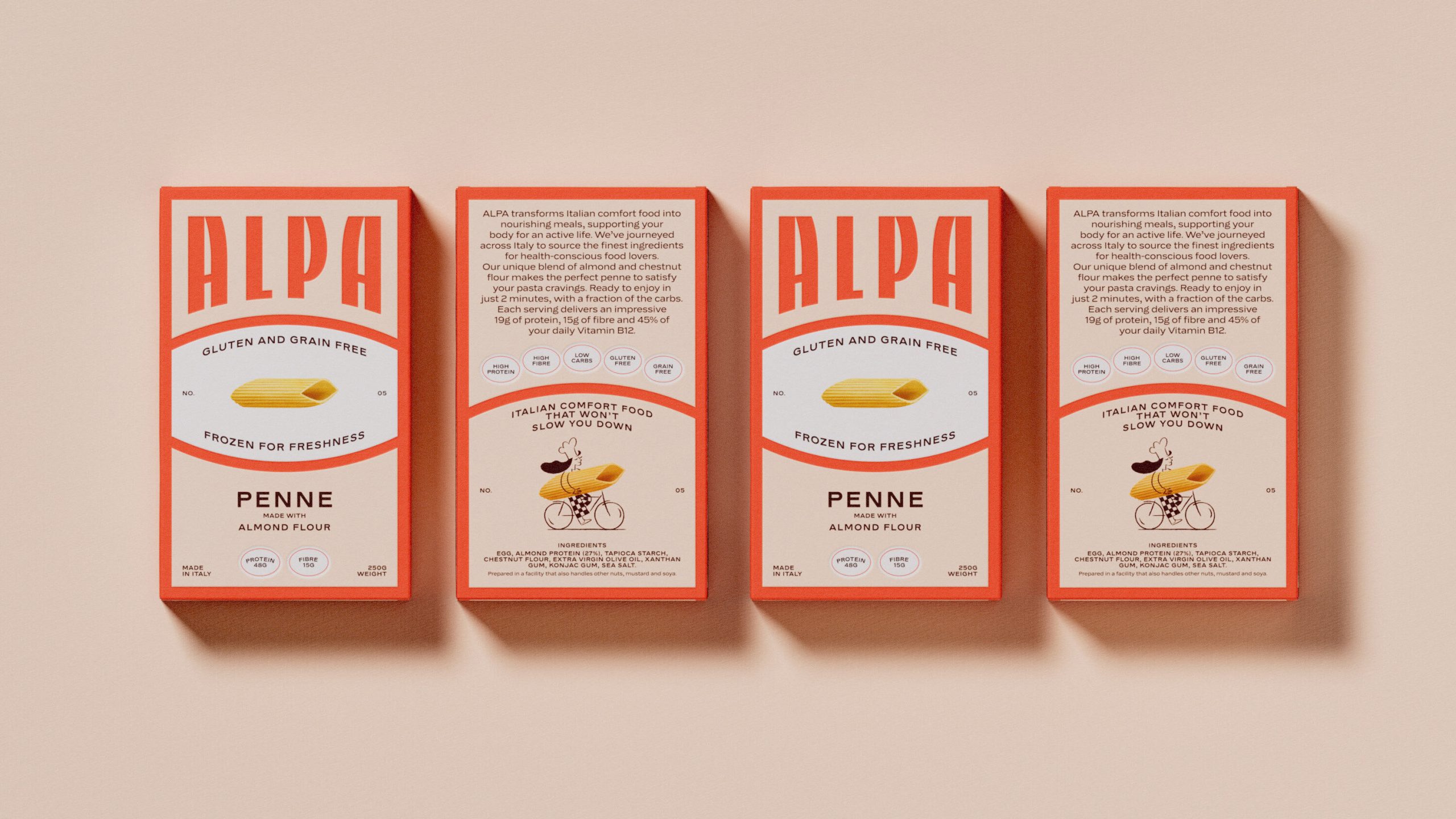
Consider Alpa, designed by Studio Tyrrell, which presents gluten-free pasta with a soaring flared serif wordmark and a vintage Italian cartouche. Mainstream industry wisdom often dictates that functional food packaging must overtly communicate its health benefits and dietary restrictions. The conventional approach often leans into clinical sterility or exaggerated natural cues to reassure consumers. However, Alpa’s design contradicts this by wrapping its product in an aesthetic of sophisticated heritage, evoking a 1960s Roman kitchen rather than a modern health aisle. This intentional anachronism bypasses direct functional claims, instead building an emotional connection through aspirational lifestyle branding. The tactile feel of its traditional printing style reinforces this premium, almost artisanal perception, inviting a different kind of engagement from the shelf.
This approach suggests that sustainability in packaging is evolving beyond merely material choice. While compostable films and recycled content are crucial, the design longevity and perceived value that discourage premature disposal become equally significant. Alpa’s aesthetic aims for timelessness, which can extend a product’s shelf life conceptually, making it less susceptible to fleeting trends. By mid-2027, the industry will witness a discernible increase in premium functional products adopting deliberately anachronistic or hyper-specific cultural aesthetics. This will challenge the assumption that transparency and overt benefit communication are the sole pathways to consumer trust for health-focused categories.
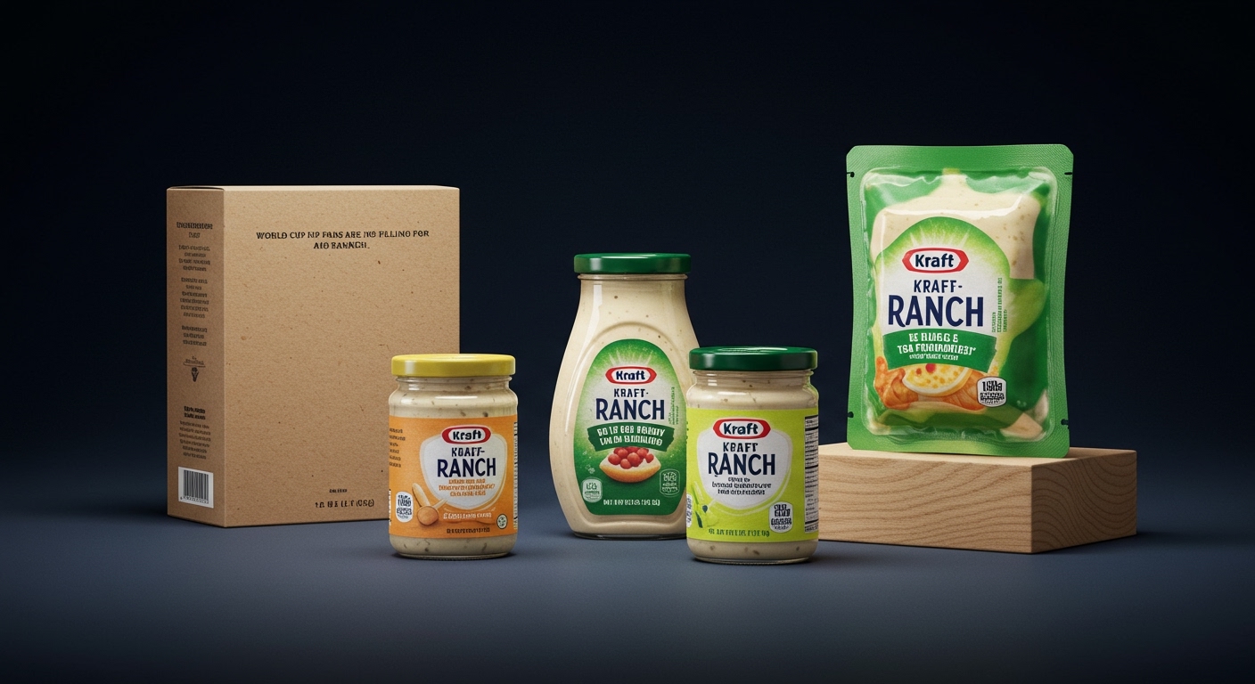
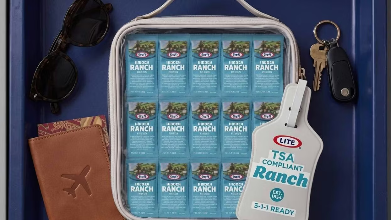
The primary opposing force to this trend comes from marketing departments reliant on A/B testing for explicit claim visibility and legal teams necessitating comprehensive nutritional information. Their established metrics often prioritize clarity and compliance over implicit storytelling, fostering a resistance to packaging designs that privilege aesthetic sophistication and tactile nuance over bullet-pointed benefits. The fear of consumer confusion or failure to communicate key selling points often stifles bolder, more subtly persuasive design directions. Kraft’s TSA-friendly ranch sachets, while innovative in their convenience, exemplify a brand driven by immediate functional need and regulatory compliance rather than an exploration of deeper aesthetic or tactile brand identity.
A working packaging professional should this week initiate a cross-functional workshop to map the desired emotional and tactile resonance of their product packaging, entirely separate from its functional benefits. This exercise should involve designers, brand managers, and even material engineers, focusing on sensory attributes like texture, weight, and opening rituals, before any material specification or graphic layout begins. The goal is to define the implicit brand story conveyed through physical interaction, prior to any explicit messaging.
TL;DR
Packaging design is shifting towards implicit storytelling and tactile resonance, challenging explicit benefit communication and offering a different path to sustainability.
Curated References


About this editorial — This piece was developed using AI-assisted research and curation across multiple industry sources. All analysis, opinions, and predictions represent the editorial perspective of JHDD. Sources are linked in the references section above.