JHDD Typography Report — 2026.06.19
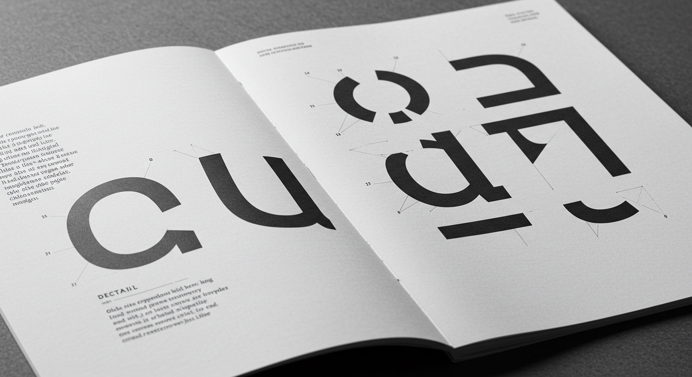
PSTL’s new typeface, Detail, eschews loud design gestures in favor of subtle curves.
This focus on the minute details of typographic form connects implicitly with contemporary discussions around historical artifacts like postage stamps and American newspapers, as highlighted by The Daily Heller. These disparate references coalesce around a quiet but insistent re-evaluation of typographic longevity and the enduring power of micro-level design decisions. It signals a move away from the pursuit of transient visual novelty towards a more considered appreciation of forms engineered for sustained engagement and intellectual resonance across diverse mediums.
The mainstream design industry frequently prioritizes immediate visual impact and brand distinctiveness through overtly conceptual or highly stylized letterforms, particularly in digital environments where attention spans are fragmented. This approach often assumes that typefaces must shout to be heard. However, PSTL’s philosophy for Detail, which finds its personality in “subtle curves, clever deviations, and a quiet sense of mischief,” contradicts this prevailing assumption. True typographic power, as exemplified by Detail, often resides in its ability to facilitate effortless reading and convey nuance, rather than in its capacity for immediate visual disruption. This commitment to granular refinement over broad strokes suggests a deeper understanding of legibility not as a baseline requirement, but as the ultimate expression of sophisticated design.
This emphasis on refined micro-typography has direct implications for how designers approach both conceptual letterforms and grid systems. Rather than viewing conceptual type as inherently requiring bold or abstract shapes, the PSTL approach demonstrates that even characterful typefaces benefit from extensive attention to sub-pixel accuracy and optical correction, enhancing their communicative efficacy without sacrificing their distinct voice. Furthermore, robust grid systems become indispensable not merely for structural organization, but as precise frameworks that allow these subtle typographic details—kerning, tracking, and the interplay of negative space within and around letterforms—to be perceived and appreciated consistently. By mid-2027, industry observers predict a discernible trend among major content platforms and publishers towards commissioning custom typefaces that prioritize this nuanced legibility and micro-typographic integrity for primary text use, moving away from overtly expressive display faces that sacrifice readability.
The resistance to this deeper typographic consideration largely stems from commercial pressures that reward rapid visual differentiation and short-term “engagement” metrics in branding and advertising. Marketing departments and creative directors, particularly in fast-moving sectors, often prioritize typefaces that deliver immediate visual distinction, sometimes overlooking the long-term costs associated with compromised legibility or visual fatigue. This drive for instant recognizability frequently overshadows the more profound value of typefaces designed for sustained, comfortable reading.
Working typography professionals should, this week, critically re-evaluate their criteria for type selection and implementation. Beyond initial aesthetic appeal, conduct rigorous legibility testing on target devices with diverse user groups, specifically measuring reading comprehension and reduced eye strain over extended reading periods. Focus granularly on the integrity of character forms at small point sizes, the optical balance of letterspacing, precise kerning pairs, and the subtle interplay of ascenders, descenders, and x-heights within both short headlines and dense body copy blocks, adopting the meticulous precision evident in PSTL’s work.
TL;DR
The enduring power of type design comes from a detailed focus on micro-typography and legibility over transient visual trends.
Curated References
About this editorial — This piece was developed using AI-assisted research and curation across multiple industry sources. All analysis, opinions, and predictions represent the editorial perspective of JHDD. Sources are linked in the references section above.