JHDD Typography Report — 2026.06.18
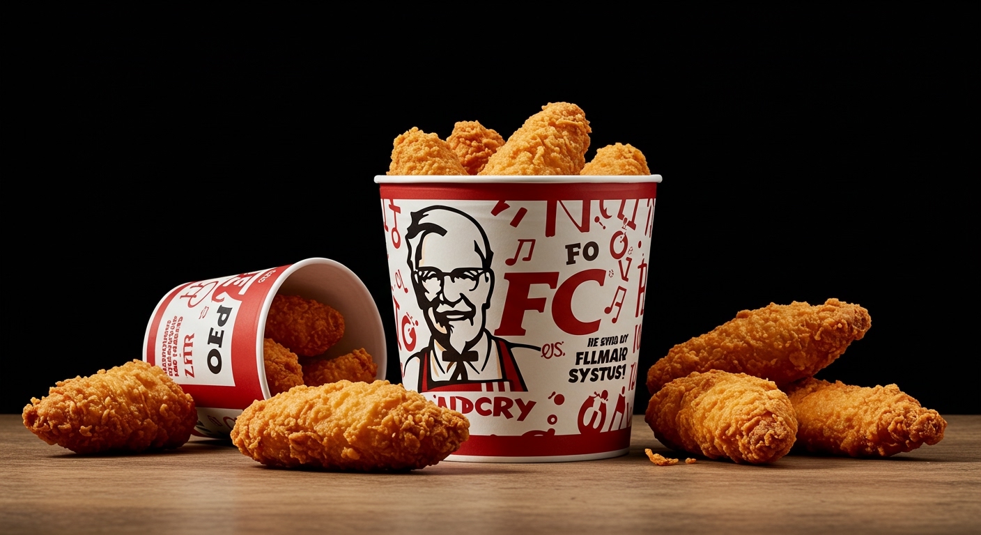
KFC’s recent brand refresh by JKR centers its most iconic asset, the bucket, with bold typography and refined illustrations. This decision, alongside other recent developments, reflects a subtle but profound shift in how design intelligence evaluates lasting impact and functional expressiveness in visual communication.
A clear pattern emerges from these disparate reports: enduring design and effective communication increasingly prioritize the rigorous re-examination of intrinsic identity over the pursuit of transient novelty. Whether exploring the historical grids of the American newspaper with Alex Wright or developing a new typeface like PSTL’s Detail, success now often hinges on the considered refinement of established structures and known forms. This approach acknowledges that authenticity, conceptual depth, and legibility are frequently rooted in a deep understanding of what is already familiar, rather than demanding entirely new visual languages. The emphasis moves from inventing forms to perfecting their execution and inherent meaning.
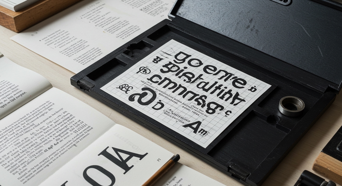
PSTL’s typeface Detail exemplifies this principle, achieving distinct personality through “subtle curves, clever deviations, and a quiet sense of mischief.” This particular success directly challenges a common industry assumption that expressive letterforms must employ overt, dramatic gestures to convey character or conceptual depth effectively. Mainstream opinion frequently pushes designers towards maximalist or highly stylized type solutions, believing that increased visual boldness equates directly to increased impact and memorability. However, Detail demonstrates that sophisticated conceptual letterforms can derive profound meaning and distinctiveness from micro-typographic decisions. The precise angle of a terminal, the specific tension in a rounded stroke, or the nuanced negative space within a counter-form all carry significant conceptual weight, contributing to both enhanced legibility and a refined brand voice without sacrificing clarity. This focus on the minute means that even within a strict grid system, the individual character of the type asserts itself through its internal consistency rather than external variation.
This emphasis on the inherent character embedded within letterforms, often achieved through meticulous micro-typographic adjustments, signifies a re-evaluation of how personality is truly communicated. A typeface’s conceptual underpinnings are not solely defined by its grand, display-oriented gestures but by its consistently applied, often almost imperceptible, details that hold up across various contexts. Consider the careful modulation of a traditional grid system for an editorial layout; its unique personality can derive from consistent, subtle micro-adjustments in leading, tracking, and character spacing, rather than from a radical new structural arrangement. This trend will likely intensify; by mid-2027, a significant portion of successful brand identity launches will feature primary typefaces that achieve their conceptual distinctiveness through refined micro-typography, ensuring legibility and a nuanced voice across all applications, rather than relying on overtly stylized or structurally experimental forms.
The primary resistance to this meticulous, detail-oriented approach comes from the accelerated pace of digital content creation and the pervasive pressure for immediate, impactful visual communication. Marketing departments and clients often operate within short campaign cycles, demanding instantaneous recognition and rapid message delivery. This frequently favors highly visible, often simplified, or dramatically altered letterforms that can be quickly processed and understood without close inspection. This emphasis on speed and surface-level impact often disincentivizes the careful consideration of micro-typographic nuance, leading to a preference for type treatments that prioritize blunt force over subtle persuasion or long-term legibility. The commercial imperative for rapid consumption clashes with the artisanal precision of conceptual micro-typographic design.
Typography professionals should, this week, select a recently released typeface that explicitly claims to possess significant “personality” and conduct a focused legibility review across both display and body text sizes. Specifically identify five distinct micro-typographic details (e.g., serif treatment, counter shape, stroke modulation, terminal cuts, axis of stress) that contribute to its unique character. Evaluate how these details function across diverse grid system applications and varying scales, noting if the typeface’s conceptual intent survives miniaturization without hindering legibility, or if its personality becomes legible only when supported by ample white space or simplified layouts.
TL;DR
Lasting typographic impact comes from meticulous refinement of existing forms and micro-typographic detail, not superficial novelty.
Curated References
About this editorial — This piece was developed using AI-assisted research and curation across multiple industry sources. All analysis, opinions, and predictions represent the editorial perspective of JHDD. Sources are linked in the references section above.