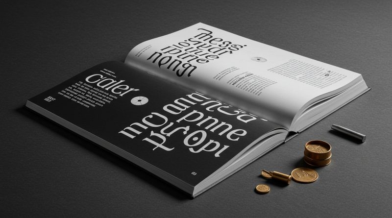
JHDD Typography Report — 2026.06.16
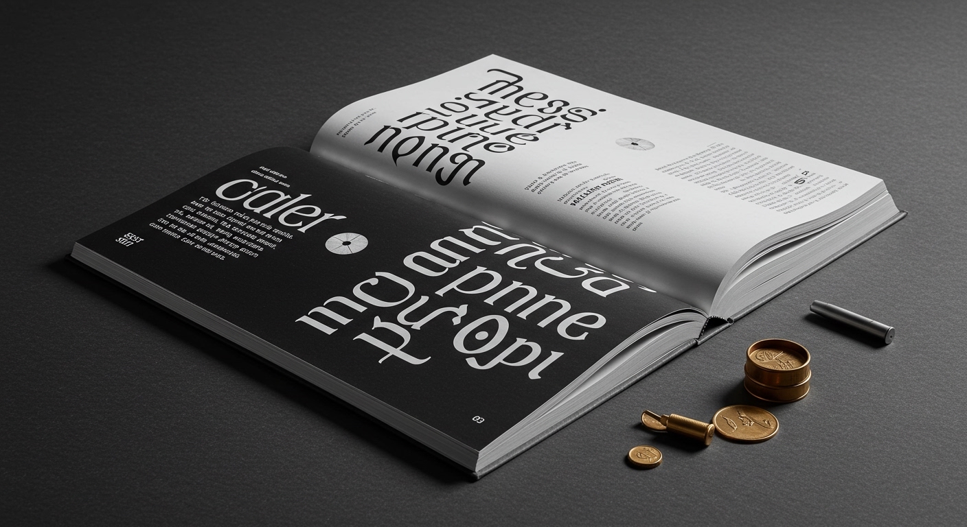
SSStudio’s identity for Adonna Wines employs “thoughtful, intentional details that celebrate culture, craft, and winemaking.”
This focus on intentional detail, whether in wine branding or Pepsi’s limited-edition cans, reflects a growing industry trend towards embedding specific narrative meaning within the often-overlooked components of visual communication. It is a shift from generic clarity to contextual depth, where every visual element, including letterforms and their arrangement, carries a weighted purpose beyond immediate recognition. The “Little Books, Big Subjects” series, too, exemplifies this, demanding precise grid systems and micro-typography to distill extensive knowledge into digestible formats.
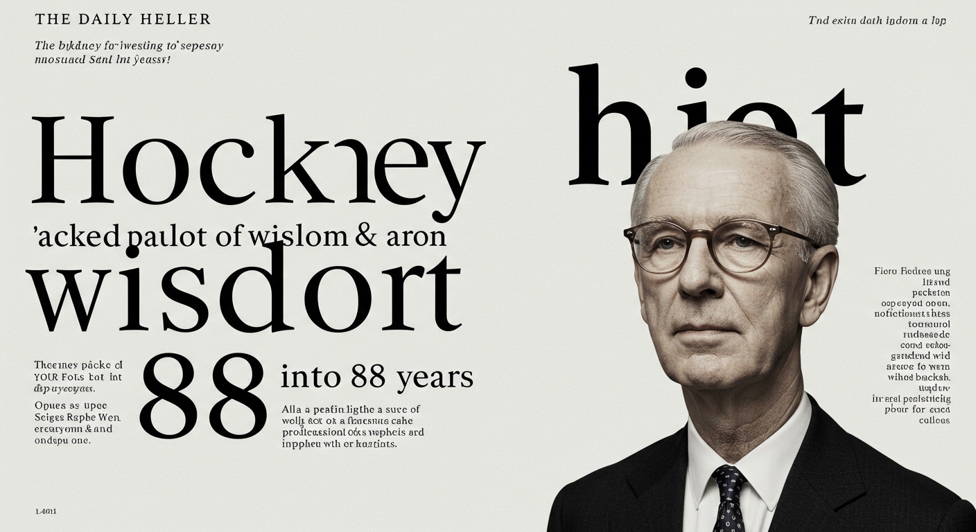
SSStudio’s design for Adonna Wines exemplifies an approach where brand values are not merely communicated but encoded within the very fabric of the visual identity. The “thoughtful, intentional details” go beyond surface aesthetics; they become mnemonic devices for the brand’s agricultural heritage and contemporary vision. Mainstream industry wisdom frequently dictates that clarity and instant recognition are paramount, often achieved by simplifying letterforms to their most generic and universally readable state. This perspective, however, risks conflating legibility with blandness, overlooking the communicative power inherent in subtly conceptual letterforms and precise micro-typographic choices. True legibility is not just about the ease of character recognition, but the ease with which a reader absorbs and comprehends the intended meaning and emotional resonance. SSStudio’s method suggests that specific cultural cues embedded within letterform construction or grid application can enhance this deeper legibility, providing context that generic readability cannot. By mid-2027, the industry will see a noticeable pivot away from purely utilitarian type choices in branding towards bespoke, culturally resonant conceptual letterforms that perform both an aesthetic and a mnemonic function.
The prevalent industry belief that conceptual letterforms inherently sacrifice legibility is a narrow interpretation. In many contexts, subtle conceptual elements, when executed with mastery, do not impede recognition but rather enrich the reading experience by providing immediate contextual cues. The idea that all type must be maximally neutral for universal appeal often strips it of the very character that aids in brand differentiation and memorability. For instance, the careful adjustment of letter spacing (kerning) and line spacing (leading), usually considered micro-typography, becomes a critical tool for shaping perception and reinforcing conceptual messages without resorting to overtly decorative forms. This nuanced approach demonstrates that conceptual depth and high legibility are not mutually exclusive, but rather complementary aspects of sophisticated design.
The primary opposing force to this detailed, meaning-rich typographical approach is the pervasive influence of template-driven design platforms and the demand for instant, high-volume content generation. These systems prioritize speed and broad applicability over bespoke nuance, often flattening visual identities into easily reproducible, yet ultimately generic, forms. The market’s insatiable appetite for rapid deployment incentivizes a lowest-common-denominator approach to typography, where default settings and readily available typefaces often dictate the final aesthetic, irrespective of specific contextual or cultural demands. This efficiency-first mentality actively resists the investment of time and expertise required for meticulous micro-typographic adjustments and deeply conceptual letterform development.
Typography professionals should, this week, select a current project and systematically audit its micro-typographic details, specifically examining how kerning, tracking, leading, and paragraph spacing are currently deployed. The exercise involves deliberately exaggerating these adjustments – both tightening and loosening – to observe their impact on conceptual legibility and emotional resonance, not just character recognition. The goal is to move beyond default values and identify opportunities where subtle, intentional variations in spacing can reinforce the underlying message or brand narrative without hindering basic readability.
TL;DR
Meaningful typography integrates cultural cues and precise micro-details for enhanced conceptual legibility.
Curated References
About this editorial — This piece was developed using AI-assisted research and curation across multiple industry sources. All analysis, opinions, and predictions represent the editorial perspective of JHDD. Sources are linked in the references section above.