
Julian’s Branding Insight — 2026.06.15
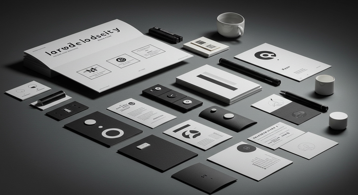
The elemental symbol, often dismissed as mere decoration, is quietly becoming the bedrock of an audacious new brand era.
In a landscape saturated with fleeting visual noise, the strategic deployment of core graphic elements is experiencing a profound resurgence, anchoring brand equity in a perpetually shifting cultural and market context. This isn’t about chasing ephemeral trends; it’s about returning to foundational principles, recognizing that a well-chosen symbol, meticulously integrated across a visual identity system, can transcend its initial form to become a potent signifier of brand intent and value. The opening of Tokyo’s Museum of Narratives, with Pentagram’s spiral identity, exemplifies this. The spiral, an ancient motif, is recontextualized to embody the museum’s cross-disciplinary ethos, its fusion of tradition and futurism, and its commitment to narrative exploration. Similarly, the “bold, no nonsense” identity for Leo, a hair rejuvenation brand, underscores a deliberate strategic choice to convey directness and efficacy, moving beyond the often-convoluted language surrounding hair loss. These examples demonstrate a growing understanding that a brand’s visual language must not only be aesthetically compelling but also functionally resonant, capable of communicating complex ideas and fostering immediate recognition and trust in an increasingly fragmented marketplace.
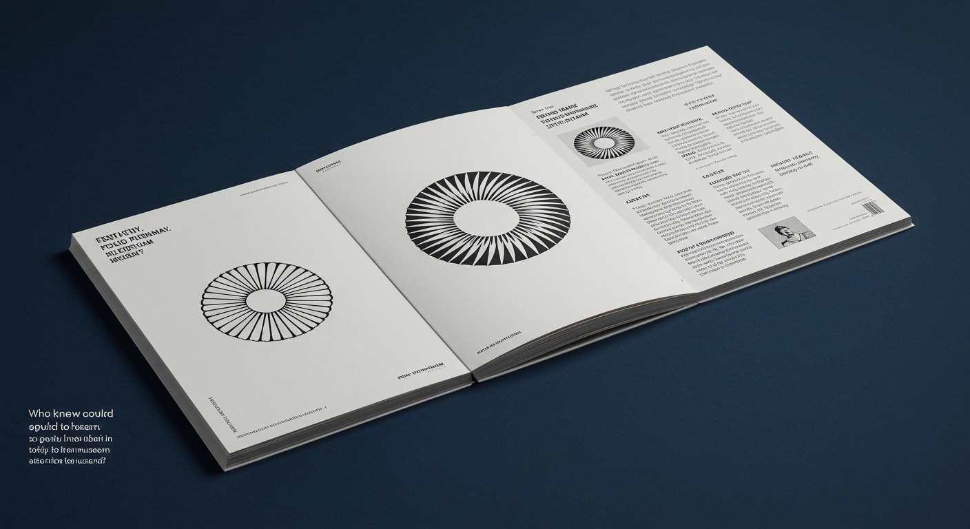
The news coalesces around a potent narrative: the deliberate distillation of brand identity to its most potent, symbolic essence. Pentagram’s work for the Museum of Narratives showcases how a singular, dynamic form like a spiral can become the generative core of an entire visual system, echoing the museum’s experimental, cross-disciplinary programming. This isn’t a simple logo; it’s a conceptual engine driving every touchpoint. Likewise, the pragmatic, almost defiant, simplicity of Creative Spark’s identity for Leo signals a departure from the often-fluffier marketing prevalent in personal care, opting instead for a direct, empathetic visual approach that speaks to the founder’s mission of demystifying hair loss. The implicit takeaway is that in an era where attention spans are dwindling and authenticity is paramount, brands are stripping away extraneous ornamentation to reveal their core purpose, communicating it through impactful, memorable visual cues. This strategic simplification allows for greater flexibility and memorability across diverse media, ensuring that the brand’s essence remains clear and consistent, whether on a grand architectural facade or a small product label.
The prevailing tension lies between the aspiration for profound symbolic resonance and the pragmatic demands of immediate market visibility. On one hand, designers are exploring the archetypal power of simple forms – a spiral, a clean typeface, a restrained color palette – to imbue brands with deeper meaning and enduring appeal, as seen in the Tokyo museum’s identity. On the other hand, the competitive landscape, particularly in sectors like food and beverage, necessitates quick recognition and an immediate understanding of the product’s offering. The work for Brusco, the smash burger brand, subtly reinvents classic tropes rather than discarding them entirely, suggesting an understanding that familiarity can be a powerful ally when paired with refined execution. This creates a fascinating paradox: how does one create a visually distinctive and conceptually rich identity that also functions as an instantly recognizable beacon in a crowded marketplace, without sacrificing the nuance and depth that true brand equity demands?
Expect to see a strategic “unbranding” of categories previously dominated by hyper-stylized or overly literal visual cues. Brands will increasingly leverage abstract, elemental graphic languages not just as aesthetic choices, but as intentional signals of their fundamental value proposition, akin to how a mathematician uses symbols. This will manifest in packaging that eschews direct product depiction for abstract patterns that evoke texture or origin, and in digital interfaces that prioritize intuitive symbolic navigation over explicit labeling.
TL;DR
Core graphic elements are becoming the new brand anchors, replacing superficial trends with enduring symbolic power.