Julian’s Typography Insight — 2026.06.11
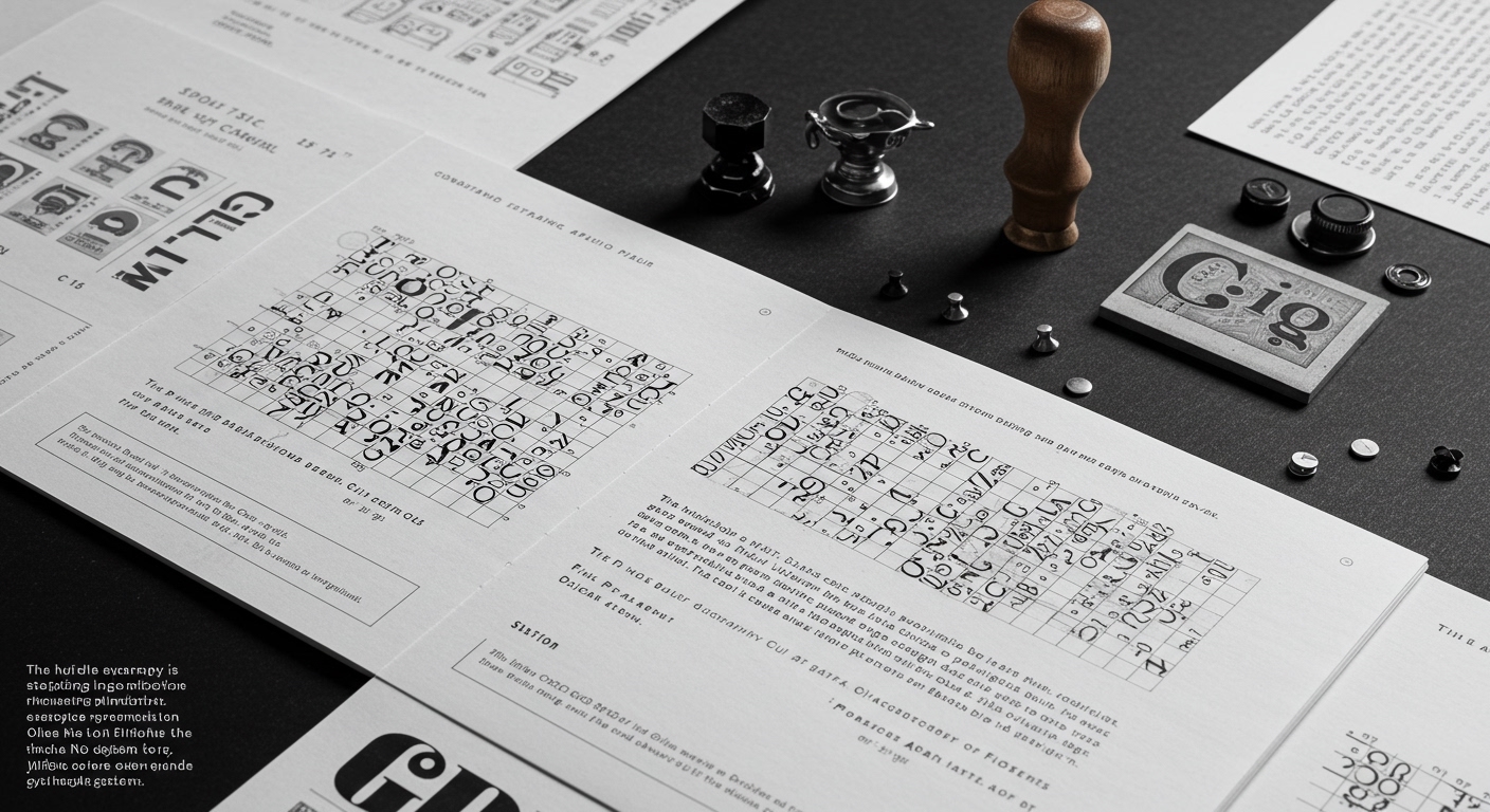
The humble stamp is staging a radical re-emergence, not as a relic, but as a potent tool for conceptual design.
In an era saturated with digital ephemera, the tactile resonance of typography demands renewed attention. Legibility, often the bedrock of functional text, is now being challenged and recontextualized by experimental letterforms that prioritize conceptual expression over immediate comprehension. Designers are actively exploring the boundaries of grid systems, not as rigid frameworks, but as dynamic scaffolds that can be bent, broken, and reassembled to evoke specific emotions or narratives. This interrogation extends to micro-typography, the often-overlooked details of spacing, kerning, and scale, where subtle adjustments can profoundly alter the reader’s perception and engagement. The resurgence of interest in historical printing methods, like the metal stamps unearthed by The Daily Heller, underscores a contemporary yearning for the tangible, for the imprint of human hand and deliberate craft in an increasingly disembodied digital landscape. This isn’t merely nostalgia; it’s a conscious recalibration of typographic values in response to the overwhelming flux of contemporary information.
The news fragments, when viewed together, paint a compelling picture of typography in transition. The discovery of vintage English textile trademark stamps speaks to a burgeoning fascination with the unique character and texture derived from analogue processes. These aren’t just functional marks; they are imbued with a history of craft and a distinct aesthetic that resonates with current design sensibilities. Simultaneously, the debut of NC HEADLINE by Newspaper Club and abcD8 signifies a forward-thinking approach to print typography, leveraging variable font technology to create adaptable and historically informed headlines for a medium undergoing its own transformation. Steven Heller’s foray into AI and graphic design, however, introduces a potent counterpoint, hinting at the automation and conceptual shifts on the horizon. W.A. Dwiggins’ passion for spine design, though seemingly a niche historical detail, also reflects a deeper engagement with the physical object of the book and the typographic articulation of its structure, a concern that feels particularly relevant as digital formats proliferate. Collectively, these items suggest a bifurcation in typographic practice: a reverence for the materiality and conceptual depth of historical methods, coupled with an embrace of technological innovation and a wary eye on the disruptive potential of artificial intelligence.
The tension lies between the deliberate, often laborious, creation of unique typographic artifacts and the impending wave of AI-generated designs. On one hand, we see designers meticulously excavating the past, celebrating the tactile qualities of handmade stamps and the considered craft of historical type design, seeking authenticity and conceptual richness in the physical imprint. On the other, we confront the algorithmic potential to generate vast quantities of design output, potentially at an unprecedented speed and scale, raising questions about authorship, originality, and the very definition of craft in the digital age. This juxtaposition highlights the enduring human desire for connection to material processes and unique expression, pitted against the seductive efficiency and transformative power of intelligent machines.
Within the next five years, expect to see a significant rise in variable typefaces designed specifically for augmented reality environments, where letterforms will dynamically adapt their weight, width, and even stylistic attributes based on user gaze, ambient light, and contextual information, creating a deeply personalized and responsive typographic experience.
TL;DR
Typography is caught between the analog past and the AI future, redefining craft and legibility.