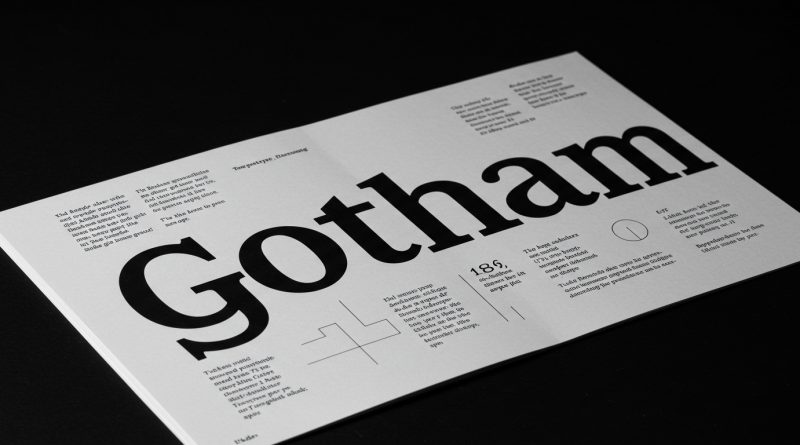
JHDD Typography Report — 2026.08.19
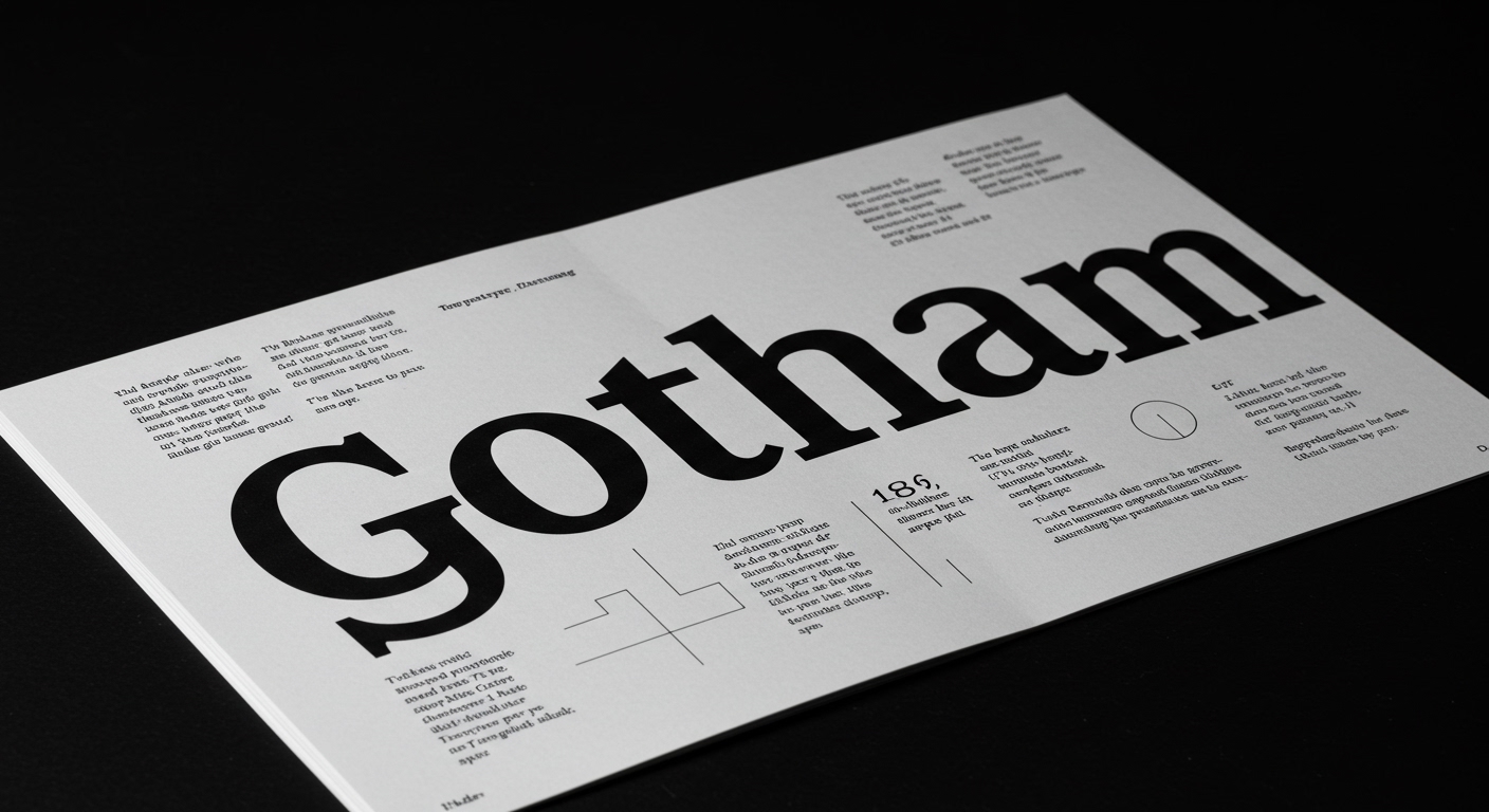
Monotype’s decision to release Gotham Variable twenty-five years after the original typeface demonstrates a conscious engagement with legacy in contemporary typography.
This move, alongside the enduring output of Seymour Chwast at ninety-five and Egon Van Herreweghe’s detailed study of storefront awnings, highlights a broader current in design. Professionals are increasingly re-evaluating established forms and everyday visual language, not as static historical artifacts, but as dynamic systems capable of adaptation. The common thread is a deep inquiry into the resilience and meaning embedded within design, from the celebrated corporate marque to the unacknowledged utilitarian element. This re-evaluation often involves both technological integration and a renewed appreciation for foundational design principles.
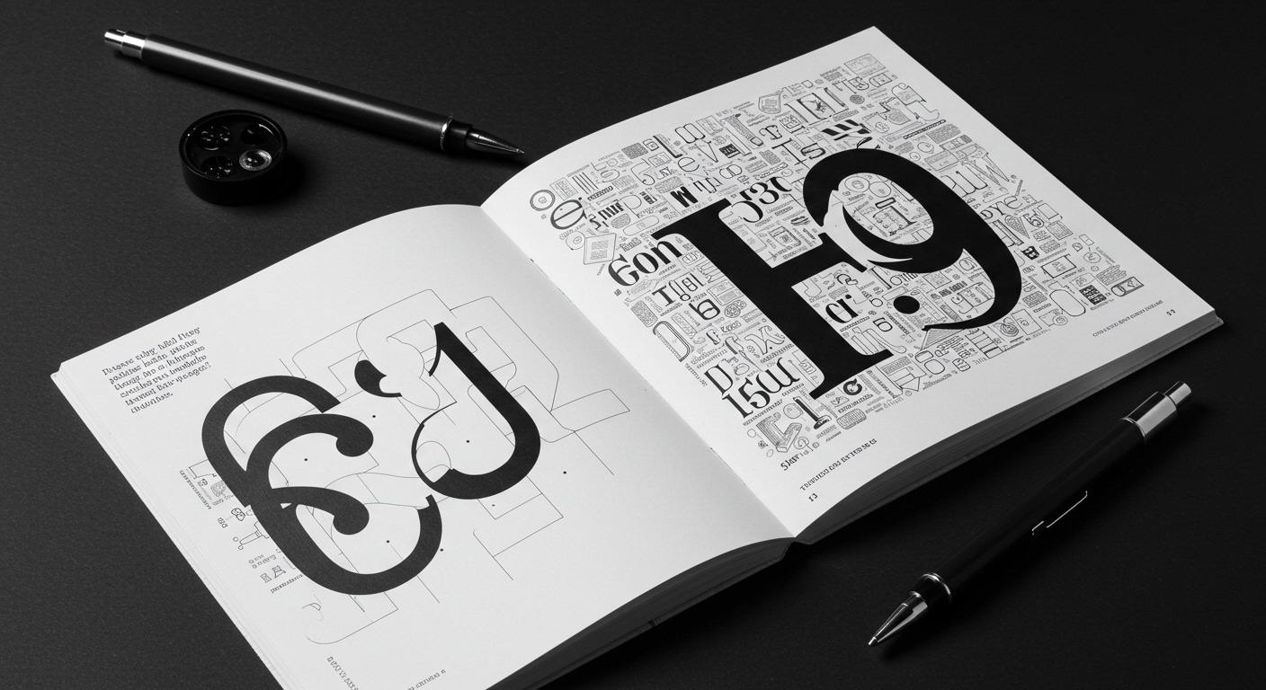
The introduction of Gotham Variable, with Sara Soskolne exploring its flexibility, suggests that a typeface’s enduring recognition might now hinge on its capacity for parametric adjustment. However, a common industry misapprehension views variable fonts primarily as an efficiency tool or a pathway to purely expressive, conceptual letterforms. This perspective overlooks a critical truth: the profound legibility and conceptual integrity of Gotham originated from its meticulously defined static forms. True typographic evolution, particularly in micro-typography, depends on how well these variable parameters are anchored in, and constrained by, the core principles of legibility and hierarchy that made the original design successful. Without a rigorous understanding of the grid systems and spatial relationships inherent in the initial fixed weight, the flexibility offered by a variable font can quickly dissolve into visual noise, compromising its very purpose in editorial design.
The real challenge for designers leveraging tools like Gotham Variable, especially with the integration of AI mentioned in its development, is not merely to unlock new interpolations, but to apply them with the disciplined eye of a master typographer. The industry often defaults to broad-stroke application of new technologies, seeking immediate impact over subtle refinement. This approach risks eroding the precise control over letter spacing, word spacing, and line-height that defines superior typography. By mid-2027, the market will likely see a corrective trend where typefoundries and brands will emphasize the controlled application of variable fonts, prioritizing granular micro-typographic legibility in user interfaces and complex data visualization over unbridled expressive potential, particularly for brand identities seeking enduring clarity.
This disciplined approach finds resistance from the prevailing trend towards ephemeral digital content and platforms that prioritize rapid iteration over enduring typographic refinement. The pressure to generate novel visual experiences quickly, often with minimal attention to the subtle nuances of letterform interaction, serves as a significant counterforce. This often leads to a devaluation of the meticulous craft embodied by designers like Walter Allner, Alexander Liberman, and Fred Troller, whose work bridged fine art and applied design with equal rigor.
A working typography professional should, this week, select a single common text typeface, perhaps a classic sans-serif like Gotham, and spend dedicated time manually adjusting its kerning, tracking, and leading across several lines of body text, simulating different screen resolutions. This exercise should be done without reliance on automated settings, focusing instead on developing a visceral understanding of micro-typographic impact on legibility, even before considering variable font interpolation or algorithmic adjustments.
TL;DR
The evolution of typefaces like Gotham Variable demands disciplined micro-typographic attention to preserve legibility amidst new flexibility.
Curated References
About this editorial — This piece was developed using AI-assisted research and curation across multiple industry sources. All analysis, opinions, and predictions represent the editorial perspective of JHDD. Sources are linked in the references section above.