JHDD Interior Report — 2026.08.18
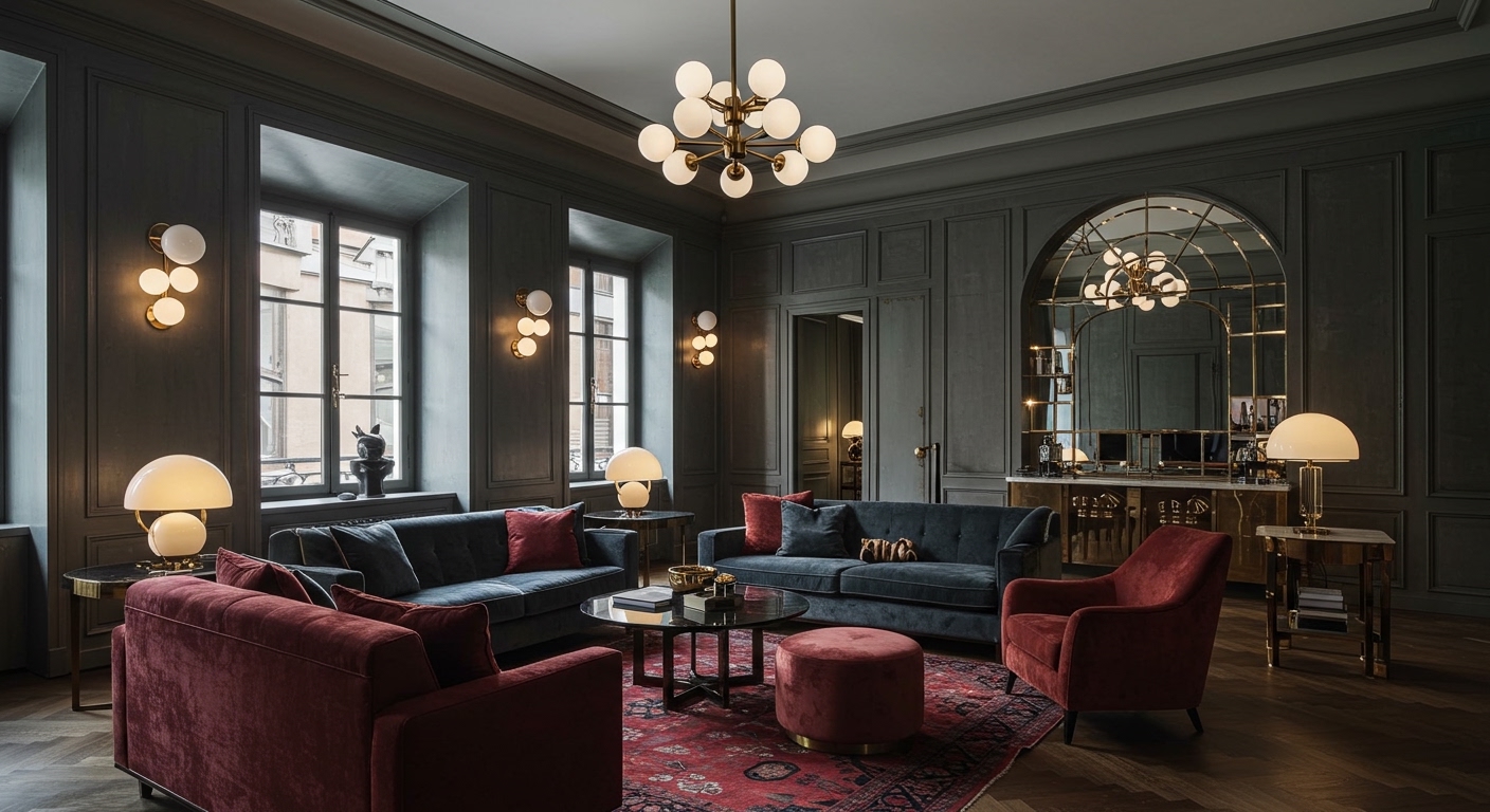
Tatjana von Stein’s design for The Dean Munich deliberately blends Jugendstil elegance with 1980s glamour, crafting an atmosphere that defies simple categorization. This approach, alongside Ome Dezin’s integration of iconic Frank Gehry and Ingo Maurer pieces into a renovated 1990s Los Angeles residence, points to a broader pattern: the conscious pursuit of spatial tension through material and aesthetic juxtaposition. These projects are not merely accumulating elements; they are orchestrating a dialogue between distinct periods and textures, aiming for environments rich in tactile and visual narrative, profoundly influencing human flow and perception.
The prevailing industry conversation often frames such eclecticism as “dopamine decor,” implying an instant, superficial gratification through bright colors and whimsical shapes. This interpretation misses the critical discipline involved in achieving sophisticated spatial tension. Tatjana von Stein, for instance, created hundreds of bespoke lights and furnishings for The Dean Munich, specifying materials that carry the distinct sheen of polished brass from one era and the opulent, often lacquered, finishes characteristic of another. This is not about spontaneous whimsy; it represents a deep commitment to material specificities and custom fabrication. The chosen styles from Jugendstil and the 1980s are not simply laid side-by-side but are synthesized, where their inherent material and formal differences create a new, resonant experience of place. The success lies in the designer’s ability to control this deliberate spatial friction, ensuring it invigorates human flow through varied visual and tactile experiences rather than creating visual chaos.
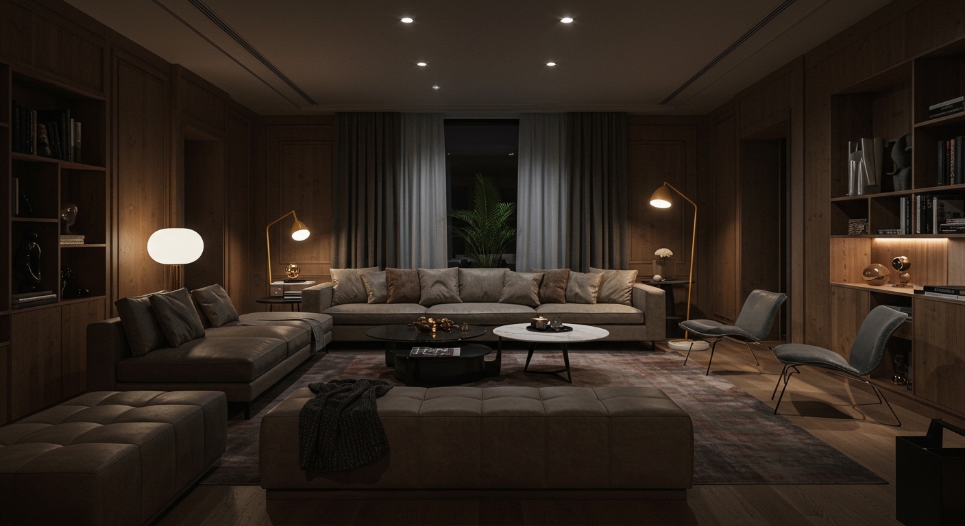
Mainstream opinion often applauds designs that present a singular, harmonious aesthetic, promoting an idea of “cohesion” that sometimes borders on blandness or predictability. However, the true mastery demonstrated by von Stein at The Dean Munich lies in her intentional cultivation of anachronistic synthesis. This is not a casual mix-and-match of readily available items; it is a calculated interplay where the tension between distinct historical material palettes and design languages generates a deeper, more memorable tactile and visual landscape. Consider the specific detailing of a Jugendstil-inspired light fixture rendered in contemporary materials, juxtaposed against a bold, geometric 1980s-esque furniture piece. This friction is not just visual; it creates an intellectual engagement and a sensory richness. The human flow through such a space becomes a journey of discovery, where each turn presents a new facet of this curated tension, inviting prolonged engagement rather than fleeting recognition. The tactile quality of surfaces – from plush velvets to cool metals – is carefully considered to amplify these contrasts, deepening the spatial narrative.
This strategic application of friction, rather than bland harmony, will become a defining characteristic of high-end design. By late 2027, a measurable shift will occur in how luxury material brands market their products. They will move from showcasing singular material purity to demonstrating how their offerings can interact dynamically within layered, multi-era compositions. This will require material innovation, focusing on surfaces and finishes that can both anchor a specific historical aesthetic and resonate effectively within a complex contemporary spatial narrative, pushing beyond simple replication to sophisticated material dialogue.
The primary resistance to this evolving methodology comes from the rapid proliferation of design trends on social media platforms. Labels like “dopamine decor,” as articulated in Julie Lasky’s critique, reduce sophisticated design efforts to simplistic psychological triggers. This encourages a superficial, imitative approach rather than deep material and spatial inquiry. The constant demand for novelty and easy categorization pressures designers to produce easily photographable spaces, often at the expense of deeply experiential and enduring environments, thereby devaluing the intentional friction that defines truly innovative work.
Interior professionals should, this week, select a specific corner or small zone in their current project and identify two materials from starkly different historical or geographic contexts that could coexist there. For example, consider integrating a highly textured, unprocessed natural material like rough-hewn timber or undyed linen alongside a highly refined, manufactured material such as polished blackened steel or an iridescent composite panel. Research how these materials were traditionally fabricated and consider one contemporary application that highlights their inherent textural and visual differences, creating a deliberate, small-scale point of spatial tension without resorting to overwhelming visual noise. This practice refines the eye for intentional material dialogue and its impact on tactile quality.
TL;DR
Design is shifting towards carefully orchestrated material friction and layered spatial narratives, resisting superficial trend labeling.
Curated References



About this editorial — This piece was developed using AI-assisted research and curation across multiple industry sources. All analysis, opinions, and predictions represent the editorial perspective of JHDD. Sources are linked in the references section above.