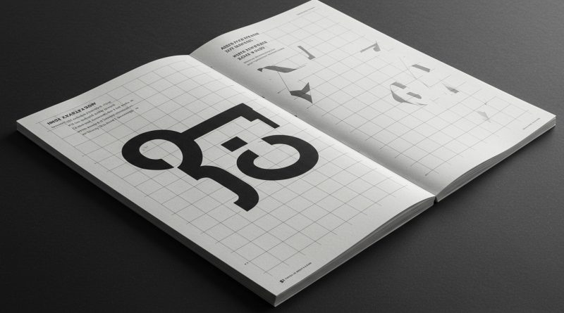
JHDD Typography Report — 2026.08.15
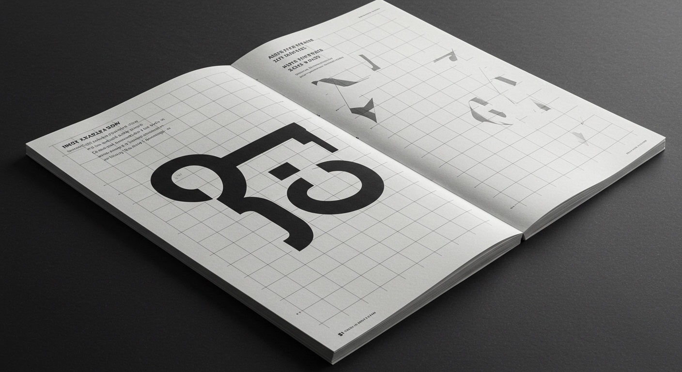
Instagram’s recent “little refresh” provided a superficial update to its visual identity.
This event, alongside the discussion of “editorial dissonance” within ‘MALE.’ and the dual practices of designers like Walter Allner, Alexander Liberman, and Fred Troller, reveals a persistent tension in contemporary design. Many visual updates prioritize perceived modernity over the nuanced application of core typographic principles. The rapid pace of digital platforms often translates to stylistic adjustments without a fundamental re-evaluation of underlying grid systems or the micro-typographic details crucial for true legibility.
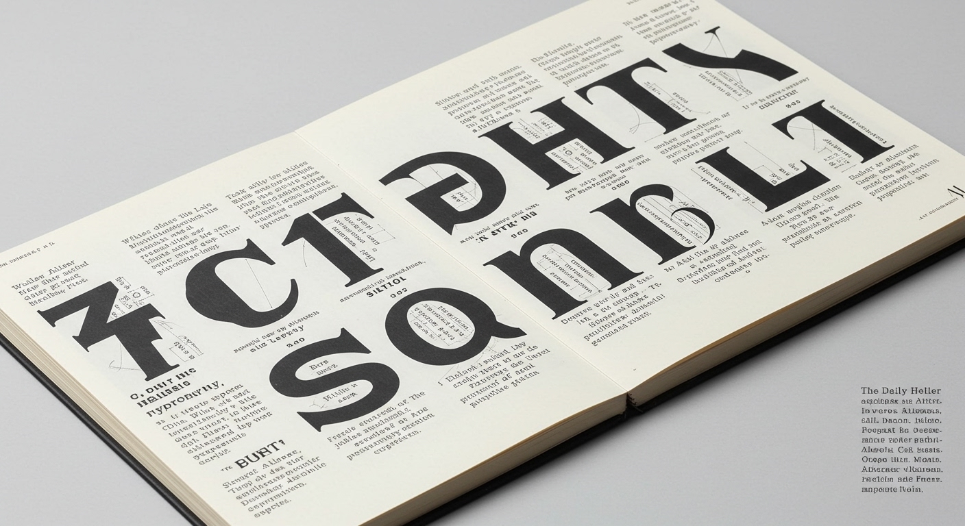
The mainstream industry narrative often frames such platform refreshes, like Instagram’s, as necessary evolutions that keep brands current and user-friendly. However, this perspective frequently overlooks the opportunity for substantive improvements in legibility. A genuine typographic refresh would delve into the minutiae of character spacing, line height, and baseline grids, rather than merely adjusting a logotype or an icon set. Instagram’s ‘little refresh,’ as described, falls into the category of cosmetic alteration, failing to address the deeper structural and micro-typographic elements that genuinely impact daily readability for billions of users. The pervasive drive for immediate visual impact often overshadows the quiet, enduring power of a meticulously crafted grid system or conceptually aligned letterforms that are also highly legible.
This prioritization of surface-level aesthetics over foundational typographic rigor is a misstep. Conventional wisdom suggests that a “cleaner” or “flatter” interface inherently improves user experience. This is often false. Without a rigorous re-evaluation of font metrics, text hierarchies, and responsive grid behaviors across diverse devices, a “refresh” can inadvertently degrade legibility and increase cognitive load. It is predicted that by mid-2027, several major tech platforms, pushed by user feedback and accessibility mandates, will be forced to roll back or significantly modify recent visual updates, specifically to improve text legibility through more deliberate micro-typographic adjustments, rather than purely aesthetic changes.
The primary opposing force to this deeper typographic engagement is the marketing imperative for constant novelty and the perceived need for rapid visual differentiation in crowded digital markets. These forces drive development cycles that prioritize speed and superficial brand signaling over the slow, iterative process required for profound typographic optimization. The focus often remains on what looks new, rather than what functions better for legibility over sustained interaction.
Typography professionals should, this week, select a commonly used digital interface—perhaps a personal productivity app or a news website—and conduct a detailed micro-typographic audit of its text, focusing specifically on character spacing (kerning and tracking), line height, and paragraph spacing within a single article or block of content. Document specific instances where adjustments of 2-3% in these values would improve readability and visual rhythm, and consider how a consistent, foundational grid system could prevent these micro-failures.
TL;DR
Superficial brand refreshes often neglect fundamental typographic legibility and micro-typographic precision.
Curated References
About this editorial — This piece was developed using AI-assisted research and curation across multiple industry sources. All analysis, opinions, and predictions represent the editorial perspective of JHDD. Sources are linked in the references section above.