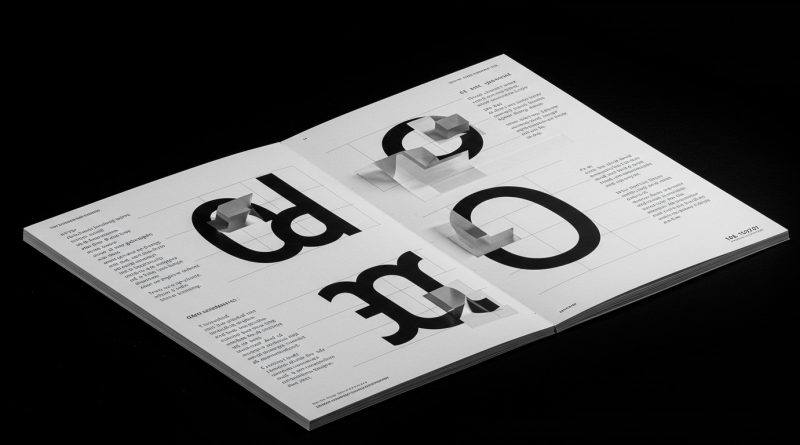
JHDD Typography Report — 2026.06.06
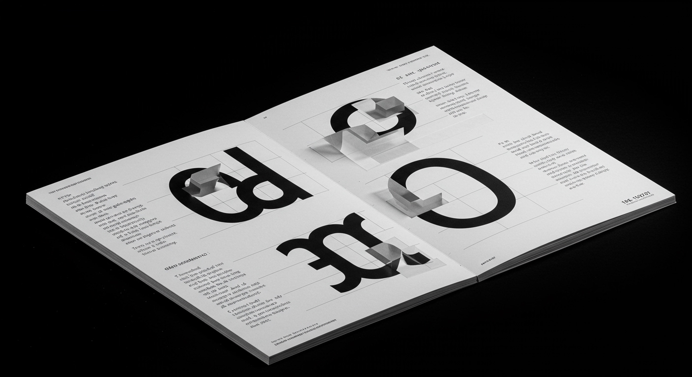
The resurgence of modular typography, stripped of its postmodernist embellishments, is signaling a return to rigorous system building, not mere aesthetic trend.
The pattern woven through recent design discourse—from the conceptual explorations of Alexandra Grant and the deliberate critique of established canons by Steven Heller to the functional re-articulation of brand identity by Collins for Olipop and the embrace of iterative process over polished finality by WDYMT—is the reassertion of foundational structural principles over ephemeral stylistic choices. This is not simply a swing of the pendulum towards clarity or a reaction against excessive decoration. Rather, it signifies a deeper, system-level recalibration in how we approach design’s core problem-solving capacity. The underlying force is what might be termed “Systemic Return”: a conscious, almost desperate, drive to re-establish robust, repeatable frameworks for creative output in an increasingly fragmented and visually saturated landscape. It’s about building the scaffolding before the facade, ensuring the blueprint can withstand the inevitable shifts in architectural fashion.
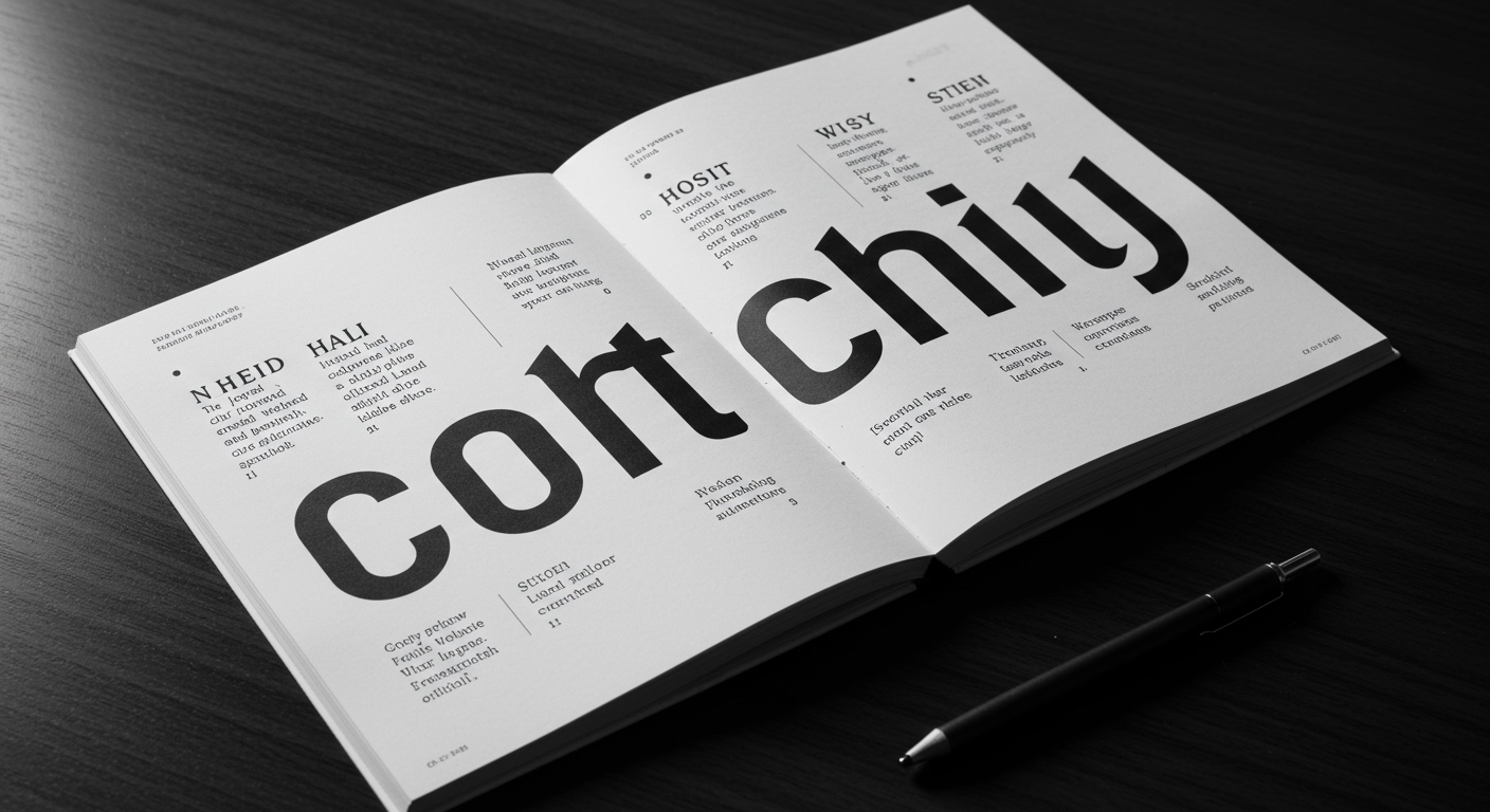
Beneath this broad systemic recalibration lies a specific tension within typographic practice. While many observe the ongoing digital migration of design as a quest for novelty and engagement, a seasoned eye sees it as a compelled migration back to rigorous grid systems and the fundamental principles of legibility. The common industry wisdom suggests that AI and generative tools will democratize design, leading to a more diverse, albeit potentially chaotic, visual output. This perspective, however, overlooks a crucial counter-current: the growing realization that true differentiation in a sea of algorithmically generated visuals will not come from superficial stylistic variations but from the deep, almost architectural, integrity of the underlying structure. Consider the work of COLLINS for Olipop. They didn’t just update the visual language; they rebuilt the brand’s perception through a carefully calibrated typographic system that prioritizes a clear, accessible message. The choice of a robust, slightly humanist sans-serif, paired with clear hierarchical structures, speaks volumes about prioritizing the act of communication over stylistic posturing. The “messy middle” WDYMT advocates for is not an excuse for sloppiness; it is an acknowledgment that the most potent ideas emerge from rigorous, iterative refinement of a well-defined system. This is a crucial distinction. The mainstream focus on generative AI producing novel forms risks conflating novelty with substance. The true innovation will be in the disciplined application of foundational typographic principles to these new tools, creating systems that are both novel and inherently legible. Therefore, this editor predicts that by late 2025, brands that successfully navigate this era will be those that champion typographically sound, systemically robust identities, even if their initial aesthetic appears more conservative than their AI-augmented competitors.
The friction in this Systemic Return is the persistent allure of conceptual letterforms and expressive typography as ends in themselves, divorced from their systemic function. Designers enamored with the performative aspects of glyph design, seeking unique, often illegible, statement pieces, are actively resisting the pull back towards legibility and structured grids. This tension reveals a fundamental schism: between design as expressive art and design as effective communication. The glorification of the idiosyncratic, the “perfectly imperfect,” as espoused by some interpretations of the “messy middle,” can inadvertently become an excuse to abandon the disciplined constraints that have historically underpinned legibility and lasting impact. The challenge lies in integrating conceptual depth with systemic integrity, ensuring that the avant-garde of letterform creation does not devolve into mere visual noise.
After reading this, a working Typography professional should dedicate significant time this week to auditing and, where necessary, rebuilding the grid systems underpinning their current projects. This means scrutinizing the foundational architecture of layouts, assessing the consistent application of spacing, alignment, and typographic hierarchy across all touchpoints. It’s about moving beyond micro-adjustments to the immediate visual elements and instead interrogating the underlying framework that dictates those elements’ relationships. This involves asking: Is the grid truly serving the content’s legibility and the brand’s clarity, or is it a relic of outdated aesthetic choices?
The triumph of systemic integrity over superficial novelty will redefine typographic excellence.
Curated References
About this editorial — This piece was developed using AI-assisted research and curation across multiple industry sources. All analysis, opinions, and predictions represent the editorial perspective of JHDD. Sources are linked in the references section above.