JHDD Typography Report — 2026.08.06
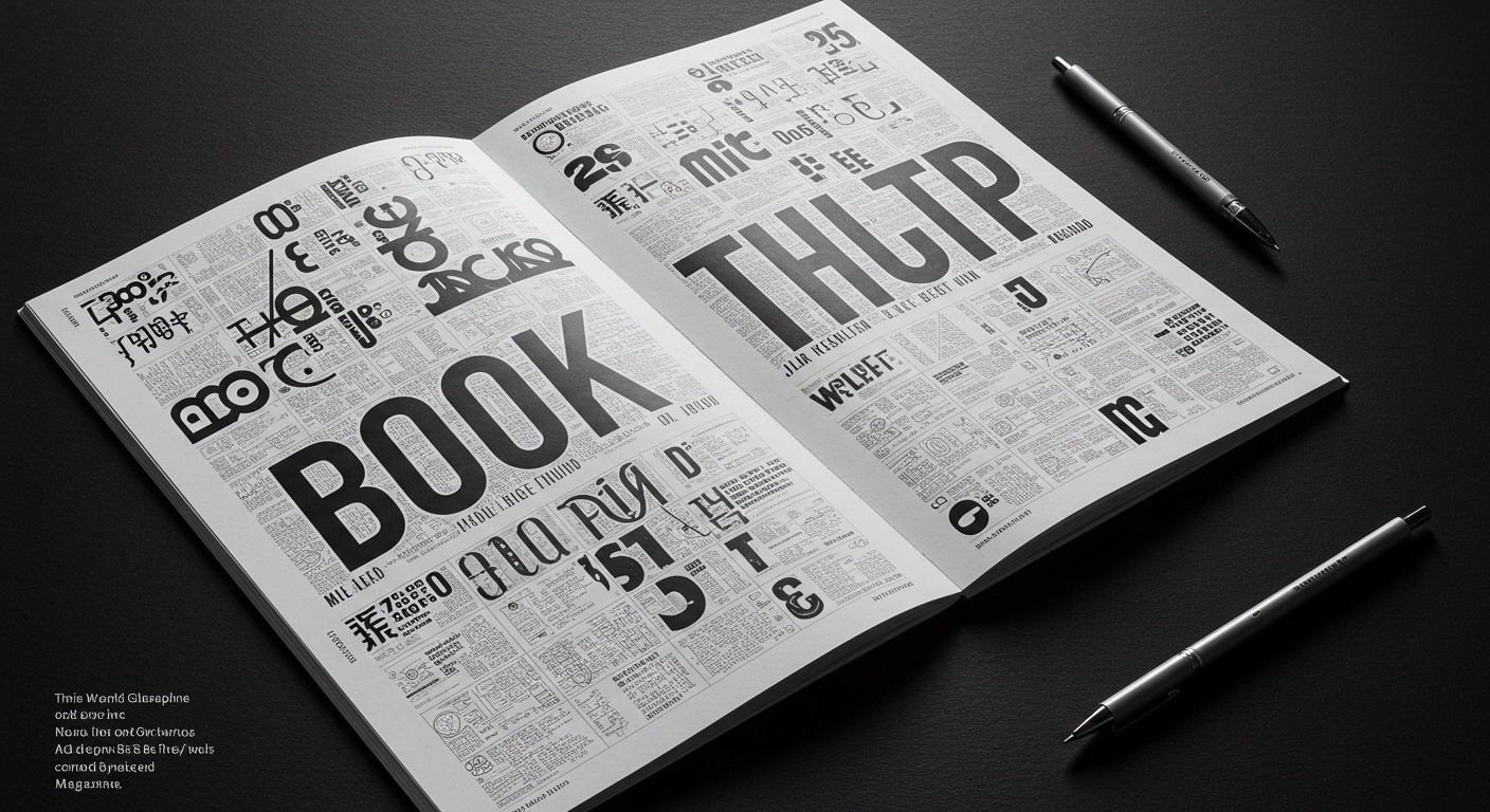
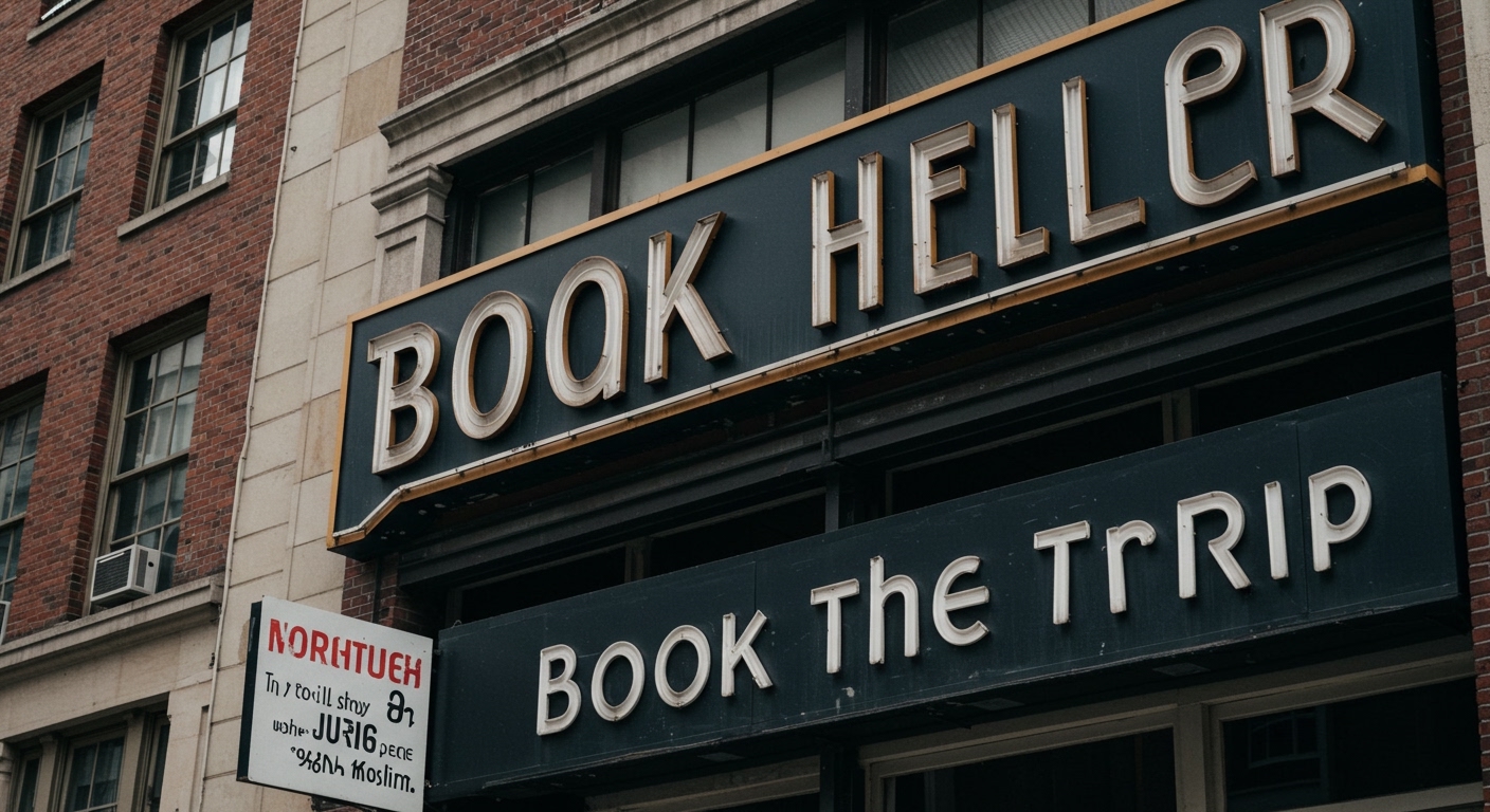
“Book the Trip,” a travelogue comprising 700 photographs of rare and one-of-a-kind letterforms, illustrates a persistent undercurrent in typographic practice.
This collection, alongside the design of Rosebriar by Laura Worthington Design, the community-focused work of Jayna Zweiman, the revival of Latin through cartoons, and Thonik’s emphasis on comprehensive client solutions, reveals a quiet but significant shift. Designers are increasingly moving beyond purely functional type towards forms that carry inherent cultural weight, historical resonance, or specific conceptual meaning. The utility of a letterform is expanding to encompass its capacity for narrative, connection, and embedded context, rather than resting solely on legibility in a generic sense.
The work of Thonik, particularly their sustained focus over thirty years on “the whole” of a client’s question and solution, provides a critical lens for this development. Many in the industry maintain that conceptual letterforms, those designed to convey specific ideas or emotions beyond their phonetic value, inherently compromise legibility and rigorous grid systems. This viewpoint suggests expressive type is a decorative layer applied after the structural work, often undermining clarity for fleeting style. Thonik’s long-standing practice contradicts this by demonstrating that the integrity of the “whole” emerges when conceptual intent guides the selection and application of letterforms from the outset. This means a typeface’s historical allusions or its subtle eccentricities, like those found in Rosebriar with its gothic ornamentation, become integral to the communicative strategy, rather than an afterthought. These choices are then integrated within a robust, yet flexible, grid that supports, rather than suppresses, their conceptual contribution. Their approach implies that the grid itself can be a conceptual framework, not merely a spatial organizer, guiding how meaning is constructed and perceived.
A truly integrated design, as advocated by Thonik, recognizes that micro-typography, legibility, and conceptual letterforms are not distinct elements to be balanced, but interdependent aspects of a coherent communicative system. This perspective suggests that granular adjustments to letter spacing, word spacing, and line height are not solely about aesthetic refinement or optical correctness, but about modulating the conceptual impact of text, guiding the reader’s pace and emphasis. For instance, subtle variations in tracking within a heading can alter its perceived weight and urgency, aligning with the core message rather than just filling space. This demands a deeper understanding of type history and the semiotics of form. By early 2028, successful studios will regularly implement adaptive typographic systems where the conceptual weight of content directly informs granular adjustments in spacing and form, allowing the grid to serve as an interpretive structure rather than a rigid cage. This will move beyond static style guides to dynamic typographic responses based on semantic and emotional context, ensuring legibility is a function of meaningful engagement.
The primary resistance to this integrated conceptual approach comes from the prevalent market demand for homogenized design outcomes driven by expediency and cost efficiency. The widespread reliance on templated design platforms, often with limited typographic controls, and the pervasive use of default fonts, which lack specific character or historical resonance, hinder deeper conceptual engagement. Furthermore, a professional culture that often prioritizes rapid deployment and client-driven revisions over meticulous, context-sensitive typographic craft, contributes to maintaining a status quo of functionally generic, rather than conceptually rich, letterform application. This economic and systemic pressure discourages the time and expertise required for nuanced micro-typographic decisions and the development of conceptual grid systems.
Typography professionals should, this week, select a body of text relevant to a current project and deliberately adjust its micro-typographic parameters. This includes experimenting with kerning to create a specific emotional tension between two letters, or subtly increasing word spacing in a key sentence to emphasize pauses and conceptual weight, rather than solely aiming for optical balance. These adjustments to letter spacing, word spacing, and baseline shift should be driven not for optical perfection alone, but to subtly amplify or redirect the conceptual meaning of specific words or phrases, observing how these micro-interventions alter the reader’s interpretation beyond simple readability. This involves treating each letterform, and the space around it, as an active participant in semantic construction and conceptual clarity within its grid.
TL;DR
Contemporary typography demands integrating cultural lineage and expressive details into structured systems to communicate more than just information.
Curated References
About this editorial — This piece was developed using AI-assisted research and curation across multiple industry sources. All analysis, opinions, and predictions represent the editorial perspective of JHDD. Sources are linked in the references section above.