JHDD Packaging Report — 2026.07.13
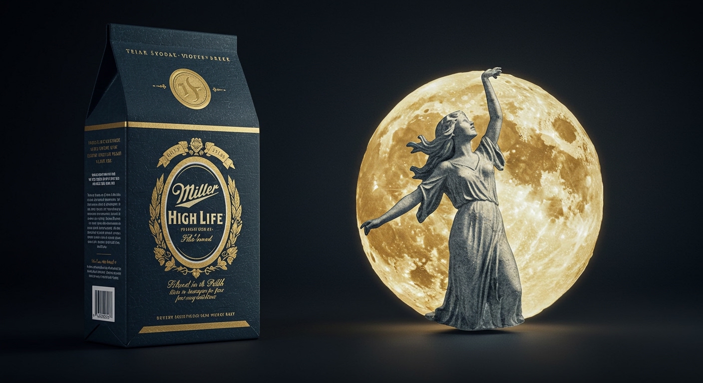
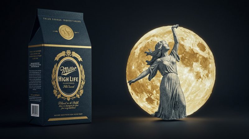
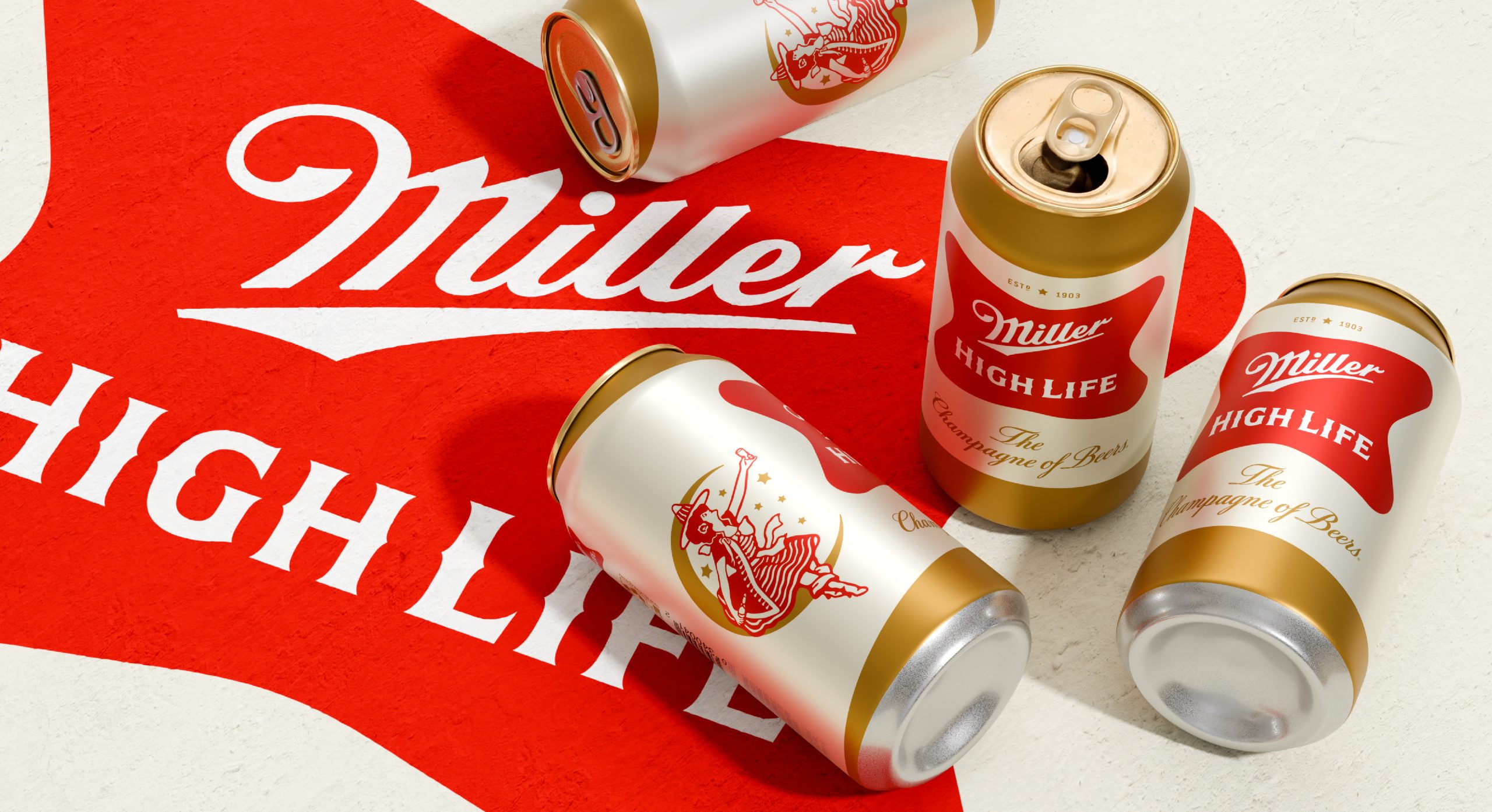
Soulsight’s refresh of Miller High Life focused on elevating the “Girl in the Moon,” a classic brand asset.
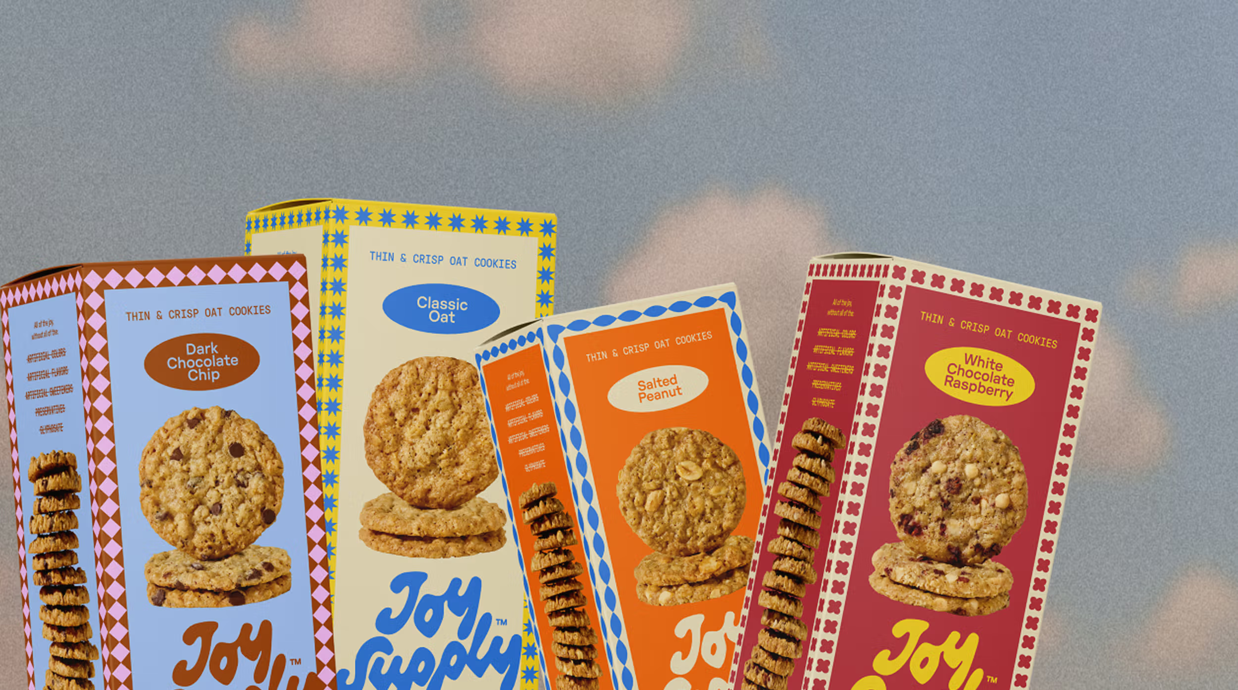
The recent wave of packaging redesigns, including Funner’s playground primaries and Joy Supply’s vintage borders, demonstrates a strategic shift toward highly specific, often nostalgic, visual and tactile branding cues. These efforts move beyond generic visual appeal to create deeply memorable identities that resonate with particular consumer segments. Rather than simply updating, these projects re-establish the brand’s tangible connection to its narrative through distinct sensory details and a clear commitment to shelf impact.
M/M Paris’s work for Funner, the haircare brand, illustrates this trend by trading typical salon shelf beige for playground primaries and wrapping each bottle in a single looping line. This approach challenges the mainstream industry’s often-stated belief that sustainable packaging, to be taken seriously, must adopt an austere or overtly “natural” aesthetic. While intentions for minimalist sustainable design are often good, this can lead to a sea of undifferentiated brown or muted-tone packaging that fails to captivate. Funner demonstrates that bold, characterful design can be inherently sustainable if it fosters product loyalty and reduces the perceived need for rapid product or packaging turnover. When a package is a desirable object, its lifecycle is inherently extended, even if only in the consumer’s mind, making it less likely to be immediately discarded.
The idea that tactile branding and strong identity are secondary to explicit “green” messaging on packaging misses the fundamental human connection to objects. Jake Nicolella’s design for Joy Supply, featuring a squiggly hand-drawn wordmark and display-worthy boxes, exemplifies how personality translates to shelf impact and a desirable unboxing experience. This distinctiveness discourages rapid consumer discard, fostering a deeper attachment. By mid-2028, packaging professionals will increasingly prioritize integrated sensory branding that elevates the object’s perceived value and longevity, understanding that this distinctiveness contributes more to overall sustainability than a purely material-centric approach alone.
The primary resistance to this approach comes from cost-cutting supply chain managers and brand owners who fear that specialized textures, intricate printing, or custom die-cuts add unnecessary expense and complexity to mass production. They often prioritize material reduction and cost per unit over the intangible benefits of a memorable tactile or unboxing experience, viewing such details as “premium” add-ons rather than essential brand differentiators. This mindset overlooks the long-term value created by emotional resonance and brand loyalty.
A working packaging professional should initiate a pilot project this week to integrate a unique tactile element – perhaps a debossed pattern, an unusual finish, or a custom structural fold – into an existing product line’s packaging. The goal should be to gather direct consumer feedback on the emotional response and perceived value generated by this sensory addition, rather than focusing solely on cost-efficiency metrics or explicit sustainability claims.
TL;DR
Packaging’s future lies in bold, tactile branding that creates lasting emotional connection and desirability, challenging minimalist sustainability norms.
Curated References

About this editorial — This piece was developed using AI-assisted research and curation across multiple industry sources. All analysis, opinions, and predictions represent the editorial perspective of JHDD. Sources are linked in the references section above.