JHDD Packaging Report — 2026.07.12
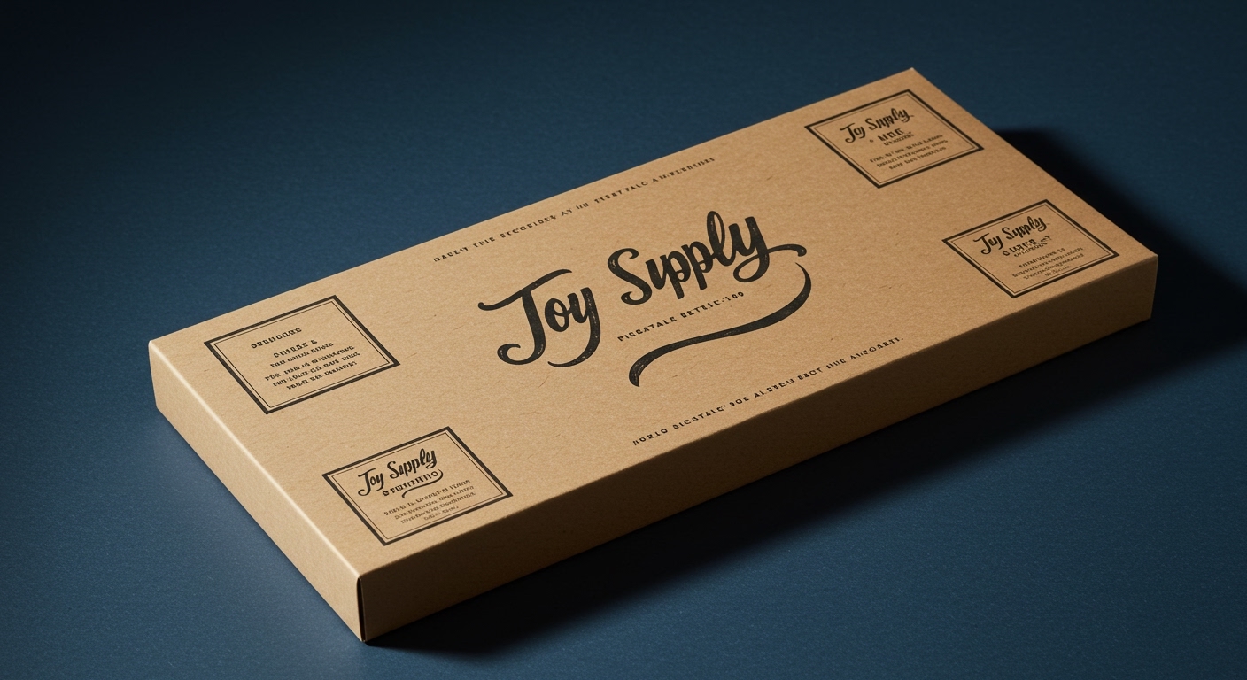
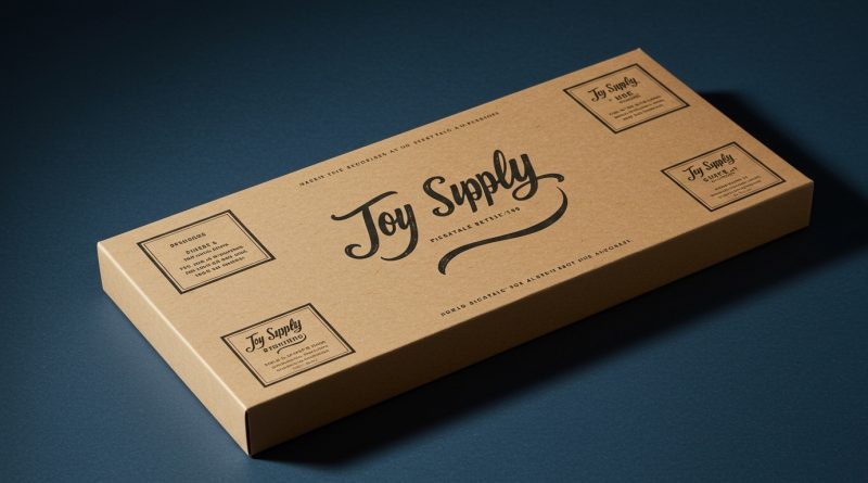
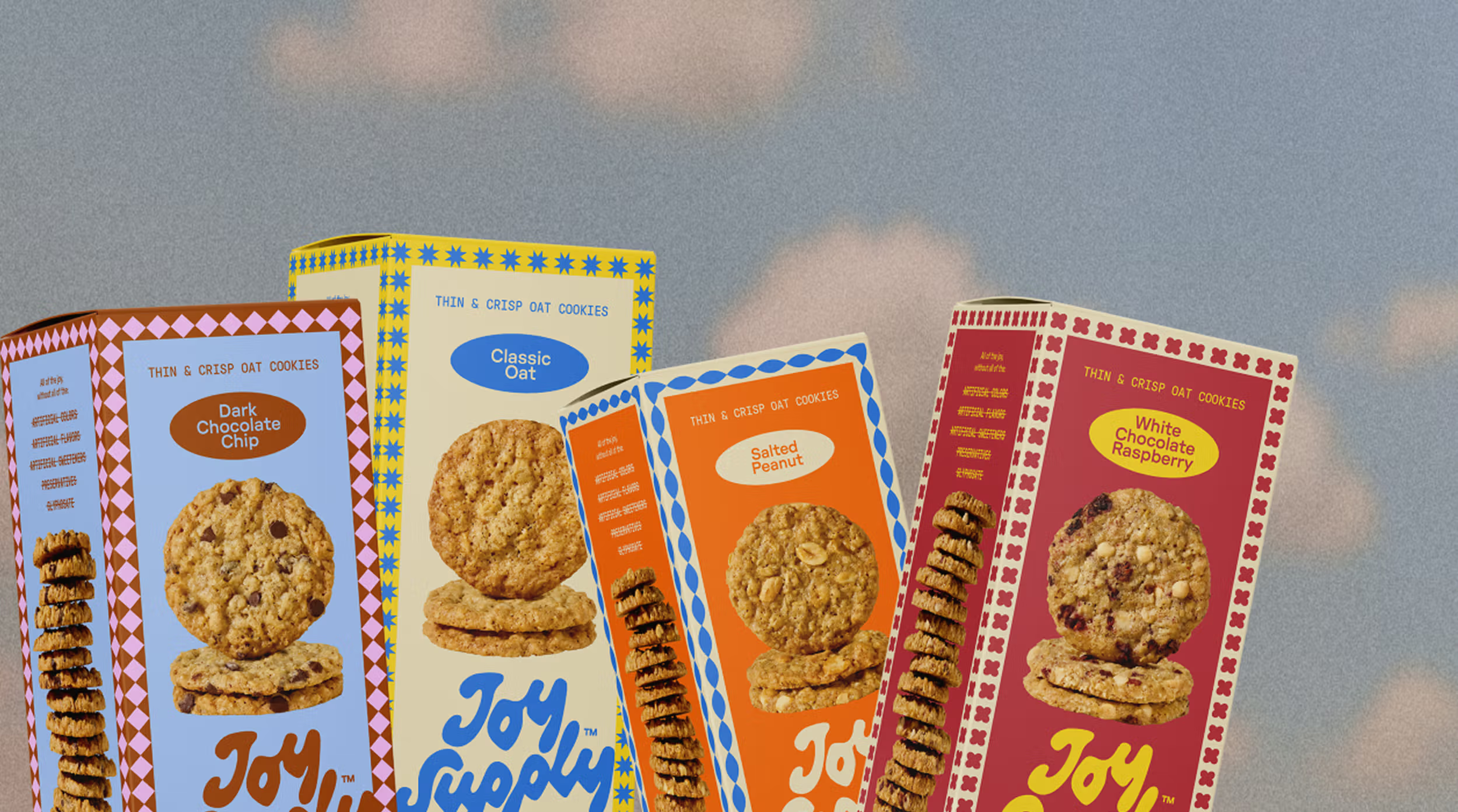
Jake Nicolella’s design for Joy Supply, featuring vintage inspired borders and a squiggly hand drawn wordmark, signals a shift in consumer engagement.
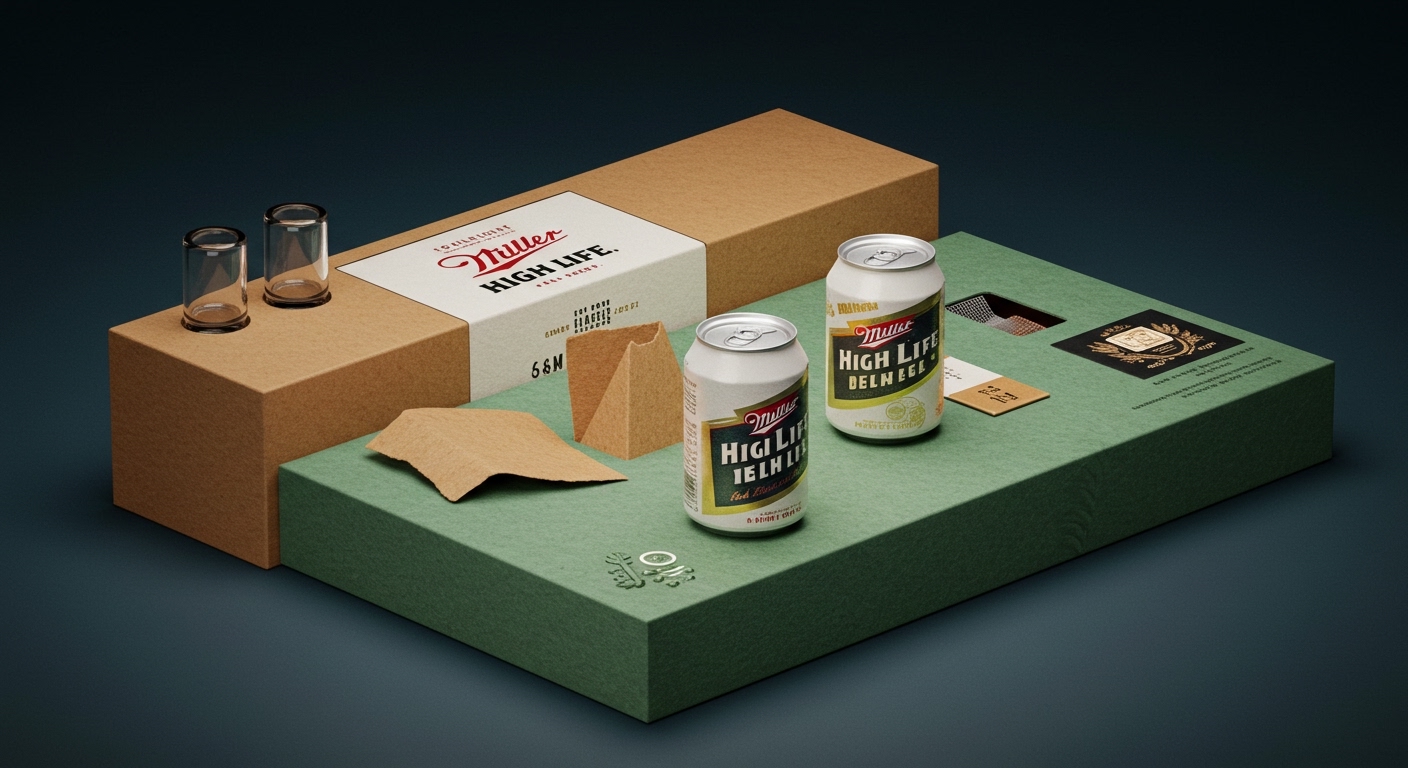
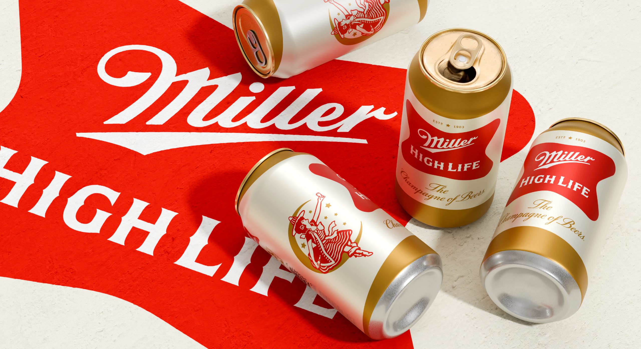
This design, alongside M/M Paris’s use of playground primaries for Funner and Soulsight’s elevation of the “Girl in the Moon” for Miller High Life, reveals a common strategy across diverse categories. Brands are increasingly investing in packaging aesthetics that evoke specific emotional responses: nostalgia, playfulness, or a sense of enduring heritage. This is not simply about standing out on a shelf; it is about embedding products with a perceived value that extends beyond their core function, fostering a connection designed to resist disposability.
Consider the Funner haircare brand, designed by M/M Paris. Its use of vibrant, almost childlike primary colors and a single looping line wrapping each bottle actively challenges the minimalist, often sterile aesthetic prevalent in premium beauty. Mainstream industry opinion often dictates that sustainable packaging prioritizes material science, focusing on recycled content percentages or ease of recycling. This approach, while crucial, often overlooks the emotional dimension of sustainability. A package designed to be visually appealing and tactilely engaging, like Funner’s bottles with their spinning logo reminiscent of a vinyl label, encourages a desire for retention and display, inherently extending the package’s perceived lifespan even after its contents are consumed. This contributes to sustainability by shifting consumer perception away from instant disposability.
This perspective suggests that emotional durability, cultivated through thoughtful tactile branding and evocative visual language, can be as impactful as material innovation. The goal is to design a package that the consumer wants to keep, reuse, or simply appreciate on their counter, as seen with Joy Supply’s playful boxes that are “worth displaying.” It is predicted that by late 2027, a measurable increase will occur in brand marketing campaigns specifically highlighting the secondary life or collectible nature of their packaging, emphasizing unique material textures and graphic treatments as central to product value.
This drive for emotional connection faces resistance from short-term marketing strategies, exemplified by the Heinz “Penalty Packets.” These condiment packages, intended to engage with a World Cup campaign, highlight the pitfalls of design overly reliant on ephemeral external events. Such approaches, driven by immediate promotional impact, often lack the deeper brand equity and lasting consumer appeal that emotionally durable packaging provides, risking rapid irrelevance or unintended negative associations when external contexts shift.
A packaging professional should immediately initiate a ‘display-worthiness’ audit for their current product lines. This audit requires evaluating existing packaging for attributes that encourage consumers to keep it on display or find secondary uses for it. Consider material tactility, graphic appeal, color palette, and structural integrity beyond initial product use. Identify opportunities for minor design adjustments that could foster this kind of sustained engagement, rather than solely focusing on end-of-life recycling metrics.
TL;DR
Packaging design that prioritizes emotional connection and longevity through distinctive tactile and visual elements offers a deeper route to sustainability than material changes alone.
Curated References

About this editorial — This piece was developed using AI-assisted research and curation across multiple industry sources. All analysis, opinions, and predictions represent the editorial perspective of JHDD. Sources are linked in the references section above.