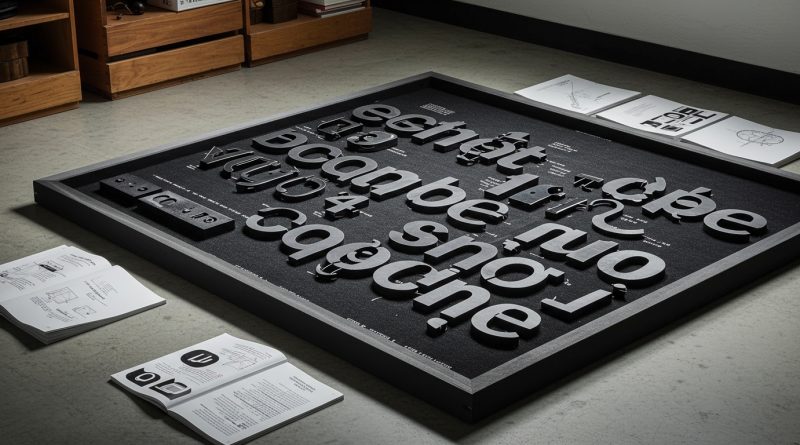
JHDD Typography Report — 2026.07.12
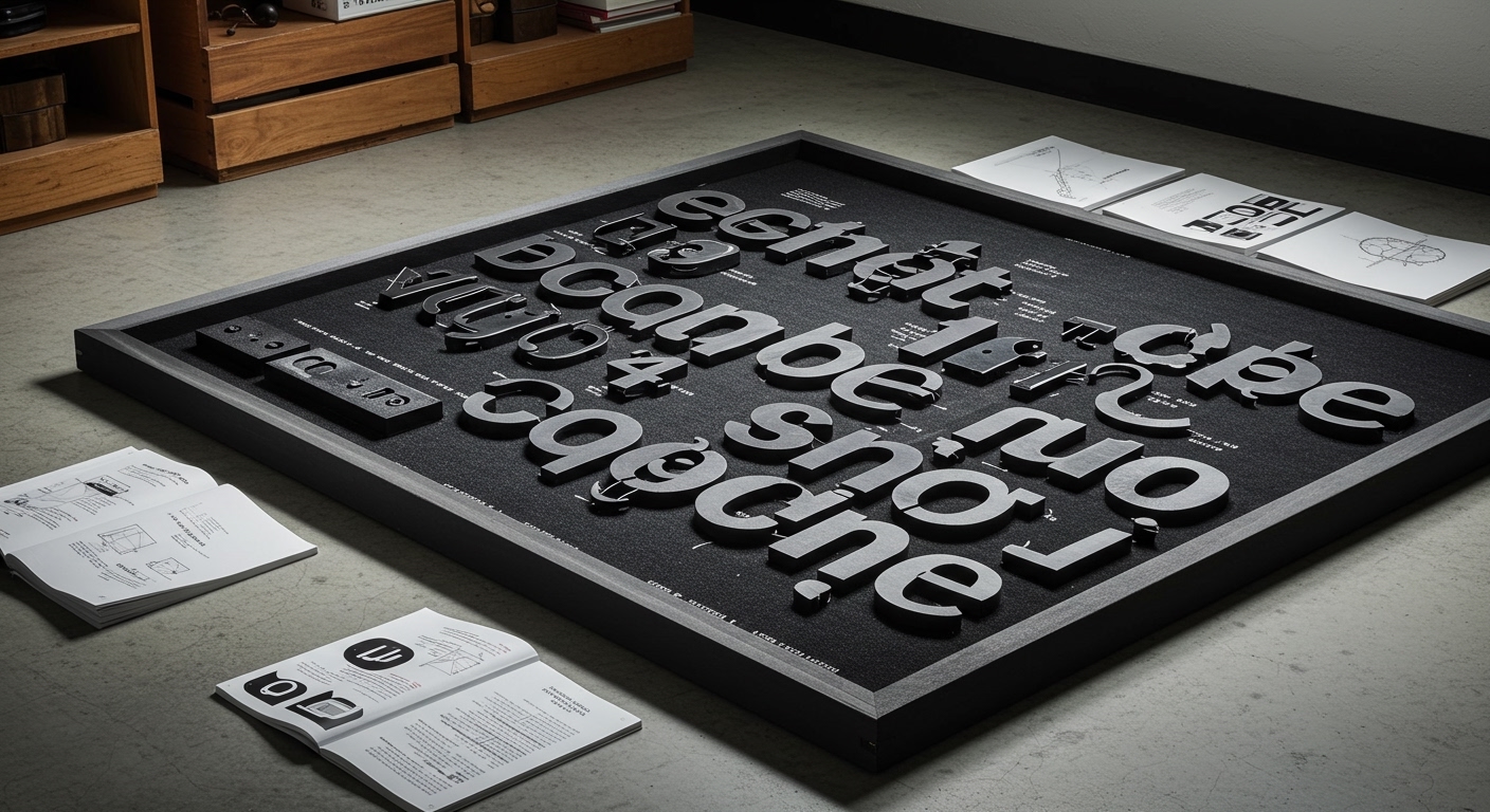
Six Cinquième unearthed a piece of history hidden in the literal fabric of 1001 Colors’ new headquarters, a specific act that reshapes the arts nonprofit’s identity.
This singular example illuminates a broader, often unacknowledged tension across diverse design contexts: the constant negotiation between universal clarity and specific, embedded meaning. Whether observing the shared aesthetic principles of Yugoslav socialism and American corporate design in the 1950s and 60s, Susan Milligan’s critique of isolating architecture, or PRINT Magazine’s commitment to human-made journalism, the underlying challenge is how established systems and legibility standards either foster or hinder conceptual depth. The pattern reveals that seemingly disparate design decisions, from typeface choice to urban planning, frequently resolve in one of two ways: towards a highly generalized, functional legibility, or towards a bespoke, culturally anchored conceptual expression that risks broader accessibility.
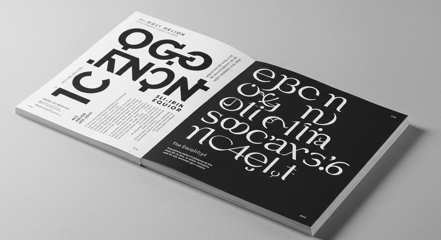
The work by Six Cinquième for 1001 Colors provides a compelling case study for this dynamic. Their approach to “scribbling a new future” by integrating historical architectural details into a scalable national identity suggests that conceptual letterforms and bespoke typographic elements are not inherently at odds with systematic legibility or grid structures. Mainstream industry opinion often champions bold, entirely novel display typography as the primary means of conveying conceptual branding. This perspective frequently prioritizes visual distinctiveness above all, sometimes inadvertently reducing legibility in the pursuit of unique aesthetics. However, a more nuanced view asserts that true typographic innovation now resides in the subtle, intelligent application of micro-typography within otherwise legible and robust grid systems. The conceptual weight is borne not by outright distortion of letterforms, but by their precise placement, spacing, and interaction, drawing from a deep understanding of context and history. This approach creates designs that are simultaneously accessible and rich with layered meaning, avoiding the superficiality of purely decorative conceptual type. By mid-2028, professional typography will increasingly differentiate itself not through novel typefaces alone, but through highly specialized, context-aware micro-typographical adjustments and adaptive grid systems that allow a single core typeface to express nuanced conceptual intent across diverse digital and print applications.
The primary opposing force to this refined approach is the pervasive pressure for expedient, mass-producible content. This pressure often manifests as a reliance on template-driven designs and automated layouts that strip away the potential for micro-typographic nuance. Similar to Susan Milligan’s observation of fear-driven architecture creating “fortresses” that isolate, an overly rigid adherence to default grid systems and standardized typographic settings can construct visual fortresses around content, hindering emotional connection and conceptual resonance. This expediency frequently prioritizes rapid deployment over the meticulous craft required for truly effective integration of conceptual depth within a legible framework.
A working typography professional should focus this week on a detailed audit of their current projects, specifically analyzing the micro-typographic decisions within body copy and short text blocks. Rather than immediately reaching for a new display typeface to convey a mood, they should experiment with adjusting character spacing, word spacing, and line leading for existing, highly legible text typefaces. Even a seemingly minor adjustment of two units in kerning or one point in leading can profoundly alter the perceived tone and reading rhythm, demonstrating how conceptual intent can be embedded subtly without sacrificing core legibility or disrupting an established grid system.
TL;DR
Effective typography integrates conceptual depth through micro-adjustments within legible systems, rather than relying solely on overt stylistic novelty.
Curated References
About this editorial — This piece was developed using AI-assisted research and curation across multiple industry sources. All analysis, opinions, and predictions represent the editorial perspective of JHDD. Sources are linked in the references section above.