
JHDD Typography Report — 2026.07.11
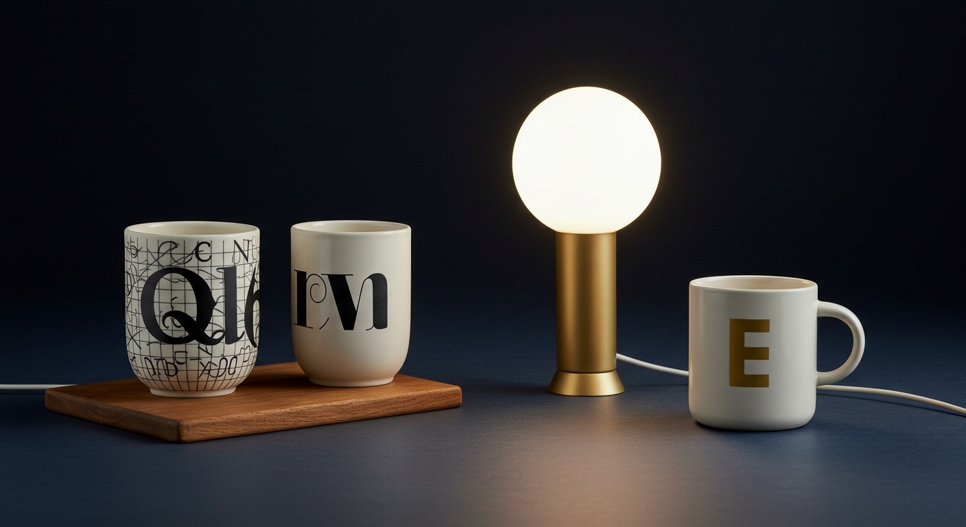
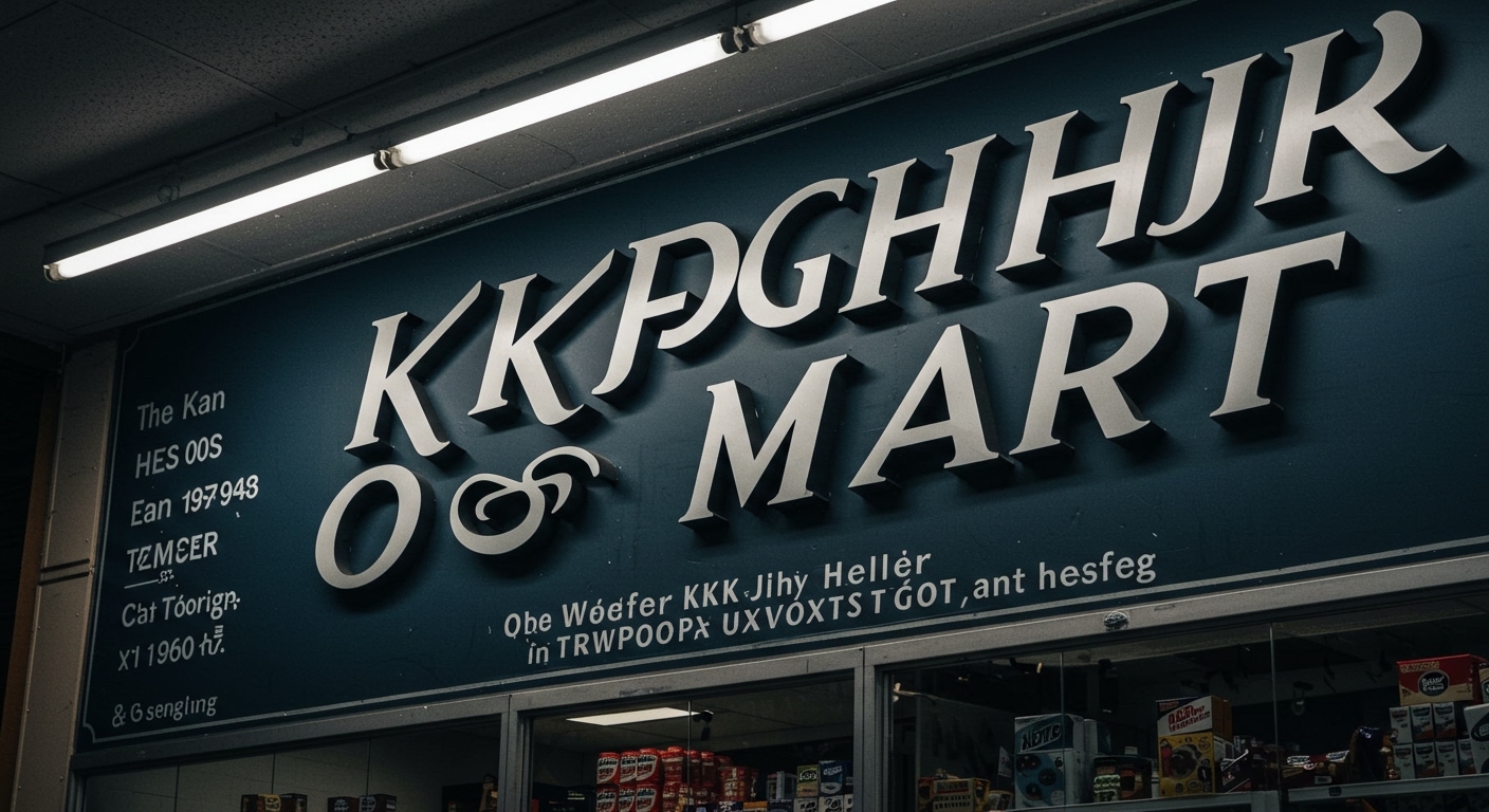
Kate Schroeder crafts unique mugs and light fixtures, drawing inspiration from carefully observed scenes in the home and midcentury modern aesthetics. This intentional construction of a distinct aesthetic world, where form communicates more than function, reveals a persistent, under-acknowledged pattern across varied design contexts. The articles, from an analysis of KKK Mart’s implied brand identity to the discussion of hair branding without hair, consistently highlight how formal visual decisions, including those pertaining to type, are always establishing a relationship or identity, irrespective of explicit content. Designers inherently shape perception and trust through visual systems.
The observation that Yugoslav socialism in the 1950s and 60s shared visual similarities with American corporate design of the same era, as noted in The Daily Heller, offers a crucial case study. Both systems, despite profound ideological differences, converged on certain clean grid systems and modernist typographic principles. This convergence, driven by a pursuit of efficiency and perceived modernity, illustrates how generic adherence to “good design” principles, often framed as universally legible and neutral, can paradoxically dilute distinct identity. When designers prioritize a generalized standard of legibility above all else, the opportunity for conceptual letterforms and micro-typographic nuance to convey specific cultural, ideological, or brand-specific meaning is often lost.
A view that contradicts mainstream industry opinion suggests that an unwavering focus on objective legibility often oversimplifies typography’s communicative power. While readability is fundamental, assuming that maximal legibility is always the primary goal for all communication overlooks typography’s capacity to build trust and convey specific values through subtle formal cues. For instance, the discussions at the Sustainable Brands Conference 2026 underscore the growing need for brands to signal authenticity and ethical commitment. This goes beyond mere textual claims; it requires design systems, including typography, to embody these values. By mid-2027, brand typefaces will incorporate intentional, subtle deviations in micro-typographic details or letterform constructions that, while not strictly optimizing for rapid scanning, communicate artisanal quality, unique heritage, or principled commitment. These details will become crucial signifiers of brand ethos.
The primary opposing force to this nuanced approach is the pervasive demand for quantifiable readability metrics and instant information consumption, particularly in digital interfaces. This pressure often compels designers towards homogenized typographic solutions that prioritize broad, effortless scannability over the deeper, more complex signals that conceptual letterforms or refined micro-typography can convey. The emphasis on speed and universal access, while valid in certain contexts, can flatten the typographic landscape, discouraging the very expressive and trust-building qualities that differentiate brands and messages.
A working typography professional should, this week, critically evaluate their current projects by asking: “Beyond the words themselves, what non-semantic message is this typographic choice conveying about the sender, and what relationship is it establishing with the reader?” This means scrutinizing kerning pairs for unintended tension, assessing grid systems for inherent flexibility or rigidity, and examining letterform constructions for subtle historical echoes or conceptual implications, ensuring that these formal elements actively reinforce the intended communication rather than merely presenting information.
TL;DR
Typography communicates identity and builds relationships through subtle formal choices that extend beyond the mere readability of words.
Curated References
About this editorial — This piece was developed using AI-assisted research and curation across multiple industry sources. All analysis, opinions, and predictions represent the editorial perspective of JHDD. Sources are linked in the references section above.