JHDD Typography Report — 2026.07.05
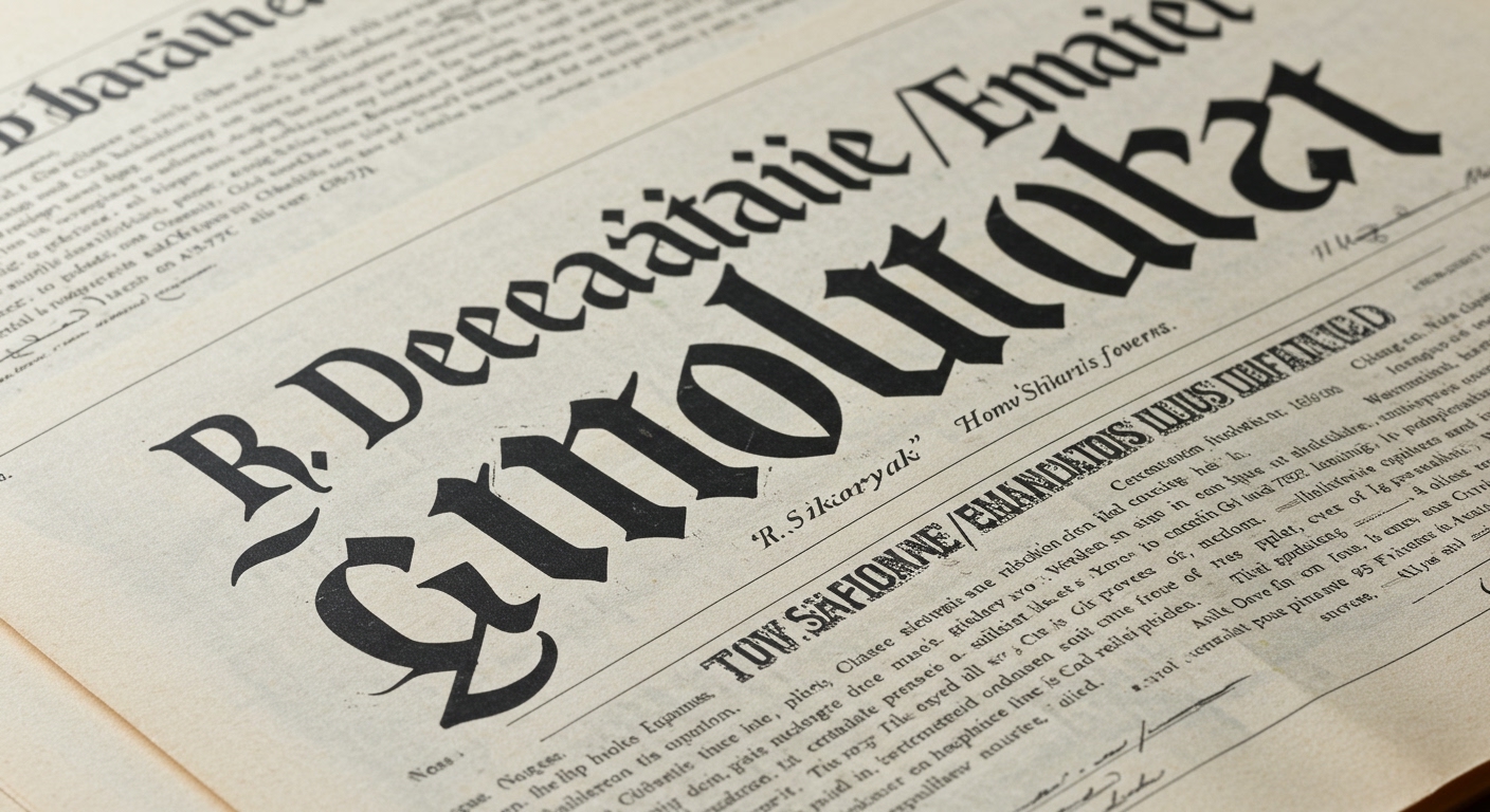
R. Sikoryak’s ‘Declaration / Emancipation Illustrated’ re-engineers America’s founding documents into a comics blend, directly challenging traditional forms of textual engagement.
The recent reports from PRINT Magazine and The Daily Heller reveal a specific, unarticulated pattern: a pervasive inclination to re-contextualize historical narratives, figures, and design movements through contemporary interpretive frameworks. Whether through comparing Washington’s Crossing with modern art responses, mashing Maimonides with the Grateful Dead, or translating civic documents into graphic novel formats, the emphasis is on dynamic reinterpretation rather than static preservation. This suggests a broader industry shift where historical content is viewed as raw material for new visual and conceptual meaning-making.
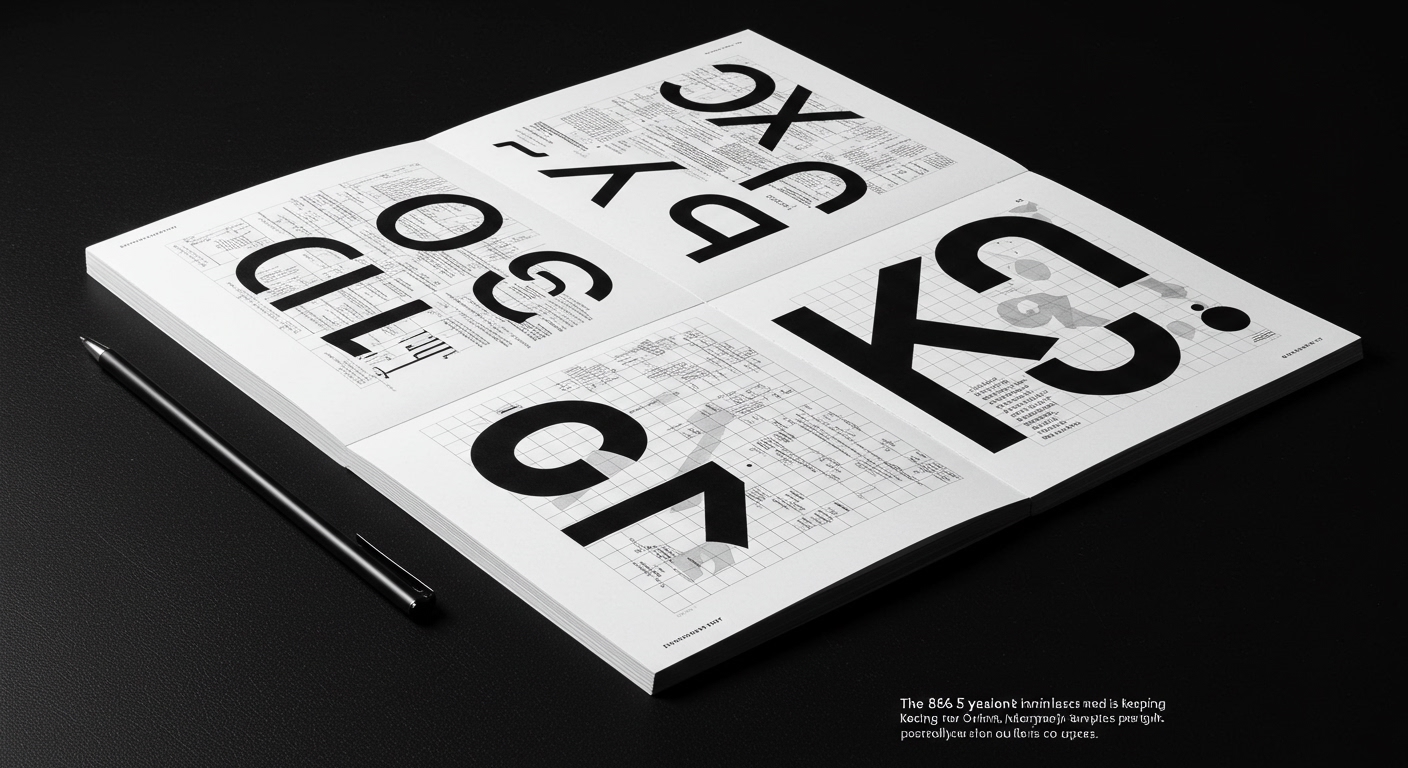
The work of R. Sikoryak in ‘Declaration / Emancipation Illustrated’ serves as a critical case study in this trend, particularly concerning legibility and grid systems. His use of a “comics blend” is not merely an artistic choice; it is a sophisticated application of a non-linear grid system that manipulates reading flow and information hierarchy. This approach deconstructs the conventional, single-column text block, replacing it with a modular, sequential grid that demands a different mode of engagement from the reader. Mainstream industry opinion frequently posits that optimal legibility primarily relies on standardized typographic conventions and consistent grid adherence to facilitate rapid, unimpeded reading. However, Sikoryak’s method contradicts this by demonstrating that by deliberately disrupting traditional linear legibility, a designer can compel deeper, more reflective interaction with the text’s conceptual content. The deliberate micro-typographic choices within speech bubbles, captions, and panel layouts become integral to interpreting the historical weight and emotional nuance of the source material. This method moves beyond simply “making text readable” to “making text felt and understood on multiple levels.”
This type of conceptual grid manipulation and textual reinterpretation is poised for wider adoption. By mid-2029, a significant percentage of civic and educational institutions will begin experimenting with dynamic, multi-layered digital presentations of historical and legislative documents, moving away from flat, static PDFs towards interactive, conceptually gridded interfaces that draw directly from graphic novel and multimedia design principles.
This interpretive momentum faces resistance from entrenched systems and expectations. The most significant opposing force stems from the default settings of popular enterprise content management systems and the prevailing corporate demand for “universal” accessibility standards that often default to simplistic, unchallenging typographic presentations. These systems prioritize ease of implementation and machine readability over the nuanced, conceptually driven legibility that reinterpretation requires, effectively flattening complex information into homogeneous visual forms.
A working typography professional should, this week, select a public domain historical document, such as a lesser-known proclamation or a section of an outdated scientific paper. Apply a grid system derived directly from comic book panel layouts or architectural blueprints to this text, explicitly breaking from standard editorial grids. Focus on how the new grid influences the micro-typographic choices for each line and word, aiming to alter the reader’s pace, emphasis, and emotional connection to the content, rather than merely enhancing reading speed.
TL;DR
Contemporary typography reinterprets historical content through novel grid systems and conceptual letterforms to enhance engagement.
Curated References
About this editorial — This piece was developed using AI-assisted research and curation across multiple industry sources. All analysis, opinions, and predictions represent the editorial perspective of JHDD. Sources are linked in the references section above.