JHDD Typography Report — 2026.07.03
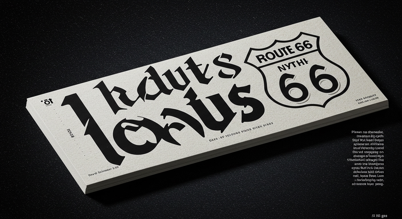
The USPS Route 66 stamp collection, featuring images by David Schwartz, highlights a recurring tension between broad design themes and specific cultural details.
Across discussions of inter-war industrial modernism, socialist design aesthetics, and the evolving role of artificial intelligence, a subtle but distinct shift is occurring. The industry is moving away from a preoccupation with universal legibility and towards a re-appraisal of contextual semantic depth in typography. The conversation at iF Design Berlin, for instance, focuses less on AI replacing designers and more on what fundamental human design values persist. This marks a pivot from scalable efficiency to granular interpretive nuance.
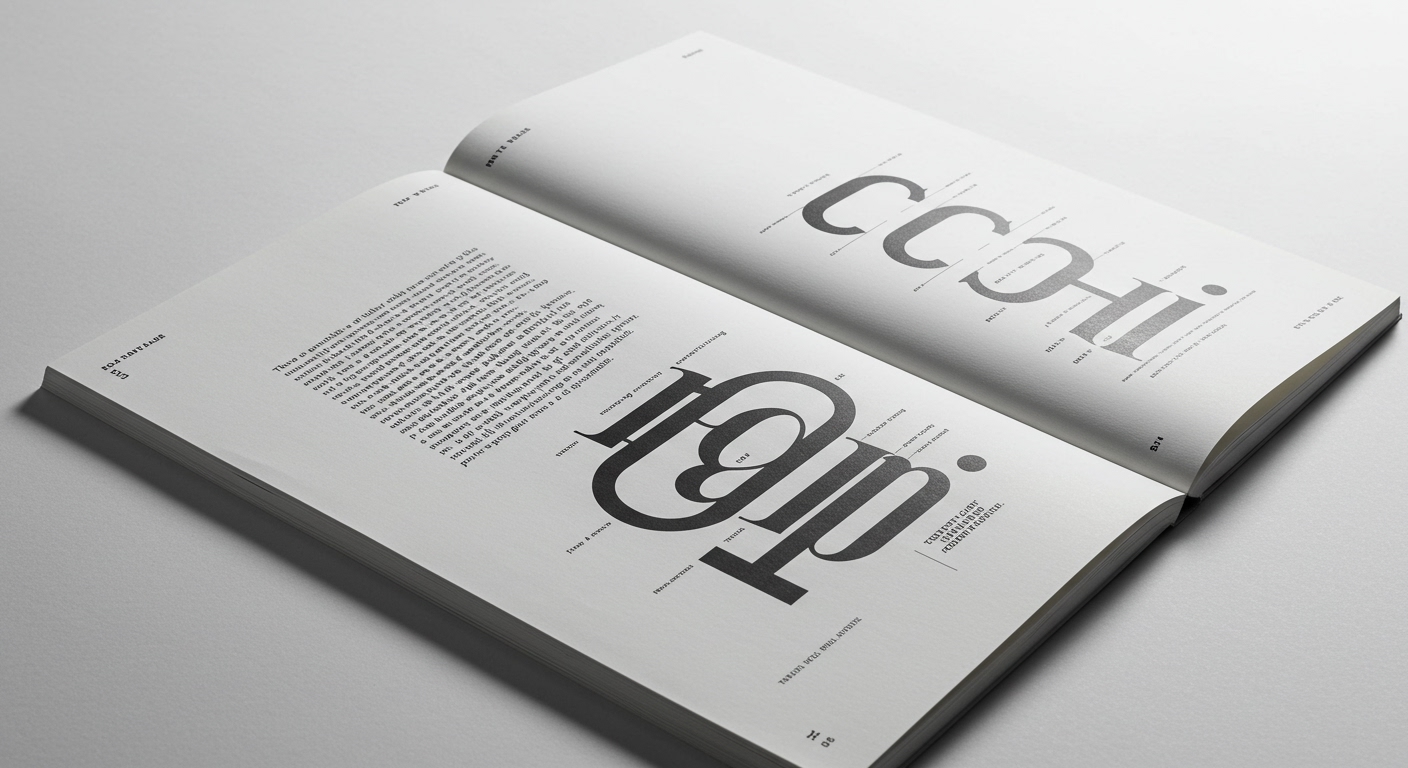
The exhibition ‘The Lost Tribe of Alphabet City,’ blending humor, nostalgia, and pop culture, exemplifies this re-evaluation. While many contemporary practitioners prioritize optimizing type for screen readability and cross-platform consistency, the commercial mainstream often overlooks the conceptual potency of deliberately idiosyncratic letterforms. The prevalent industry belief emphasizes a default-neutral legibility, aiming for maximum unimpeded comprehension across diverse audiences. This view, however, mistakenly conflates legibility with immediate transparency. True legibility, particularly in complex communication, often benefits from forms that reward engagement and invite interpretation, rather than merely facilitating rapid scanning. The forms in ‘Alphabet City’ are not universally legible in the conventional sense, yet their cultural resonance makes them profoundly readable to their intended audience. This demonstrates that legibility is not a universal constant, but a context-dependent achievement, often enhanced by forms that actively participate in meaning-making.
This re-examination extends to micro-typography and grid systems. Industrial modernism, as explored in ‘Modern Design Across Borders’, established principles of functional clarity often expressed through strict grid systems. These systems provided an architectural backbone for legibility and order. However, future AI tools, while proficient at generating and iterating on grid structures and common letterforms, will struggle to synthesize the subtle, culturally embedded cues that define true conceptual typography. Designers employing AI primarily for speed in generic layout tasks will find their output indistinguishable. Conversely, those who leverage AI as a tool to explore the boundaries of legibility—pushing against generic forms to create bespoke micro-typographic expressions with cultural specificity—will redefine their value. By late 2027, the industry will begin to see a clear divergence: design outputs that prioritize generic legibility will be heavily commoditized by AI, while highly contextualized, conceptually rich letterforms and subtly broken grid systems will command premium value, reflecting their resistance to automated replication.
The primary opposing force to this shift remains the persistent market demand for instantaneous, universally accessible content. Corporate design, whether American or Yugoslav in the ’50s and ’60s, often converged on forms that prioritized broad legibility and clear messaging over regional idiosyncrasies. This historical precedent, coupled with current metrics-driven content consumption models, pressures designers to revert to standardized, easily digestible typography. The perceived risk of alienating a broad audience with nuanced or challenging letterforms often overrides the potential for deeper engagement.
Working typography professionals should this week conduct a micro-typographic audit of a current project, specifically evaluating how tracking, kerning, and line-height deviations can introduce subtle semantic cues beyond standard legibility rules. The exercise should focus on how these alterations, even minute ones, can enhance the character and intent of the text for its specific audience, rather than just optimizing for default screen readability. This involves actively interrogating the ‘default’ settings and making deliberate, concept-driven choices at the micro-level, even if they appear unconventional.
TL;DR
The future of typography values contextual semantic depth and nuanced micro-expressions over generic, universally legible forms, challenging the assumption that legibility means transparency.
Curated References
About this editorial — This piece was developed using AI-assisted research and curation across multiple industry sources. All analysis, opinions, and predictions represent the editorial perspective of JHDD. Sources are linked in the references section above.