JHDD Packaging Report — 2026.07.03
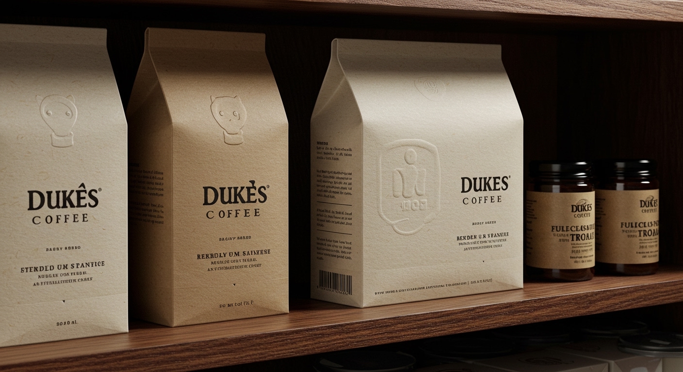
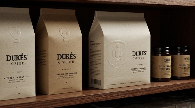
Dukes Coffee, redesigned by SODAA, features a subtle, blind debossed wordmark, an element easily overlooked in a cursory glance.
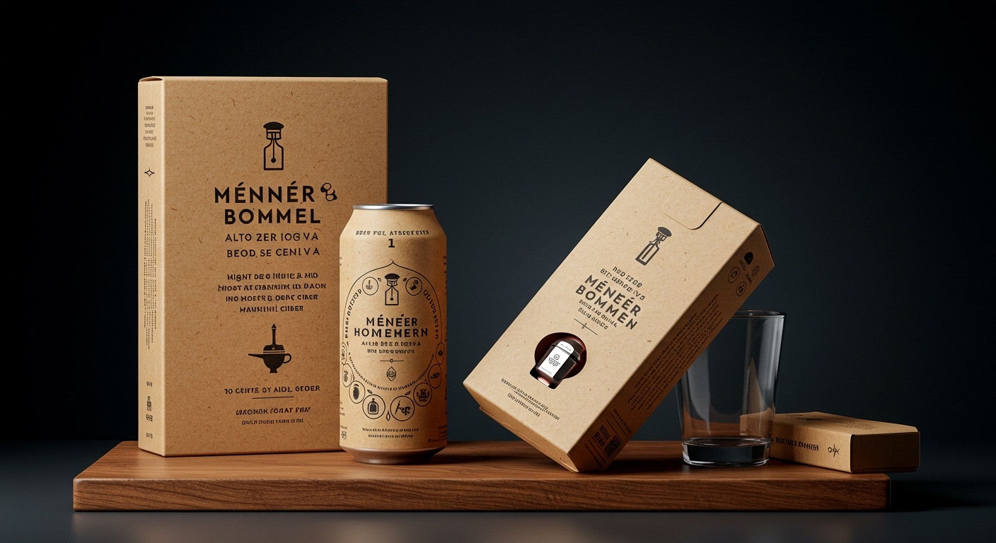
This subtle detail, alongside the distinctive approaches seen in Meneer Bommel’s hand-lettered charm and Unbridled Spirit’s sculptural form, reveals a growing pattern in packaging design. Brands are now actively subverting established category codes not with overt visual disruption, but through a calculated recalibration of sensory engagement. The focus is shifting from merely standing out to creating a memorable, embodied experience that challenges predefined consumer expectations of a product’s tactile and visual identity.
SODAA’s design for Dukes Coffee exemplifies this by choosing restraint in a market often characterized by maximalist “loud” packaging. This approach directly contradicts the mainstream industry opinion that prominent shelf impact relies solely on bright colors, large logos, or overt graphical statements. Instead, the blind debossed wordmark offers a quiet sophistication, inviting closer inspection and creating a sense of understated luxury. This tactile detail leverages the physical properties of the substrate to communicate premium quality, fostering a deeper, more intimate connection with the consumer that bypasses typical visual noise. This considered choice of material interaction also subtly aligns with sustainable principles; focusing on intrinsic material quality and texture reduces reliance on heavy inks or complex multi-material finishes, promoting a more singular, valued packaging component.
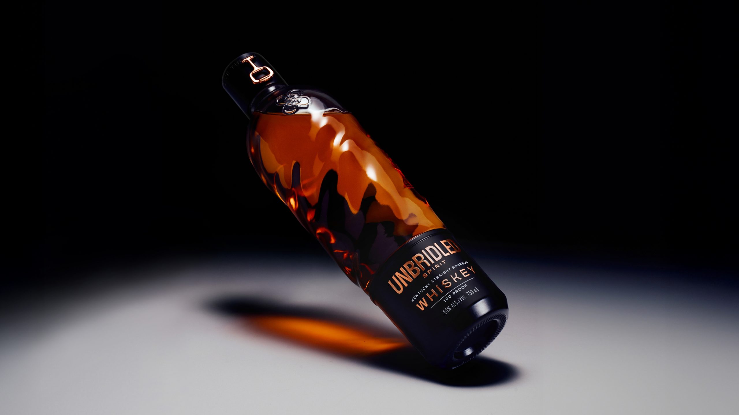
Similarly, Holy Studio’s Unbridled Spirit bourbon defies traditional distillery aesthetics with its sculptural glass bottle, rose gold snaffle bit hardware, and matte black label. This combination suggests a fashion house influence, completely resetting expectations for a bourbon unboxing experience. The integration of high-end tactile materials and unexpected structural elements transforms a simple product opening into a multi-sensory narrative. The use of a sculptural glass bottle, for instance, implies durability and potential for reuse, suggesting a more considered approach to material life cycle. This shift towards designing for a complete tactile and visual unboxing journey, beyond just the outer carton, will become a widespread expectation. By mid-2028, consumers will increasingly seek out products offering such deliberate sensory depth across mainstream categories, pushing brands to invest in material finishes and structural designs as core brand identifiers, often favoring materials with inherent sensory appeal and perceived longevity.
The primary resistance to embracing such nuanced, sensory-driven design strategies comes from internal stakeholder priorities. Procurement departments often default to cost-optimized material specifications, favoring readily available or volume-discounted options over unique tactile finishes or custom structural elements. Simultaneously, some marketing teams may prioritize easily measurable, immediate visual impact or a clear “disruptive” visual signal for campaigns, overlooking the longer-term brand equity built through sophisticated sensory engagement and material storytelling.
A packaging professional seeking to differentiate products should immediately conduct a “sensory audit” of their competitive landscape. This involves physically handling competitor products, assessing not only their visual characteristics but also their weight, texture, sound upon opening, and the interaction with any specific material finishes. Following this, the professional should identify one specific tactile or material element that could deliberately counter a pervasive category norm, and then propose a pilot project to explore its feasibility, focusing on the unique sensory experience it delivers rather than solely its aesthetic appeal.
TL;DR
Successful contemporary packaging increasingly redefines category presence through refined tactile experiences and sensory subversion, challenging purely visual impact strategies.
Curated References


About this editorial — This piece was developed using AI-assisted research and curation across multiple industry sources. All analysis, opinions, and predictions represent the editorial perspective of JHDD. Sources are linked in the references section above.