JHDD Typography Report — 2026.07.02
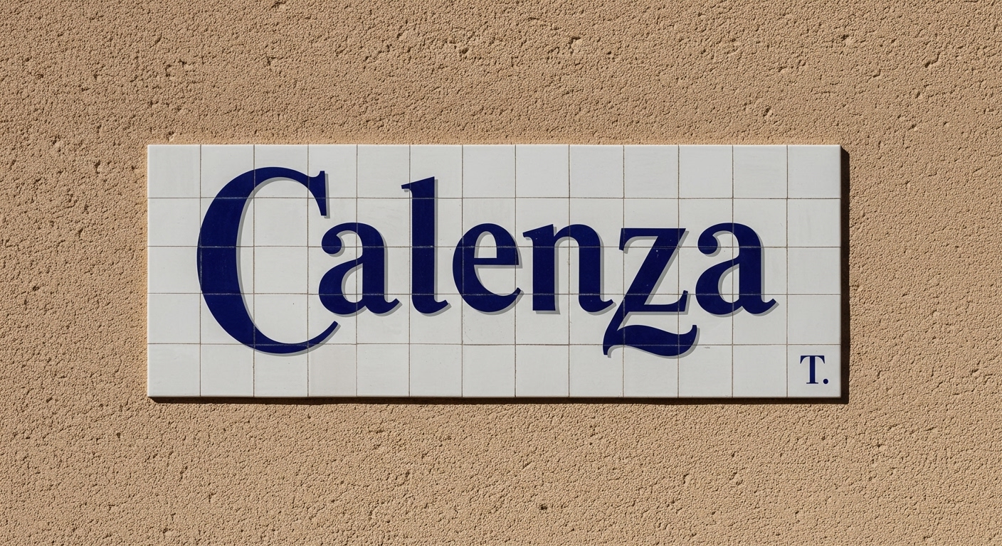
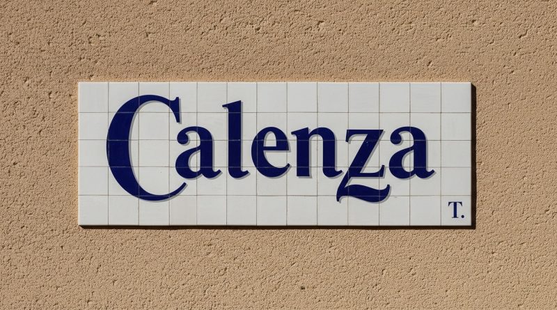
Calenza transforms the vernacular lettering of Valencia’s iconic ceramic street signs into a contemporary type family. This project exemplifies a deeper, less obvious pattern within recent design discourse: the systematic re-evaluation of historical, vernacular, and often overlooked typographic artifacts as robust sources for contemporary design intelligence. The individual narratives — from the cultural specificity of Alphabet City’s visual heritage to the surprising parallels in Yugoslav socialist design and American corporate graphics — converge on a critical examination of how design principles, particularly those related to letterforms and underlying grids, manifest in diverse, non-canonical contexts. This extends beyond mere inspiration; it is about reverse-engineering the inherent logic of these forms.
The Calenza project serves as a clear case study. It began with the direct observation of public signage in Valencia, specifically ceramic street signs that developed their unique letterforms and spatial arrangements under local conditions and material constraints. Translating these idiosyncratic forms into a comprehensive type family necessitates an acute focus on micro-typography, where the subtle curves, terminals, and counter-forms of the original hand-crafted letters are analyzed for their contribution to local legibility and conceptual distinctiveness. The creation of a unified digital typeface from such varied sources demands the imposition of an underlying grid system that respects the original visual spirit while ensuring consistent, contemporary legibility across a range of applications.
A view that contradicts mainstream industry opinion posits that truly robust legibility and unique conceptual letterforms often emerge not from the invention of entirely new typographic solutions, but from the deep understanding and systematic refinement of the “imperfections” and adaptive qualities present in historical vernacular typography and its inherent grid systems. Conventional wisdom frequently prioritizes standardized, theoretically optimized forms, yet many vernacular solutions evolved to solve specific, real-world legibility problems under practical constraints that no abstract design brief could replicate. This often means that forms initially considered informal or ‘quaint’ contain sophisticated micro-typographic decisions that contribute significantly to their contextual readability. This systematic approach will become increasingly vital as digital tools evolve; by mid-2027, the primary challenge for typographers will be curating and intelligently refining algorithmically generated type families derived from vast vernacular datasets, rather than solely digitizing them manually.
The principal opposing force to this detailed re-engagement with vernacular and historical typography comes from the pervasive drive towards universal homogenization in digital interfaces and corporate branding. This force, often manifested through operating system defaults, large tech company design systems, and the pursuit of maximal “legibility” through bland simplification, tends to flatten cultural specificity and micro-typographic nuance. The example of American corporate design in the 1950s and 60s, despite its parallels with Yugoslav socialism, often moved towards a generalized, functional aesthetic that, while efficient, frequently stripped away the very contextual details that lend character and specific communicative power to letterforms.
A working Typography professional should, this week, select a specific local example of pre-digital vernacular lettering—such as a hand-painted shop sign, an engraved civic plaque, or old transit signage—and meticulously diagram its underlying construction. This involves sketching the implicit grid system, analyzing the weight distribution, stress points, and terminal shapes of individual characters, and documenting the micro-typographic decisions that contribute to its unique local legibility, rather than simply reproducing its appearance.
TL;DR
Contemporary typography gains profound insights by systematically analyzing the micro-typographic details and grid principles embedded within historical vernacular letterforms.
Curated References
About this editorial — This piece was developed using AI-assisted research and curation across multiple industry sources. All analysis, opinions, and predictions represent the editorial perspective of JHDD. Sources are linked in the references section above.