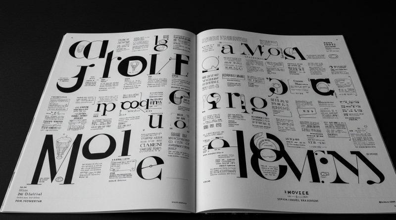
JHDD Typography Report — 2026.08.02
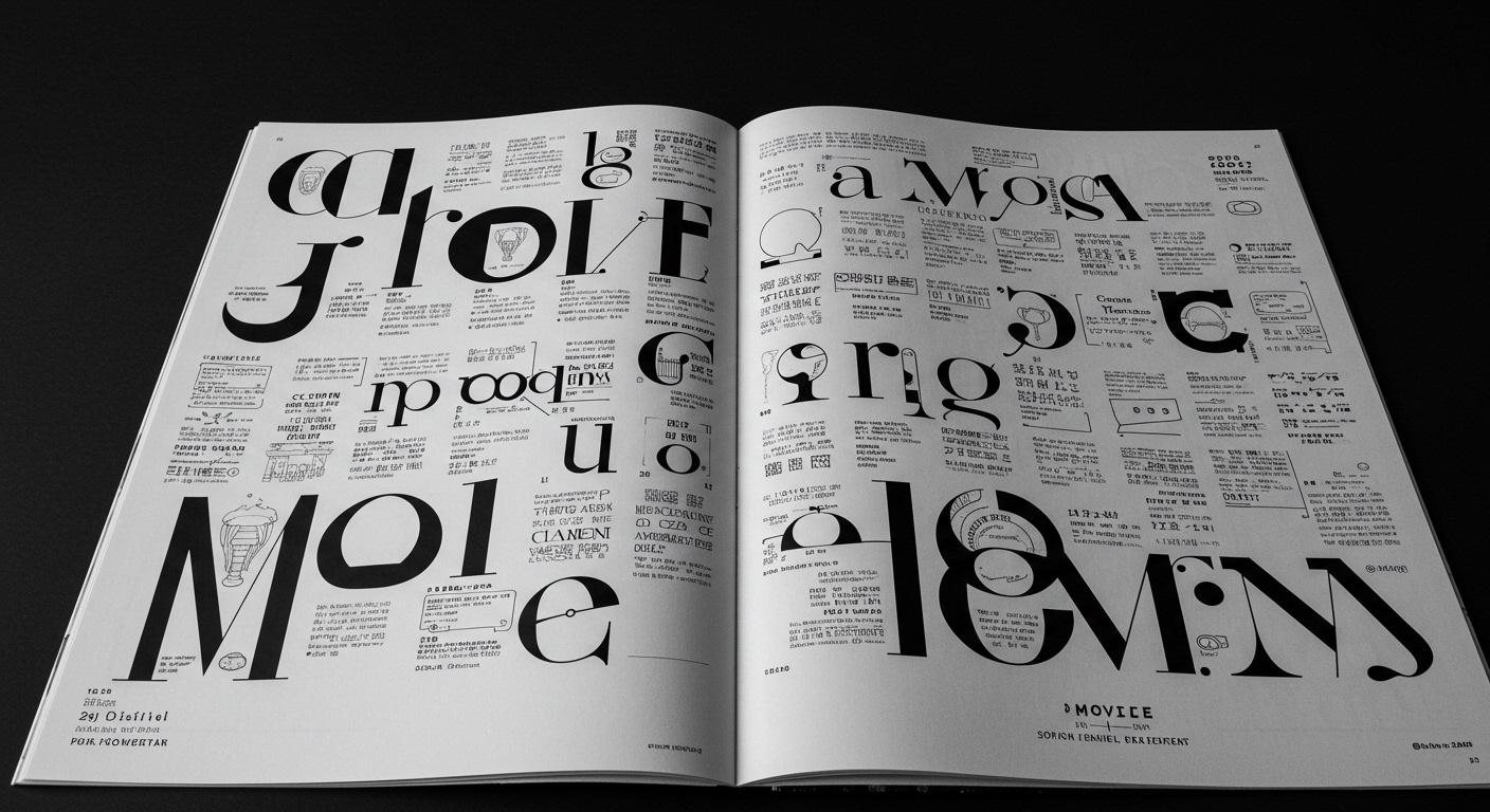
Pianist Sofiane Pamart’s “Movie” project employs designer Adrien Beaujeant to create immersive visual worlds for his album and score books.
This collaboration, alongside the historical re-evaluation of ALL CAPS and Jamie Clarke’s typeface Reel, indicates a significant shift where letterforms are increasingly understood as integral components of larger conceptual systems rather than isolated elements. The discussions around jazz record cover design and the Merrill C. Berman Collection reinforce a trajectory where typography’s communicative power extends beyond simple data transfer, intertwining deeply with narrative, emotional resonance, and historical context. These instances suggest a growing demand for nuanced typographic expression that enriches the entire visual and intellectual experience.
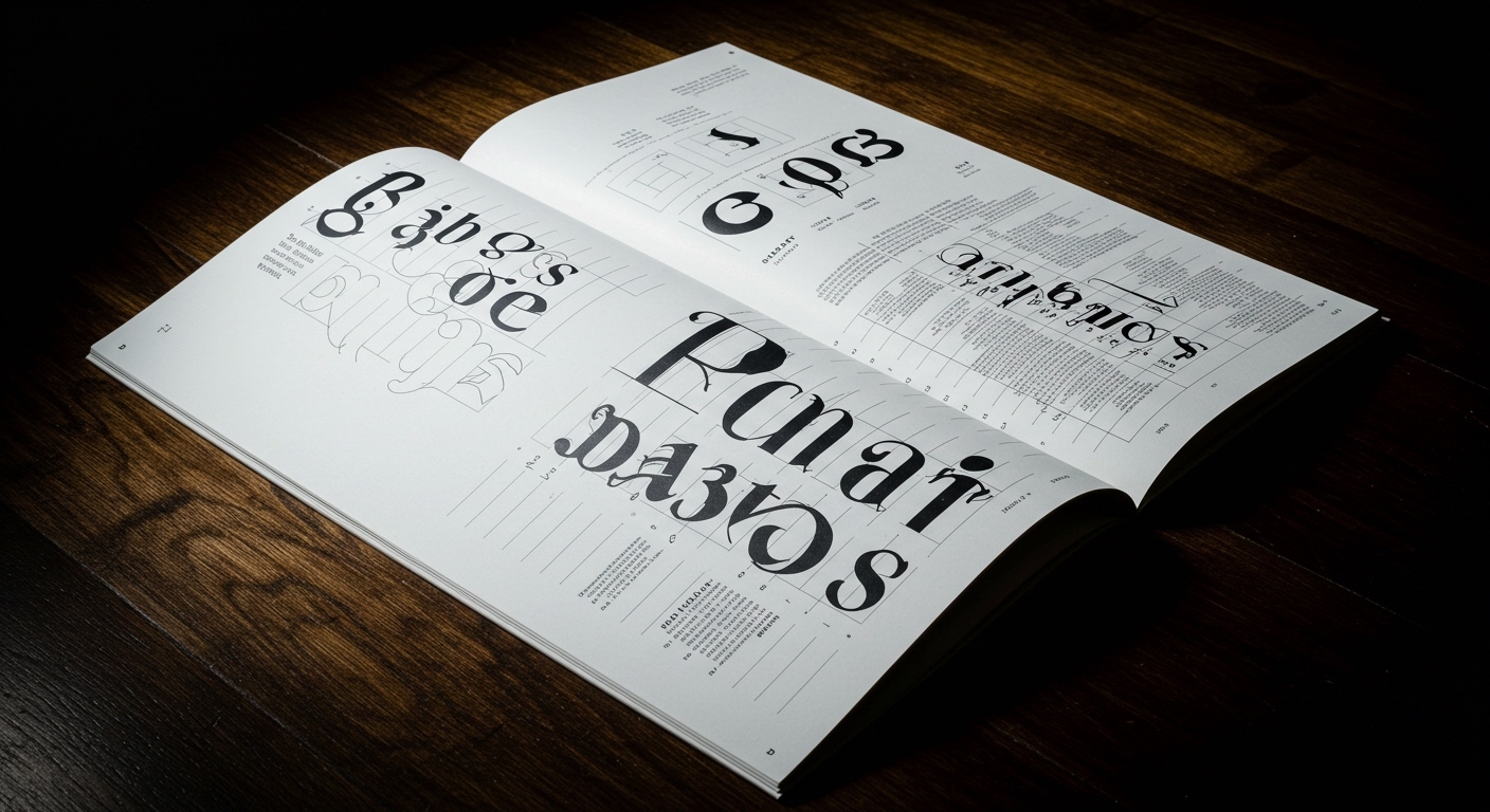
The argument that ALL CAPS has “lost its voice” due to overuse, presented in relation to Jamie Clarke’s Reel typeface, misses a crucial nuance about typographic authority. Mainstream design often equates authority with visual dominance or singular interpretive power, suggesting overuse diminishes impact. However, the historical trajectory of ALL CAPS, from classical inscriptions to digital shouting, reveals not a loss of voice, but a diversification of its communicative register. What is perceived as weakened authority is, in fact, a broadening of its semantic range, making it adaptable for both declarative statements and ironic commentary, depending entirely on micro-typographic context, grid placement, and color. This challenges the conventional wisdom that a typeface or style inherently possesses fixed “authority.” Its perceived power resides in the user’s skillful manipulation of its contextual deployment.
Jamie Clarke’s Reel, characterized as “expressive, conversational typography,” reflects an industry trend that often prioritizes novelty over foundational legibility principles. While conceptual letterforms certainly have their place in branding and headlines, the real challenge for professional typographers lies in integrating such expressive elements without compromising the sustained readability necessary for extended text. This is where micro-typography becomes paramount. Within two years, sophisticated variable font implementations will likely move beyond stylistic variations to offer dynamic, context-aware adjustments of kerning, tracking, and character width based on surrounding letterforms, line length, and even screen resolution, significantly enhancing both expressiveness and legibility in real-time. This will make static font files and their rigid character sets increasingly seem like relics.
The primary opposing force to this intelligent, dynamic approach is the pervasive reliance on default settings in popular design software and the widespread adoption of web development frameworks that prioritize quick deployment over fine typographic control. These systems often flatten the potential for nuanced grid systems and micro-typographic adjustments, encouraging a “good enough” approach that overlooks the subtle yet powerful impact of precise letterform placement and spacing. Client expectations for rapid iteration and budget constraints also frequently disincentivize the deep typographic craftsmanship required for truly integrated conceptual letterforms and responsive legibility.
A working Typography professional should this week audit a current project’s stylesheet or design system for any fixed-value kerning, tracking, or line-height settings, especially within body text. Replace these with contextual, relative values or explore the use of advanced OpenType features like `salt` (Stylistic Alternates) or `rclt` (Contextual Ligatures) to ensure letterforms adapt more intelligently to their neighbors, rather than relying on global defaults. This small shift will begin to reclaim granular control over micro-typography and improve overall legibility and visual flow.
TL;DR
Typography’s future lies in dynamic, context-sensitive letterforms and grid systems that prioritize nuanced expression and adaptive legibility over static defaults.
Curated References
About this editorial — This piece was developed using AI-assisted research and curation across multiple industry sources. All analysis, opinions, and predictions represent the editorial perspective of JHDD. Sources are linked in the references section above.