JHDD Typography Report — 2026.07.28
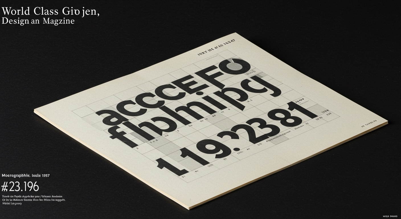
The cover of a menswear catalog designed by Milton Glaser in 1957 remains a point of historical reference for designers today.
This observation about Glaser’s work reveals a subtle but pervasive pattern across recent industry discussions. Whether discussing the physical experience of Circles Conference, the intentional carving of a magazine into stone, or the philosophical approach of WMH&I’s Mark Nichols, there is a clear re-prioritization of the enduring over the merely immediate. This collective interest points to a counter-current against the transient nature of much digital design output, asserting the value of design artifacts with lasting resonance or foundational human interaction. This shift implicitly re-evaluates how legibility and conceptual letterforms are conceived in an environment increasingly dominated by rapid production.
Connie He’s work with Google DeepMind to create new AI tools for her short film ‘Dear Upstairs Neighbors’ represents a significant development in conceptual letterform generation. Mainstream industry opinion often lauds AI for its unprecedented efficiency and capacity for novelty generation, suggesting it empowers designers with endless creative avenues. However, this efficiency often undermines the deeper conceptual rigor required for truly impactful typography, particularly concerning legibility and the nuanced communication facilitated by micro-typography. While AI can rapidly produce variations, its current iterations frequently lack the inherent understanding of semantic weight, cultural context, or the subtle optical adjustments that a human typographer brings to letter spacing or stroke modulation for optimal legibility. The ‘new animation language’ might manifest visually arresting forms, but the underlying conceptual framework, traditionally embedded in type design through historical precedent and human perceptual study, is frequently superficial or absent in AI outputs. This creates a conceptual void, where form precedes intrinsic meaning rather than arising from it.
The challenge for typographic practice lies not in the generation of novel forms, which AI excels at, but in imbuing these forms with intentionality and ensuring their communicative efficacy. Conceptual letterforms, when designed by humans, carry layers of historical, cultural, and emotional association that guide interpretation and enhance legibility. AI-generated forms, absent this human-centric understanding, often present as mere surface novelty. This leads to a critical re-evaluation of grid systems, which traditionally provide a framework for legible and harmonious type. An AI producing type without a deep understanding of content or context may disregard subtle grid alignments, leading to visual chaos. By mid-2028, typography professionals will observe a distinct divergence in AI-generated type. One path will optimize for purely aesthetic novelty, often sacrificing legibility for visual flair. The other, less immediate path, will focus on highly specialized, context-aware micro-typography generation, requiring extensive human-curated datasets to surpass basic legibility and achieve true expressive nuance.
The primary opposing force to this emphasis on endurance and human-centric nuance is the rapid deployment of general-purpose generative AI, exemplified by the tools used by Connie He with Google DeepMind. These systems are designed for speed and broad utility, prioritizing rapid content generation across multiple media, often without deep consideration for the micro-typographic details or grid systems historically integral to long-term legibility and conceptual integrity. The immediate gratification of automated output frequently overshadows the slower, more deliberate process of crafting typography with enduring impact, thereby devaluing the human expertise that underpins effective visual communication.
This week, a working Typography professional should select a current digital project and, rather than relying on automated kerning or tracking, manually adjust five specific instances of character pairs and line spacing to optimize for subtle legibility and visual flow, documenting the tangible improvements in reading experience. This deliberate focus on micro-typography will sharpen their perceptual skills, which are currently irreplaceable by general AI, directly impacting the effective application of grid systems and the development of truly conceptual letterforms.
TL;DR
Enduring design principles and human micro-typographic precision continue to hold distinct value against the rapid proliferation of general AI tools.
Curated References
About this editorial — This piece was developed using AI-assisted research and curation across multiple industry sources. All analysis, opinions, and predictions represent the editorial perspective of JHDD. Sources are linked in the references section above.