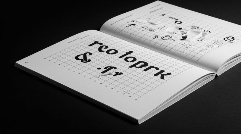
JHDD Typography Report — 2026.07.16
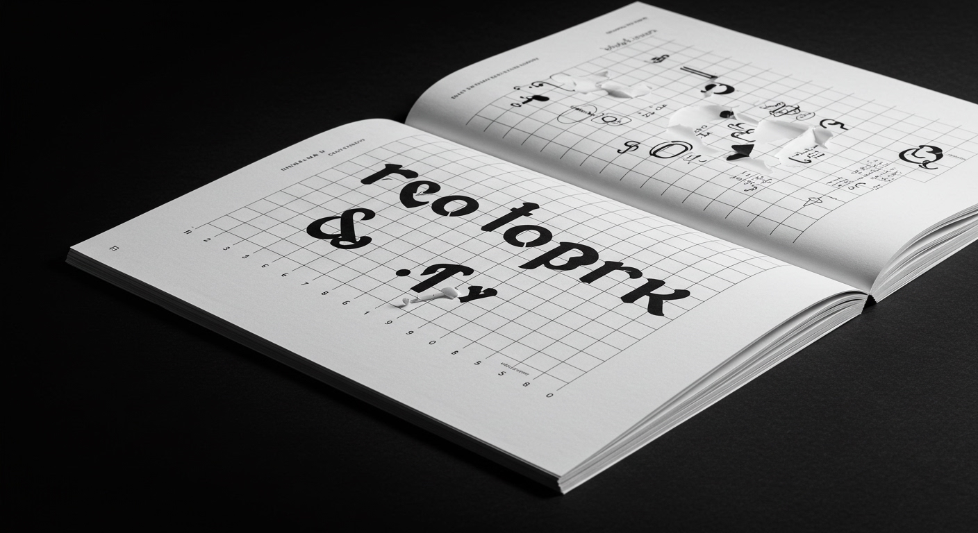
Yard NYC designed the European Wax Center identity using contrasting typography to achieve a balance of expertise, confidence, and personality.
This design decision, along with observations regarding the visual self-representation of groups like the Patriot Front and the historical KKK, points to a deeper, often overlooked pattern: the increasingly sophisticated deployment of letterforms not merely for readability, but for immediate conceptual transmission. Whether professionally commissioned or organically evolved, typography is operating as a primary vector for complex ideological or emotional messaging, frequently prioritizing impact over conventional legibility.
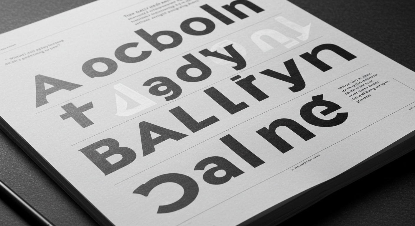
The industry narrative often champions legibility as the paramount virtue in typographic design, particularly for consumer brands. However, this perspective overlooks the profound effectiveness of conceptual letterforms that intentionally create friction. For European Wax Center, the use of contrasting typography demonstrates a calculated move beyond bland homogeneity. It suggests an understanding that a brand’s “personality” is not always best served by the most universally “readable” solution, but by a distinct visual language that engages on a more sensory, less purely cognitive level. The subtle micro-typographic choices in kerning, tracking, and leading, for example, can contribute significantly to this conceptual friction, creating a texture of expertise or confidence that a simple, perfectly legible sans-serif might not convey.
This approach contradicts the mainstream emphasis on frictionless user experience and immediate information acquisition. A more challenging visual experience, when expertly managed, can compel a deeper engagement, forcing the viewer to pause and interpret rather than merely consume. For entities such as the Patriot Front, their self-styled branding, while deplorable in its message, exemplifies the raw power of conceptually strong, if crudely executed, letterforms to immediately signify identity and ideology, often by deliberately eschewing traditional aesthetic “niceties” for a more aggressive or direct stance. This tension between immediate legibility and conceptual force will become a central challenge for type design: by mid-2027, commercial typography will see a significant increase in brands experimenting with typefaces that intentionally introduce subtle visual dissonance to convey specific, nuanced brand attributes, moving away from purely functional clarity.
The primary resistance to this trend comes from the burgeoning field of AI-driven content generation and automated design systems. These tools inherently prioritize quantifiable metrics like speed of processing, universal accessibility scores, and rapid A/B testing for maximum conversion, often at the expense of nuanced, conceptually driven typographic choices. Their algorithms favor standard, easily parsed letterforms and predictable grid systems, effectively flattening the potential for intentional typographic friction or subtle spatial storytelling.
Typography professionals should dedicate specific time this week to deconstructing two existing brand identities that employ contrasting or unconventional letterforms. Rather than simply evaluating their legibility, analyze the precise micro-typographic decisions (baseline shifts, subtle character widths, tracking variations) that contribute to their conceptual message or emotional tone. Document how these details create a specific feeling or convey an an ideology, even if they momentarily impede immediate reading speed.
TL;DR
Conceptual letterforms and micro-typographic friction are gaining strategic importance over universal legibility for identity communication.
Curated References
About this editorial — This piece was developed using AI-assisted research and curation across multiple industry sources. All analysis, opinions, and predictions represent the editorial perspective of JHDD. Sources are linked in the references section above.