JHDD Typography Report — 2026.07.09
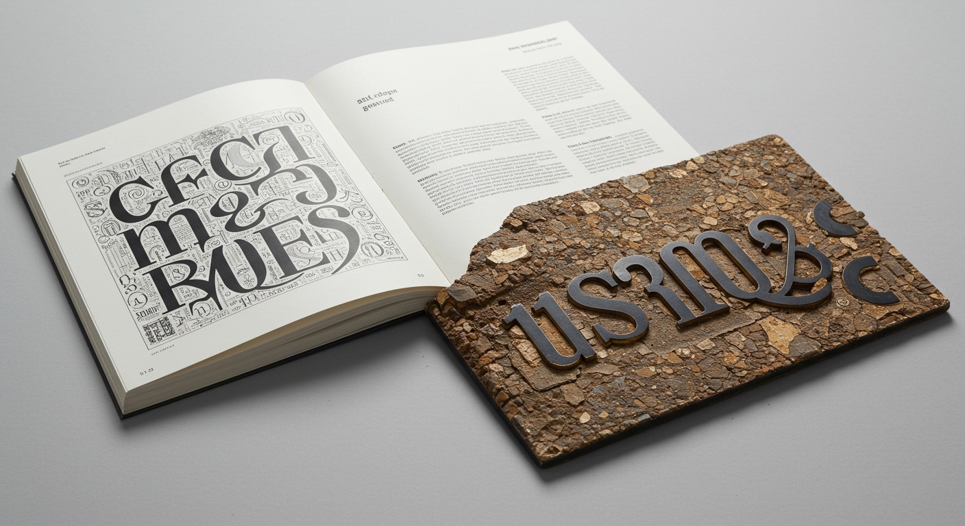
Six Cinquième gave the arts nonprofit 1001 Colors a scalable national identity by unearthing a piece of history literally hidden in the fabric of their new headquarters.
This approach reflects a specific evolution in how design studios are developing typographic systems. They are moving beyond abstract brand narratives, instead anchoring conceptual letterforms and grid structures in specific, often historically resonant, physical or cultural contexts. The common thread is the search for foundational meaning, which is then translated into a systematic framework that dictates expression, rather than expression being applied as an afterthought. This method seeks to imbue type with inherent conceptual depth, ensuring that even the most expressive letterforms derive from a tangible, rather than a generalized, source.
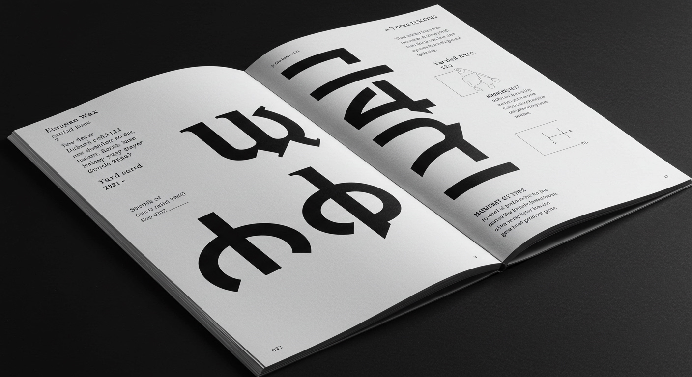
Yard NYC’s identity for European Wax Center, which uses contrasting typography to balance expertise, confidence, and personality, serves as a case study. While lauded for its “smoother, more expressive identity,” the widespread embrace of such contrasting type solutions often overlooks critical micro-typographic considerations. The mainstream industry opinion frequently champions the visual drama and conceptual flair of disparate typefaces without adequately scrutinizing their combined performance across all scales and media. This enthusiasm can inadvertently prioritize immediate stylistic impact over the sustained, effortless legibility that defines effective communication. The subtle tensions created by highly contrasting forms, if not meticulously managed within a rigorous grid system, can introduce visual friction, particularly in smaller text sizes or dynamic digital environments.
The belief that typographic expression must always manifest through stark contrast or overt conceptualization is misguided. True mastery of conceptual letterforms and grid systems lies in achieving distinctiveness without sacrificing the functional grace of micro-typography. An identity might be expressive, but if its legibility falters at the edge of a responsive breakpoint or under varied lighting conditions, its effectiveness is compromised. The focus should shift to systems that are inherently expressive through their structural integrity and adaptive capabilities, rather than relying solely on surface-level visual juxtaposition. By mid-2027, design practices will increasingly be judged not just on the initial impact of their conceptual letterforms, but on the enduring legibility and robust micro-typographic performance across a full spectrum of real-world applications.
The principal opposing force to this nuanced perspective comes from marketing-driven brand strategies. These strategies frequently demand immediate, unambiguous visual differentiation, often pushing designers towards more overt stylistic statements that risk neglecting the intricacies of legibility and the quiet power of a finely tuned grid. The pressure to “stand out” can overshadow the long-term value of a highly functional, subtly sophisticated typographic system.
A working typography professional should dedicate time this week to taking an existing brand identity that relies on contrasting typefaces and meticulously auditing its legibility. This involves setting text in various sizes, on different backgrounds, and through simulated mobile interfaces, specifically identifying points where the conceptual distinctiveness impedes the seamless reading experience due to issues like optical size conflicts, inconsistent stroke weights, or poorly managed tracking and leading.
TL;DR
Overemphasis on expressive, contrasting conceptual letterforms often neglects the critical importance of micro-typographic legibility and grid system integrity.
Curated References
About this editorial — This piece was developed using AI-assisted research and curation across multiple industry sources. All analysis, opinions, and predictions represent the editorial perspective of JHDD. Sources are linked in the references section above.