JHDD Packaging Report — 2026.09.07
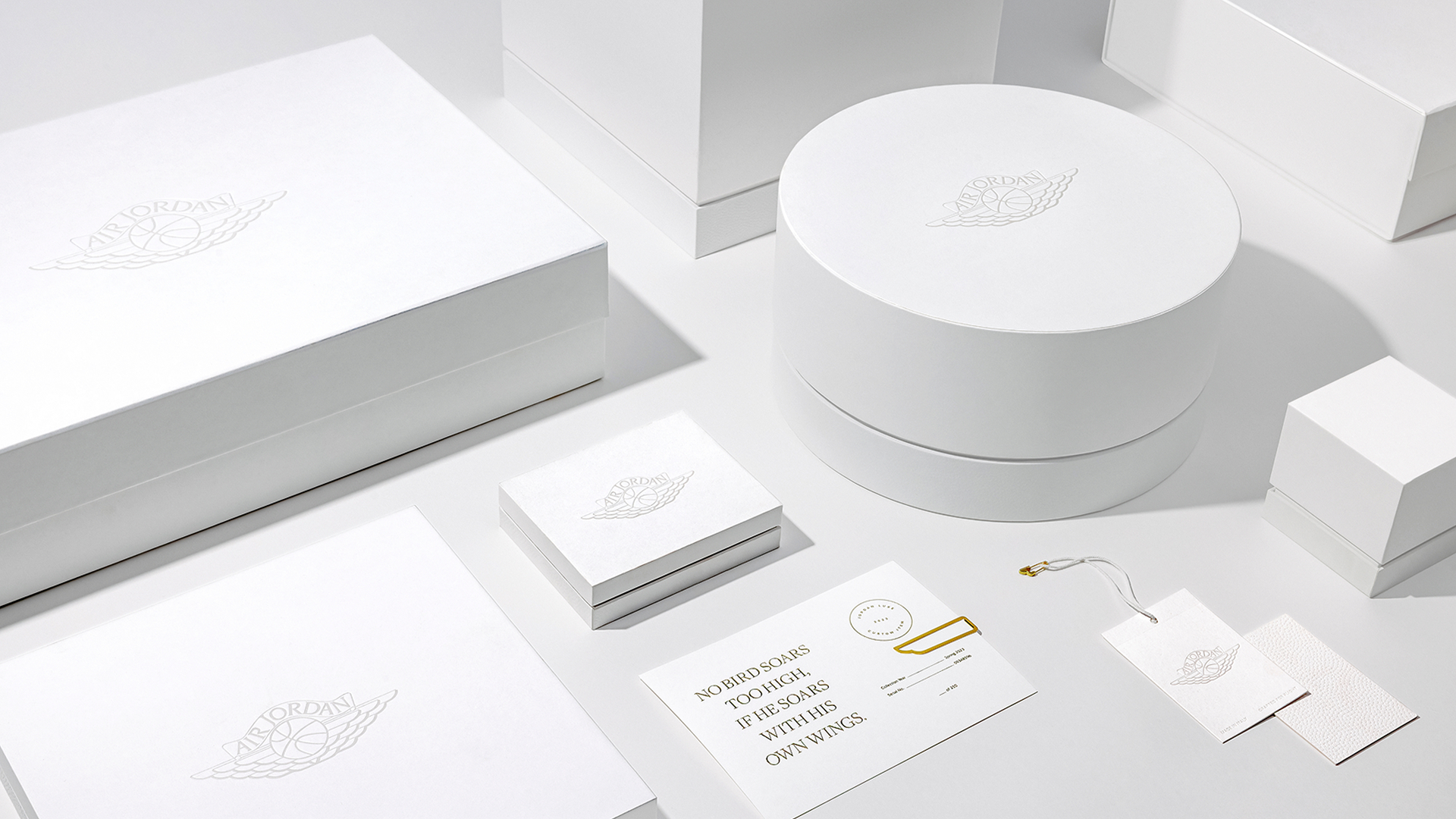
Tolleson’s reimagining of Air Jordan Lux packaging with its tactile basketball textures moves brand interaction beyond just visual recognition.
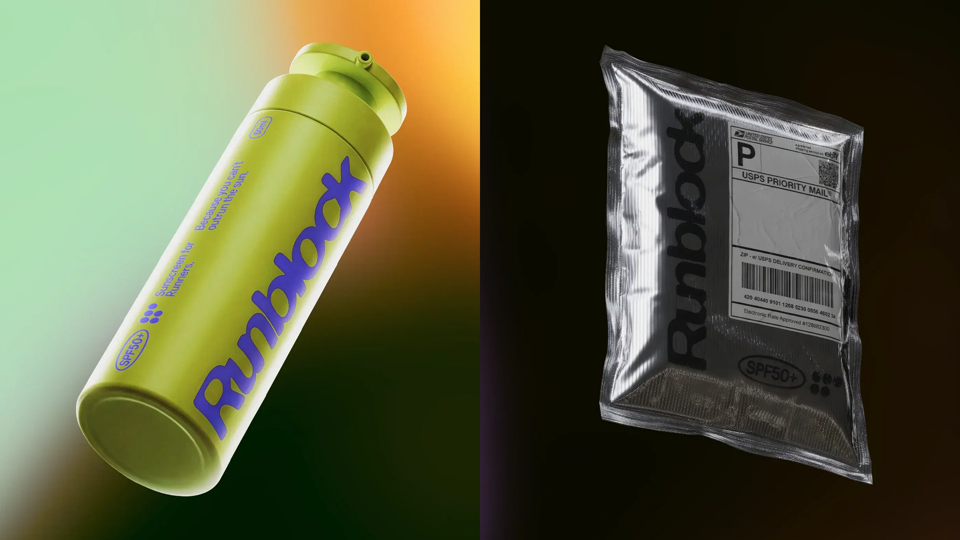
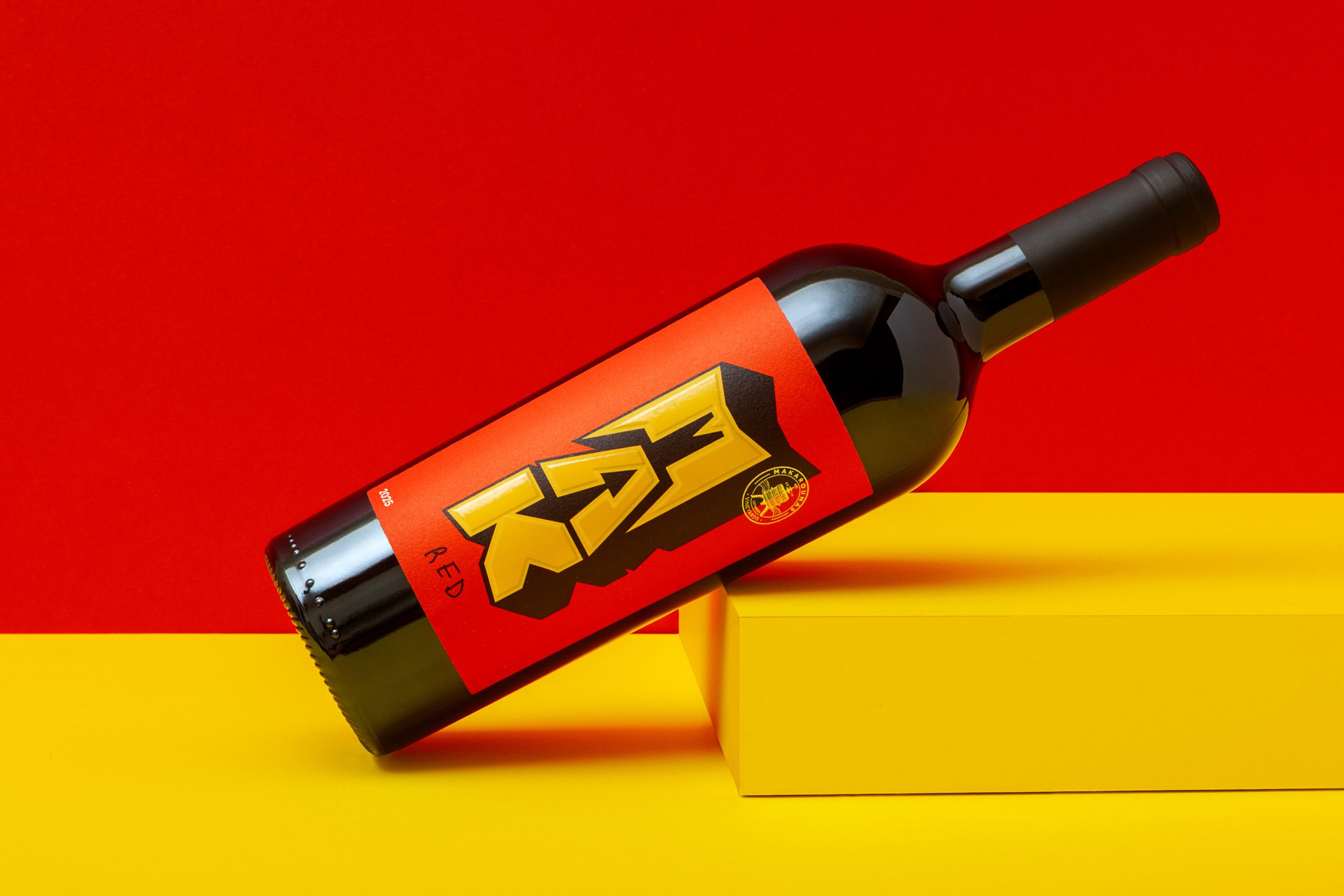
Across the consumer goods landscape, a clear divergence emerges: some brands pursue loud, graphic disruption while others refine the sensory experience with understated tactility. Runblock sunscreen and MAK wine exemplify a trend towards electric colors and playful graphics, aiming for immediate shelf impact within specific market segments. Simultaneously, projects like Air Jordan Lux demonstrate a commitment to elevating brand perception through nuanced material engagement, focusing on touch and perceived quality, even for established mass-market products. This indicates a broader industry search for differentiation, moving beyond merely functional packaging.
The Air Jordan Lux project, with its refined gold details and tonal whites, illustrates a quiet luxury approach that prioritizes a premium unboxing experience. This approach, which emphasizes tactile textures reminiscent of basketballs, challenges the mainstream industry’s overreliance on fleeting visual trends for impact. Conventional wisdom often dictates that “expressive CPG” design, as seen in the vibrant branding for Runblock or MAK wine, is the primary path to stand out on crowded shelves. This perspective frequently overlooks the power of enduring material quality and thoughtful haptic design, often underestimating how sustainable material choices can contribute to a premium feel that lasts beyond initial visual appeal.
True brand resonance, especially in the context of sustainable choices, often comes from physical interaction rather than transient visual novelty. Packaging professionals frequently mistake maximalist graphic applications for innovation, when often a more restrained, material-centric design, particularly using innovative sustainable substrates, can deliver greater perceived value and longevity. By late 2027, more established brands will pivot towards integrating subtle, brand-specific tactile elements and high-quality mono-material structures into their primary packaging, prioritizing durable sensory experiences that encourage product retention over purely eye-catching aesthetics. This shift will emphasize the unboxing experience as a multi-sensory brand touchpoint rather than a fleeting visual reveal.
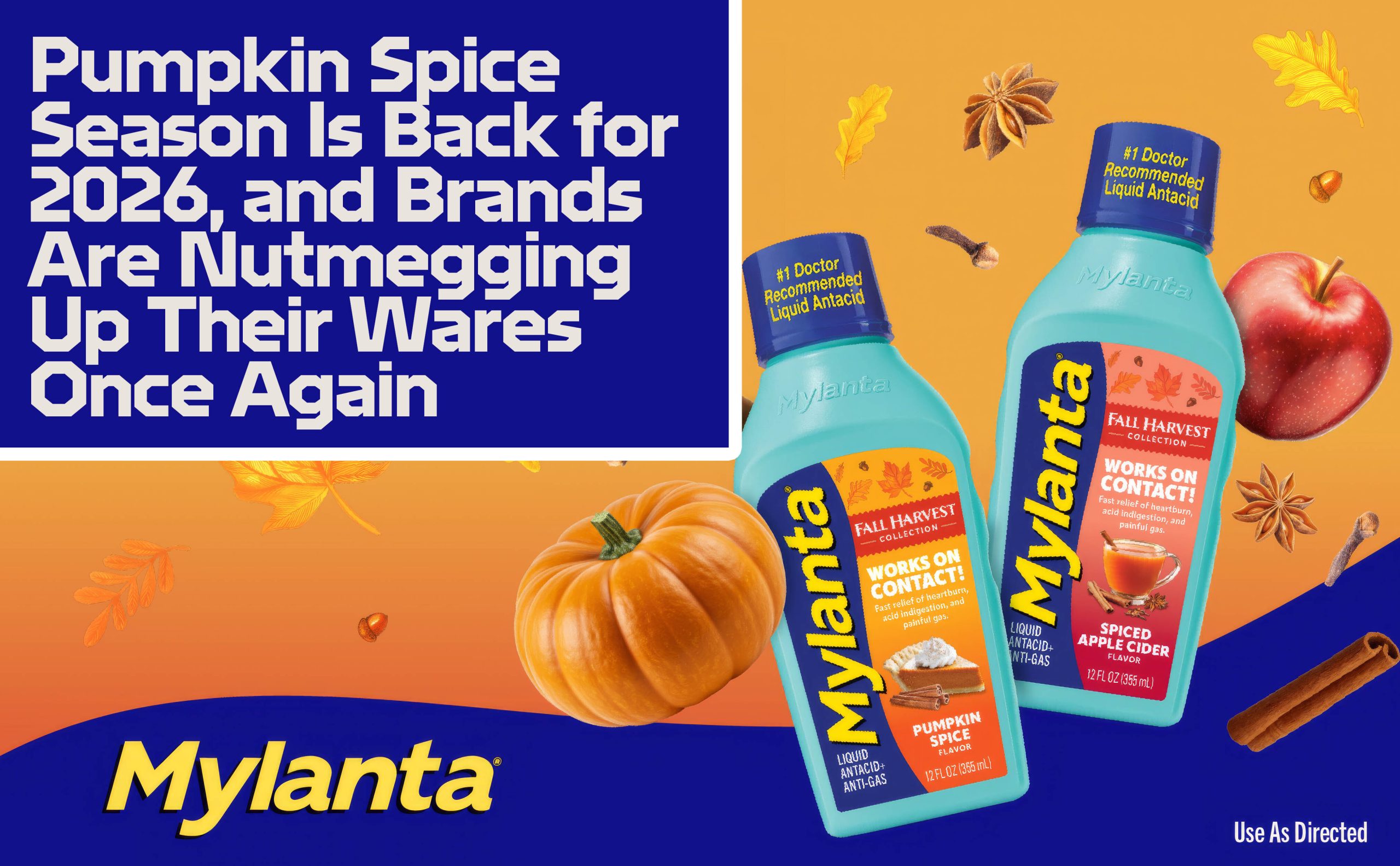
This pursuit of tactile depth faces resistance from market forces content with superficial updates, such as the annual return of Pumpkin Spice Season. This phenomenon, where brands primarily “nutmeg up their wares” with seasonal color palettes and flavor associations, represents a reactive approach to consumer engagement. It often prioritizes rapid, low-effort aesthetic adjustments over genuine material innovation or a considered unboxing journey. This trend perpetuates a cycle of disposable packaging design, where the focus remains on seasonal novelty rather than lasting material intelligence or thoughtful sensory branding.
A working packaging professional should immediately audit their product’s unboxing journey for points of tactile engagement that could be enhanced using sustainable materials. Consider how a debossed logo on recycled paperboard, a specific finish on a bio-based polymer, or the intentional texture of a molded fiber insert can add perceived value and reinforce brand identity. Prioritize single-material constructions to aid recycling and integrate haptic feedback that subtly communicates product quality or brand narrative, rather than relying solely on graphic overhauls.
TL;DR
Packaging must evolve beyond surface-level visuals, embracing tactile experiences and considered materials for authentic brand connection.
Curated References

About this editorial — This piece was developed using AI-assisted research and curation across multiple industry sources. All analysis, opinions, and predictions represent the editorial perspective of JHDD. Sources are linked in the references section above.