JHDD Packaging Report — 2026.07.26
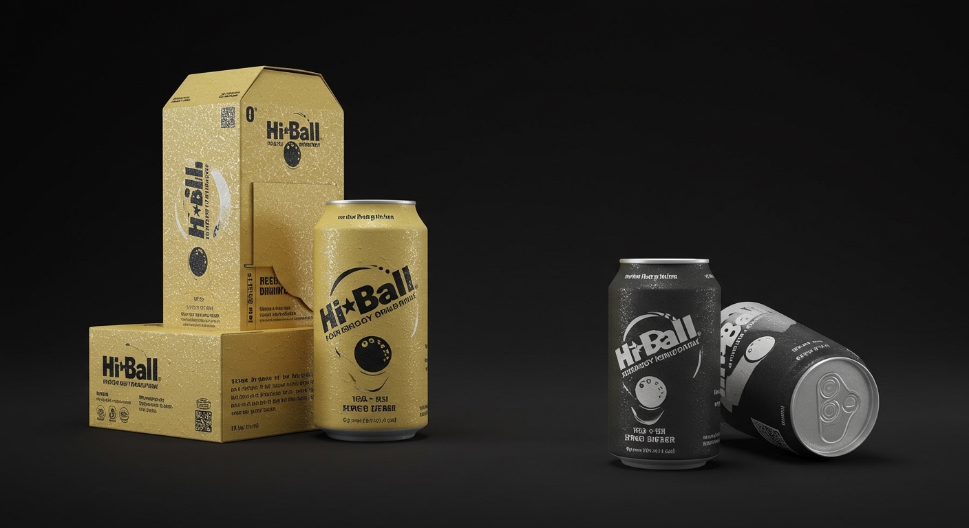
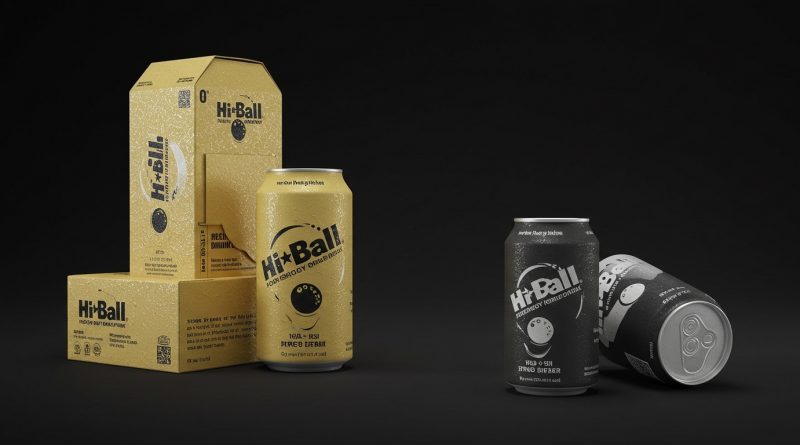
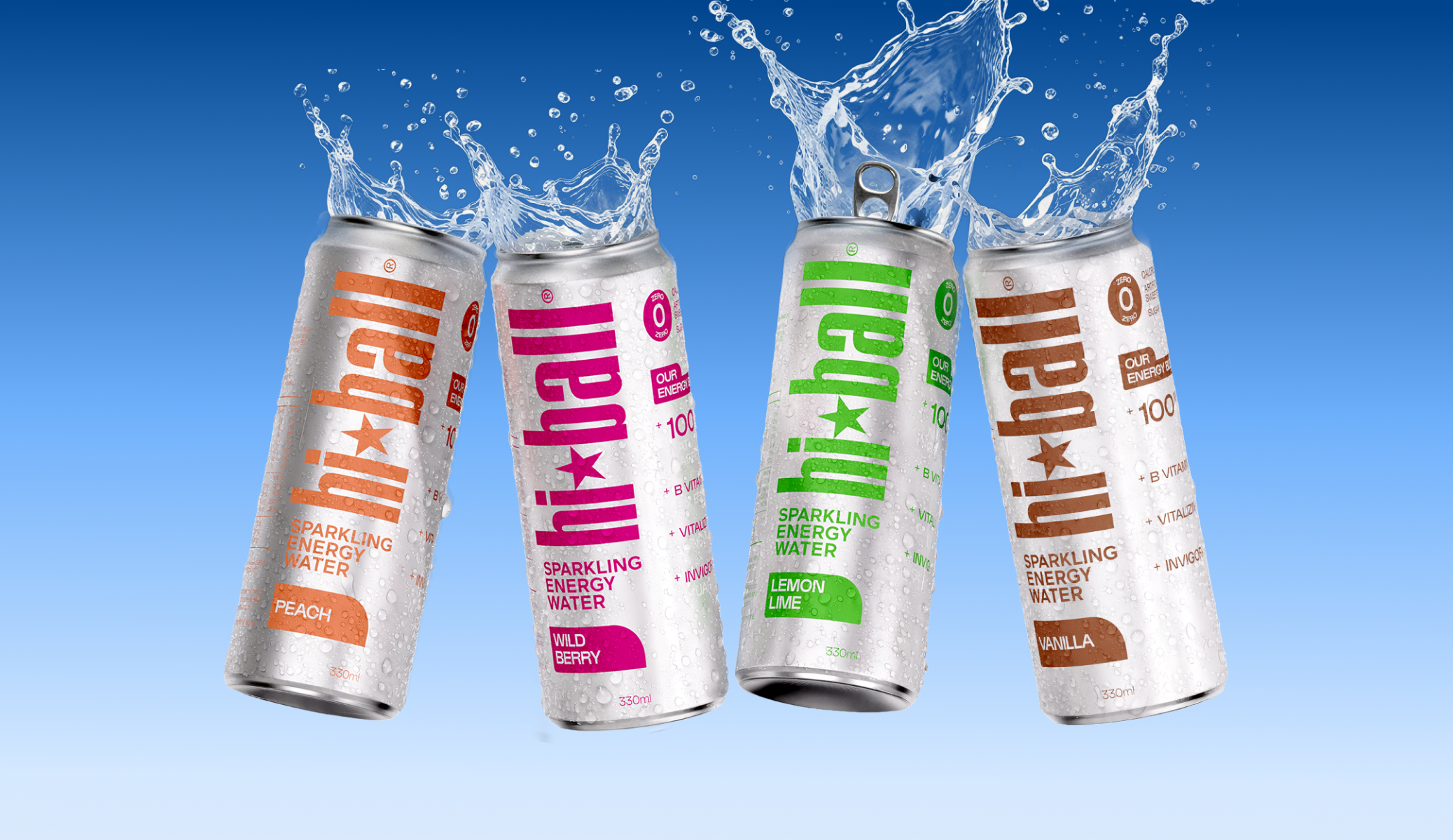
Hi*Ball’s new design features a stripped-down aesthetic, aiming for standout appeal in a crowded energy drink market.
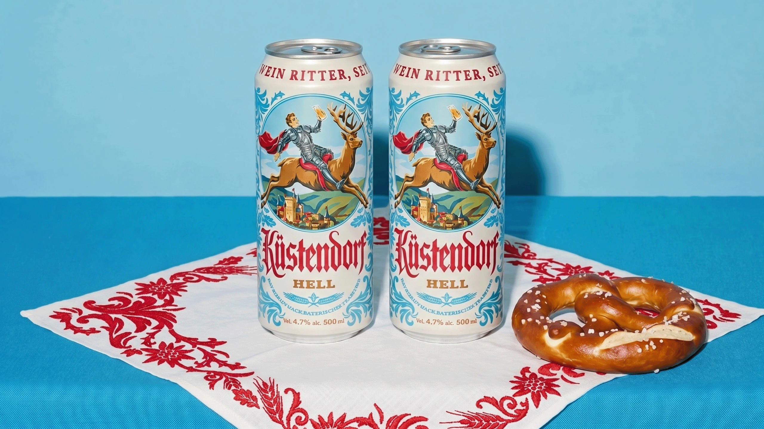
These examples reveal a consistent shift away from overt messaging toward nuanced communication. Whether through Kustendorf’s quiet historical cues or Rude Olive’s playful material choices, brands are leveraging texture, subtle graphics, and understated personality to connect with consumers, suggesting a move from shouting claims to embodying character and narrative.
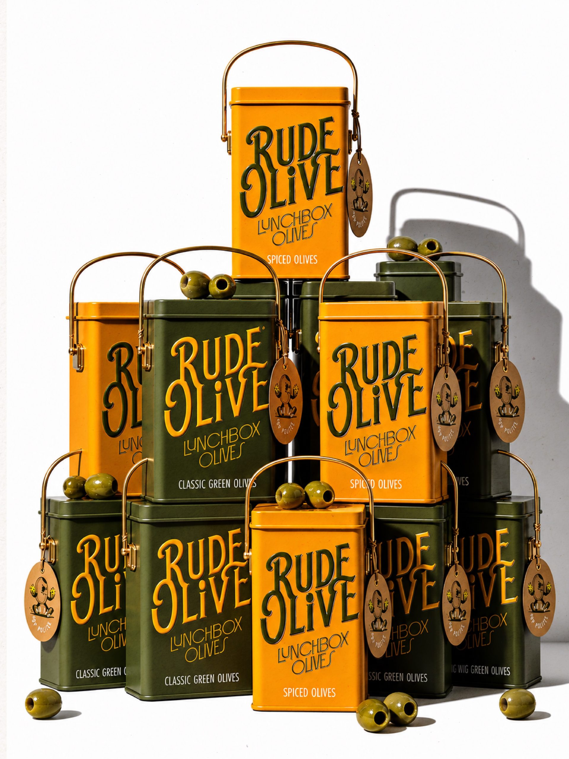
Affogato Design’s conceptual Rude Olive brand provides a compelling case study for this evolving approach. The design features a lunchbox tin with swashy vintage script, metallic olive and mustard finishes, and brass swing handles. This concept goes beyond mere containment; it performs as an object. It crafts an unlatching experience that is inherently tactile and memorable, connecting with the user through physical interaction rather than overt marketing slogans. The cheeky hangtag olive further reinforces this personal, engaging approach without needing to make grand statements.
Conventional industry wisdom frequently dictates that sustainable packaging must overtly declare its eco-credentials, often through rustic aesthetics or prominent “green” labels. This perspective often overlooks a more profound route to sustainability: fostering a durable, lasting consumer relationship with the packaging itself. Rude Olive, with its robust tin and engaging design, demonstrates this. Its sustainability is not explicitly stated but is embedded in its perceived value and potential for prolonged reuse as a cherished item. This strategy effectively extends packaging life and reduces waste by creating an object of desire, rather than a disposable item, however compostable. By early 2028, a significant portion of niche food and beverage brands will prioritize designs that encourage secondary use or display, thereby embedding sustainability through perceived value rather than explicit material declarations. This will manifest in a surge of packaging featuring durable components and sophisticated tactile elements.
The primary resistance to this design evolution originates from high-volume, low-margin sectors where packaging cost optimization is paramount. Large corporations, focused on rapid consumption cycles and immediate, often loud, shelf standout, frequently disregard the long-term brand equity achievable through subtle, enduring tactile experiences. Their marketing departments often prioritize bold, transient campaigns over thoughtful, lasting unboxing journeys and materials that invite reuse.
Working packaging professionals should implement tactile audits for both their brand’s products and key competitors. This involves critically evaluating not just visual appeal but also the weight, texture, sound, and perceived durability of materials. The focus must shift to how these sensory elements contribute to the product’s narrative and foster post-purchase engagement, designing for an experience that extends well beyond the initial unwrap or unbox.
TL;DR
Brands are finding impact through subtle design, tactile elements, and inherent value, rather than overt messaging or explicit sustainability claims.
Curated References


About this editorial — This piece was developed using AI-assisted research and curation across multiple industry sources. All analysis, opinions, and predictions represent the editorial perspective of JHDD. Sources are linked in the references section above.