JHDD Packaging Report — 2026.07.14
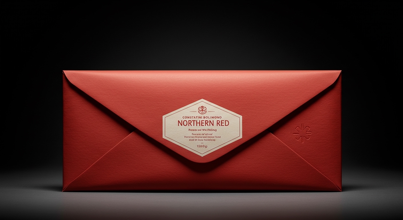
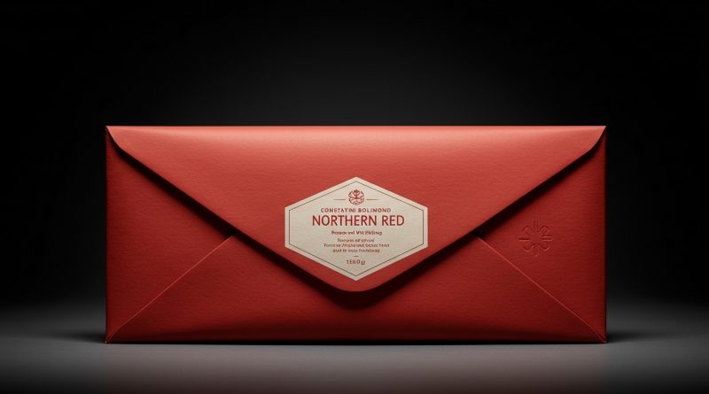
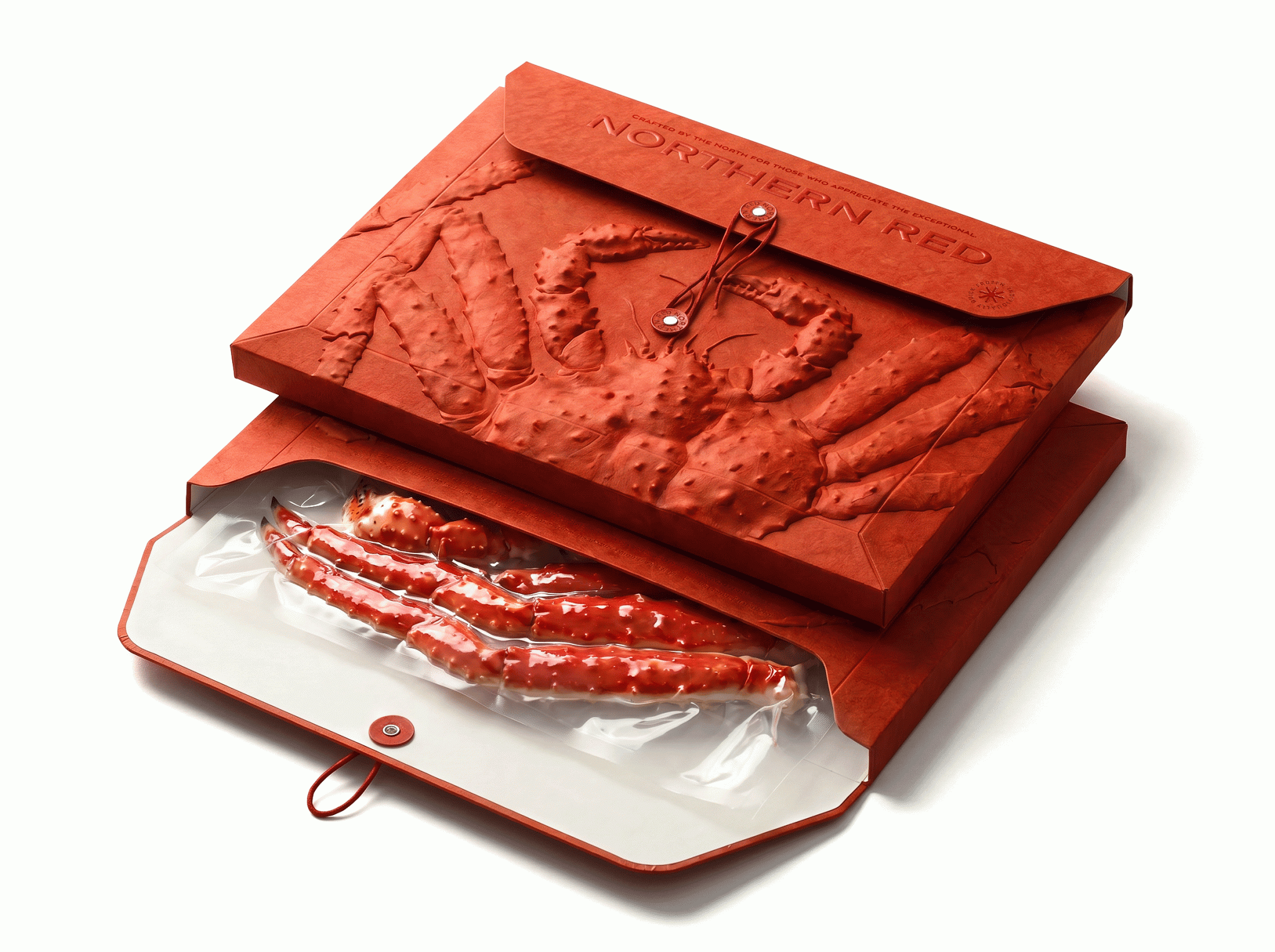
Constantin Bolimond’s Northern Red concept reimagines frozen king crab as a luxury object, an envelope-style package intended for display and retention.
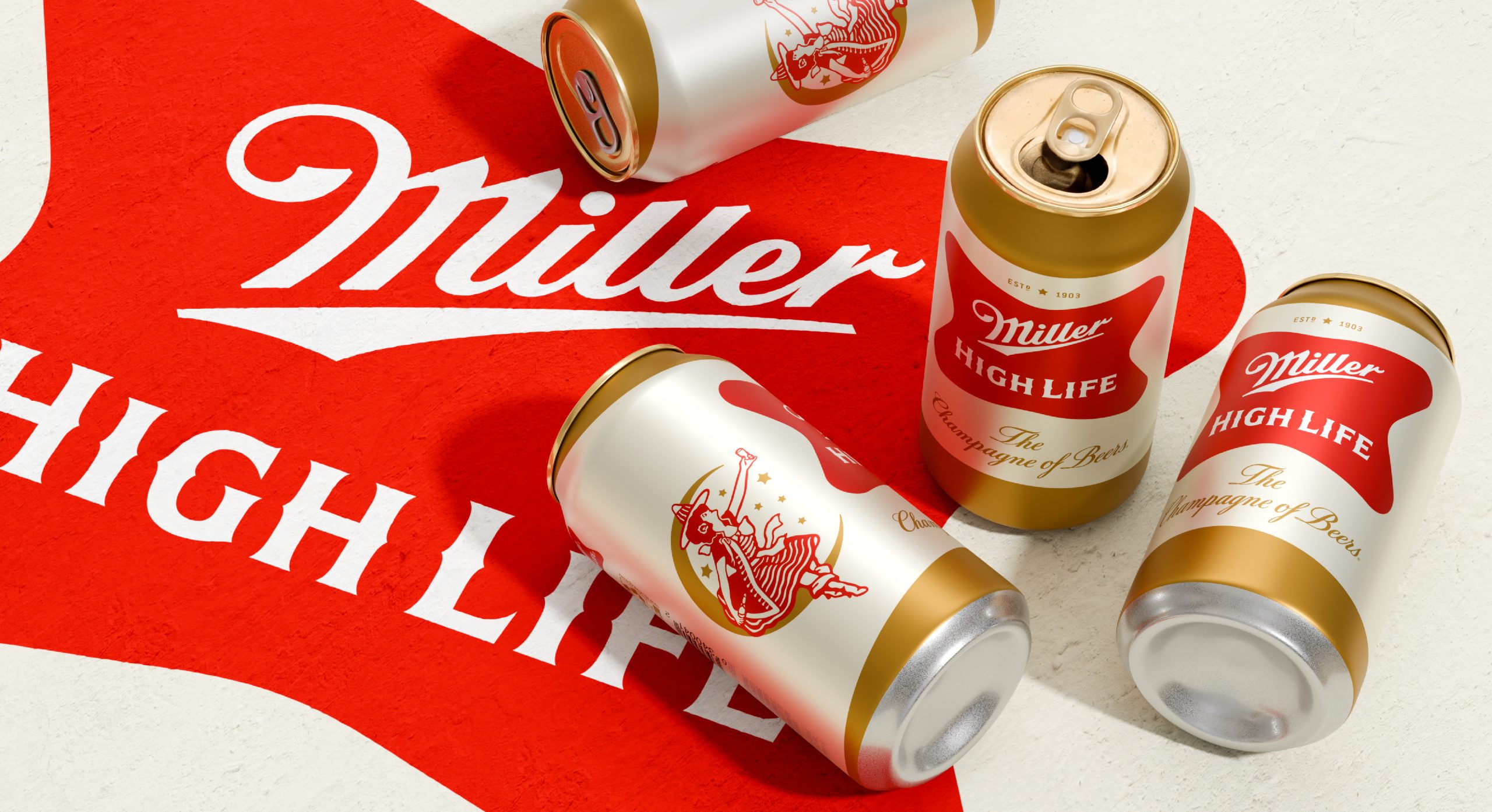
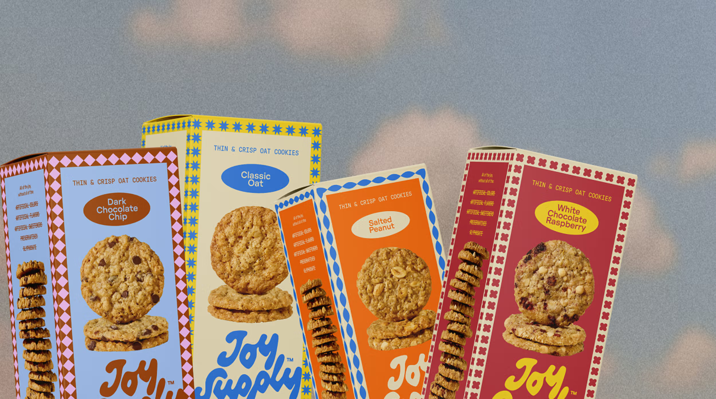
This approach connects several recent designs that transcend typical packaging functions, shifting focus from pure utility to creating items worth keeping. From My Graphic Lab’s Roja ketchup with its collectible appeal to Jake Nicolella’s Joy Supply cookies designed for counter display, packaging is increasingly treated as an integral, permanent part of the consumer’s environment. Soulsight’s refresh of Miller High Life similarly elevates a brand asset into a focal point, suggesting a broader intent for visual permanence.
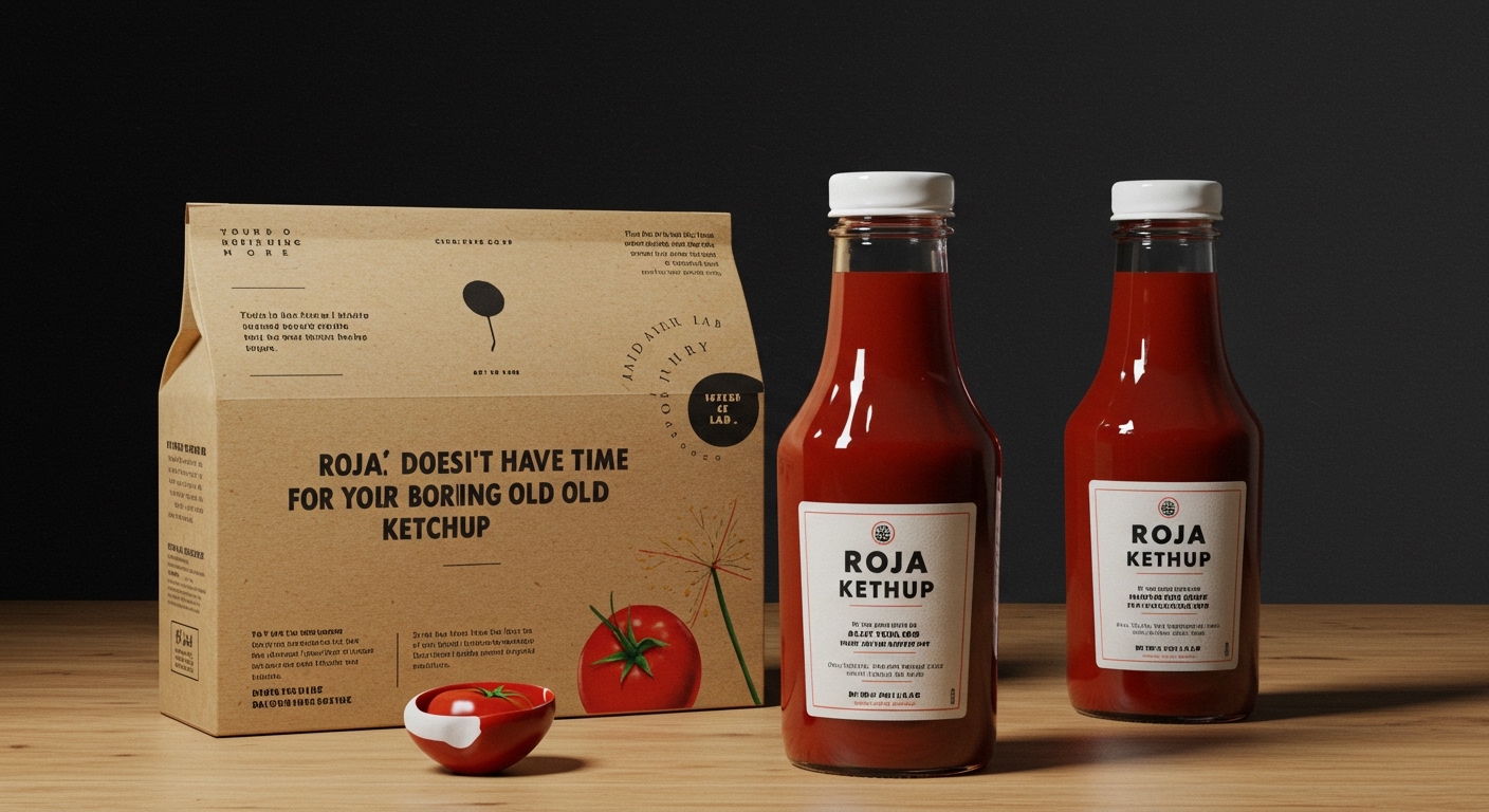
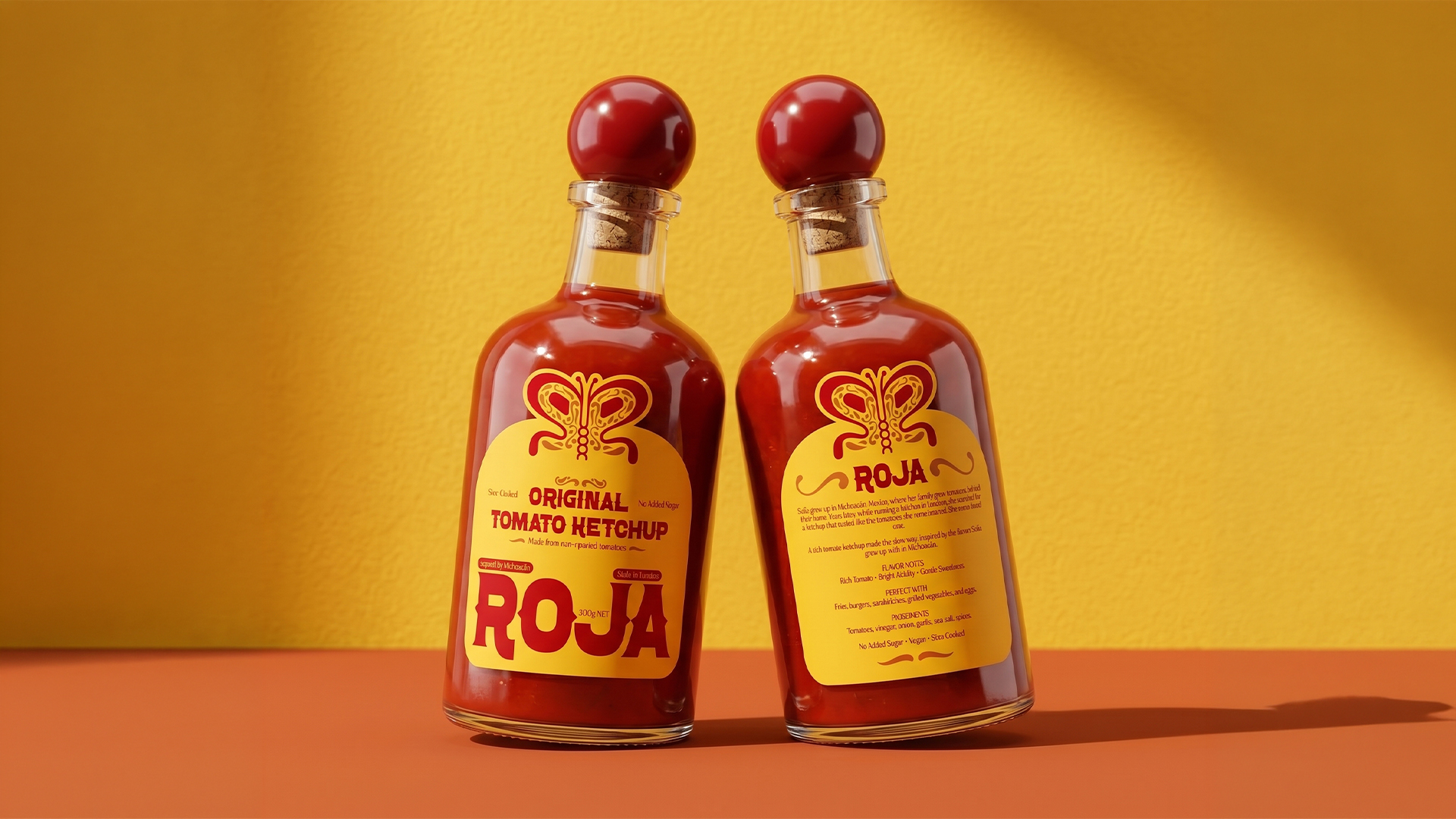
My Graphic Lab’s design for Roja ketchup exemplifies this paradigm shift. The brand’s butterfly mark, formed from mirrored R shapes and Mexican folk art details, alongside a flavor-coded color system, transforms a basic condiment bottle into something artful and tactile. This design strategy aims to elevate the entire unboxing and post-purchase experience, making the act of unwrapping or presenting the product a moment of discovery. Mainstream packaging discourse often champions minimalism and dematerialization in the name of sustainability, arguing that less is inherently more environmentally friendly and reduces waste at end-of-life. However, this perspective overlooks the potential for packaging to foster longevity and reduce perceived disposability through emotional connection and functionality within the home. When a package becomes a desirable object—something beautiful, tactile, or symbolic—its lifespan within the consumer’s home extends. It might be refilled, repurposed, or simply kept for its aesthetic value, thereby delaying its entry into the waste stream and contradicting the assumption that all elaborate packaging is inherently unsustainable. This approach shifts the sustainability conversation from immediate material reduction to promoting a longer, more valued product lifecycle.
This investment in aesthetic and tactile durability can foster deeper brand loyalty, giving products a longer “shelf life” both physically and emotionally in a consumer’s mind. The perceived value shifts from product alone to the entire presentation and the multisensory interaction it provides. For instance, the deeply embossed crab relief on Constantin Bolimond’s Northern Red concept offers a significant tactile dimension, transforming a commodity into a sensory experience. This level of detail elevates the unboxing, inviting touch and engagement beyond simply opening a container. By mid-2027, the integration of deeply embossed textures and sophisticated, story-rich visual narratives, similar to Northern Red’s and Roja’s approaches, will become a standard expectation for even mid-tier consumables seeking to differentiate. This will move beyond mere visual appeal into a profound multisensory brand engagement, prioritizing the unboxing and post-purchase experience as key drivers of brand equity and consumer retention.
The primary resistance to this trend often comes from established players, particularly the “disappearing middle” design agencies mentioned in Shelf Life 118, alongside brand procurement departments. These entities are frequently bound by cost-efficiency metrics and legacy production processes that view decorative embellishments and custom tooling as prohibitive expenses rather than value-adding investments. The focus often remains on optimizing unit cost or reducing production lead times over enhancing the long-term emotional value or functional longevity of the package itself. Furthermore, some brands might adhere to an outdated interpretation of “sustainable packaging” that strictly equates it with the absence of embellishment or the use of recycled content, overlooking the potential for design-driven longevity to also contribute to sustainability goals. This resistance hinders the adoption of more premium, tactile finishes for everyday items.
Packaging professionals should conduct an immediate internal review of their product lines to identify commodity items that could benefit from a “collectible” or “display-worthy” treatment, without necessarily increasing material volume. This involves exploring existing production capabilities for textural enhancements—such as dry embossing, debossing, or selective varnishes—on current substrates. Focus on one small, specific product line to test consumer reception to an elevated tactile experience and its impact on perceived value and display behavior.
TL;DR
Elevating everyday packaging into display-worthy, tactile objects enhances longevity and consumer connection, challenging traditional views on sustainable design.
Curated References
About this editorial — This piece was developed using AI-assisted research and curation across multiple industry sources. All analysis, opinions, and predictions represent the editorial perspective of JHDD. Sources are linked in the references section above.