JHDD Interior Report — 2026.09.20
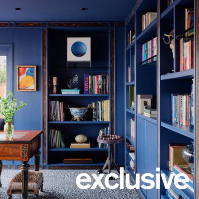
The Veronica Mishaan-designed penthouse in Bogotá demonstrates a calculated use of visual contrast through patterns and textures.
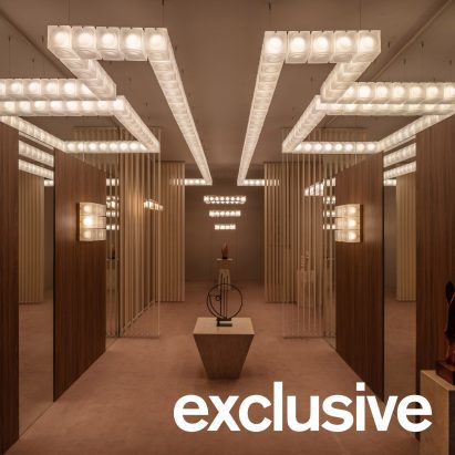
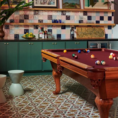
This observation points to a developing pattern in high-end residential and semi-public interiors. The collected examples reveal a movement towards designing highly specific, almost theatrical, sensory experiences within private residences and focused zones. These are not merely decorative flourishes; they are deliberate interventions to manipulate mood, activity, and human flow, primarily through specific materiality and spatial configuration. The emphasis is on curating distinct atmospheric zones, evident in the “billiard tables on cue” lookbook, Anam Design Studio’s club-like dining room, and Lee Broom’s glass-block installation.
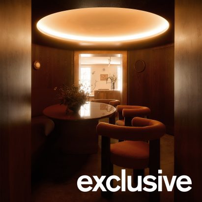
Anam Design Studio’s East Sussex home, with its red travertine kitchen and dark, rounded timber dining room, showcases a strategic use of material friction. The conventional wisdom often champions seamless transitions and visual harmony as the ultimate spatial goal. This perspective frequently overlooks the human need for varied sensory input and distinct energetic zones within a single dwelling. A continuous visual and material language can diminish perceptual engagement, reducing the impact of individual spaces. Anam Design Studio instead embraces intentional material discord, creating a moment of tonal and tactile departure that heightens the experience of transitioning between areas. The warmth of the travertine against the deep, enveloping timber defines separate emotional landscapes, compelling a re-calibration of the occupant’s state as they move.
This approach demonstrates that effective flow sometimes requires moments of deliberate contrast rather than continuous blending. The “successful juxtaposition” seen in Mishaan’s work or the “atmospheric environment” of Lee Broom’s Chant Chambers also reflect this. By mid-2027, the industry will observe a significant rise in bespoke joinery and surface treatments designed to create these distinct material “anchors” within larger open-plan schemes, consciously segmenting perceived space without physical barriers and manipulating tactile quality.
This movement towards deliberate material and spatial friction finds resistance in the prevailing developer-driven push for universal, easily replicable aesthetics. The focus on maximizing broad market appeal and minimizing construction complexity often prioritizes cost-effective, uniform material palettes over the nuanced, custom experiences evident in projects like Anam Design Studio’s. Standardized finishes and simplified floor plans, aimed at wide market acceptance, actively resist the introduction of material tension or specific, mood-defining zones.
An interior professional should, this week, identify one client project and propose a single, materially contrasting element—perhaps a specific wall finish, a segment of flooring, or a piece of bespoke millwork—in a key transitional area. This intervention should aim to create a distinct tactile and visual pause, challenging the surrounding material language rather than blending with it, thereby enhancing spatial awareness and human flow.
TL;DR
Intentional material and spatial friction improves engagement within designed environments.
Curated References
About this editorial — This piece was developed using AI-assisted research and curation across multiple industry sources. All analysis, opinions, and predictions represent the editorial perspective of JHDD. Sources are linked in the references section above.