JHDD Branding Report — 2026.10.10
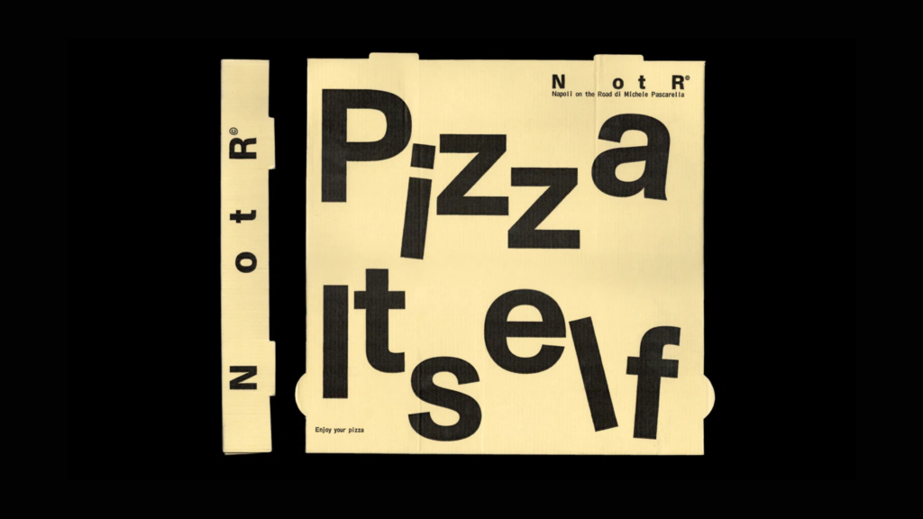
Vrints-Kolsteren’s identity for Napoli on the Road gained attention for its ability to bring “a little mischief to minimalism.”
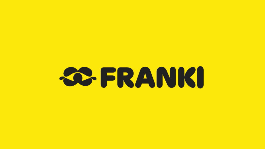
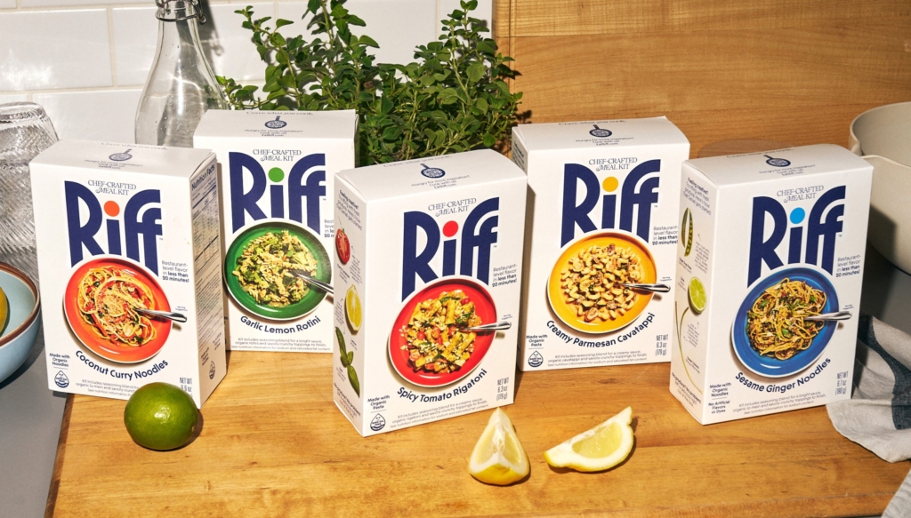
This approach is not isolated to a single project or sector. Across design projects for food, beverage, and dining applications—from Koto’s “lively, thoroughly human, and just the right amount of cute” branding for Franki to Center’s work for Riff—a consistent thread emerges: brands are deliberately deconstructing expected visual codes and reassembling them with a knowing wink. The aim is not outright rebellion against category norms, but a sophisticated reinterpretation, creating distinction without alienating familiar comfort. This shift moves beyond mere aesthetic updates, signaling a deeper evolution in how brand equity is built through visual identity systems, moving beyond superficial adherence to established aesthetics.
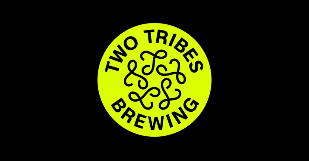
All Purpose’s identity for Two Tribes Brewing exemplifies this strategic maneuver. The work is described as “resolutely ‘craft’, while also turning its back on all which that signifies.” Mainstream industry opinion often dictates that for a brand to resonate as ‘craft’, its visual identity must adhere to a well-trodden path of artisanal cues—rustic textures, traditional typography, and sometimes deliberately unrefined aesthetics. This perspective is fundamentally flawed because it prioritizes a mimicry of historical visual tropes over the actual values and cultural signals that define the category’s evolution. It suggests that ‘craft’ is an aesthetic rather than a philosophy.
True brand equity in the ‘craft’ space, as demonstrated by Two Tribes’ origin from London’s 90s club scene and its Campfire venue acting as a cultural hub, derives from authenticity, independence, and a commitment to distinct, often community-oriented experiences, not from visual pastiche. All Purpose’s work for Two Tribes demonstrates that ‘craft’ can manifest through contemporary, even polished or experimental, visual languages, provided the underlying brand values are genuinely authentic. This redefinition of visual expectation enables stronger market positioning by allowing a brand to own a unique space. Within two years, brands that have rigidly adhered to outdated visual tropes of ‘craft’ will experience significant stagnation in market positioning, finding their once-distinct signals diluted into generic background noise and their cultural relevance diminishing.
This nuanced evolution faces resistance from a specific set of powerful forces. These include risk-averse corporate marketing departments and established brand custodians clinging to proven, albeit increasingly dated, visual formulas. There is also the influence of consumer research methodologies that, by focusing on familiarity and pre-existing associations, inadvertently reinforce conservative approaches to visual identity, hindering genuine brand distinction. Such resistance often stems from a deeply ingrained fear that deviating from established visual language will confuse consumers or alienate existing audiences, reinforcing a conservative approach to brand equity development.
A working branding professional should this week conduct a “category deconstruction” exercise for a current client. This involves visually mapping the five most ubiquitous graphic devices, typefaces, and color palettes used across their competitors’ branding. Following this audit, the professional should identify the client’s truly unique value proposition and then brainstorm three entirely new visual identity concepts designed to convey this proposition specifically without employing any of the identified common category cues. This forces a deliberate break from visual conformity.
TL;DR
Successful modern brands are subtly subverting category visual expectations to forge distinct market positioning.
Curated References
About this editorial — This piece was developed using AI-assisted research and curation across multiple industry sources. All analysis, opinions, and predictions represent the editorial perspective of JHDD. Sources are linked in the references section above.