JHDD Branding Report — 2026.09.04
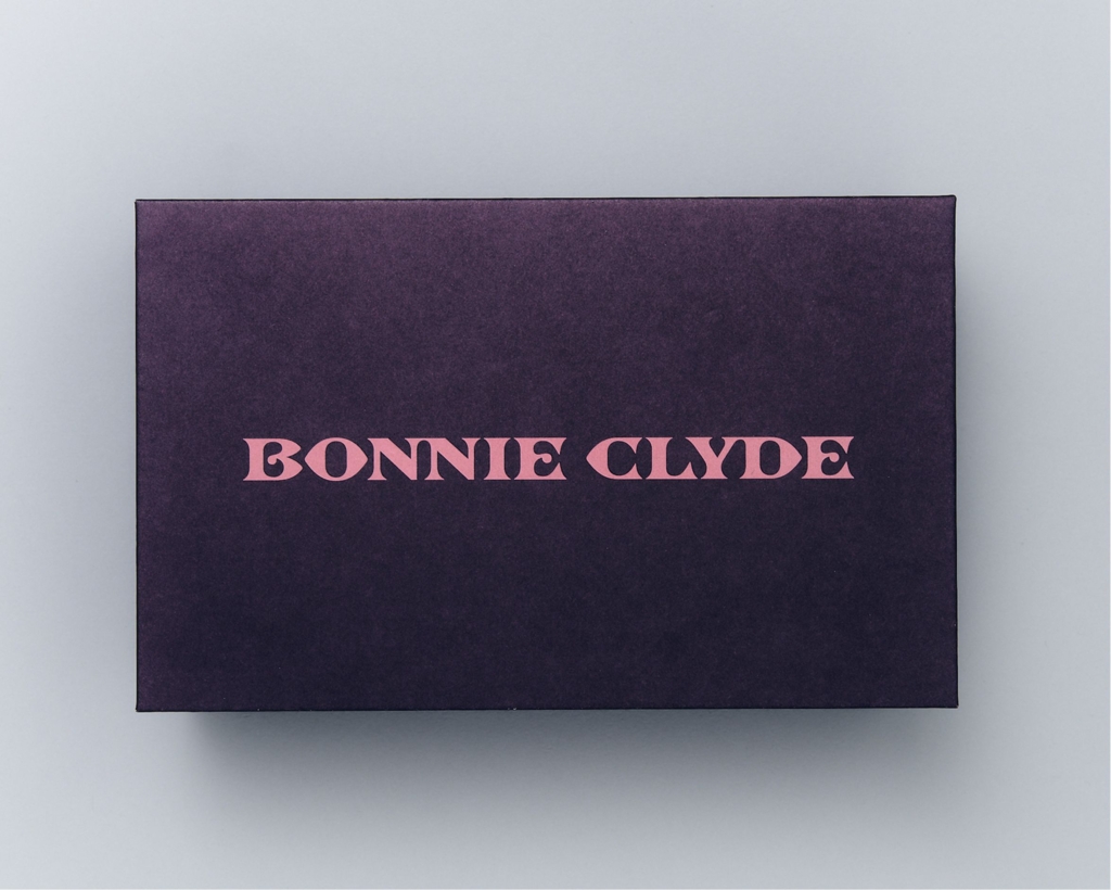
Mouthwash Studio’s identity for eyewear brand Bonnie Clyde is described as “infuriatingly historically inaccurate,” yet achieves a distinct brand presence.
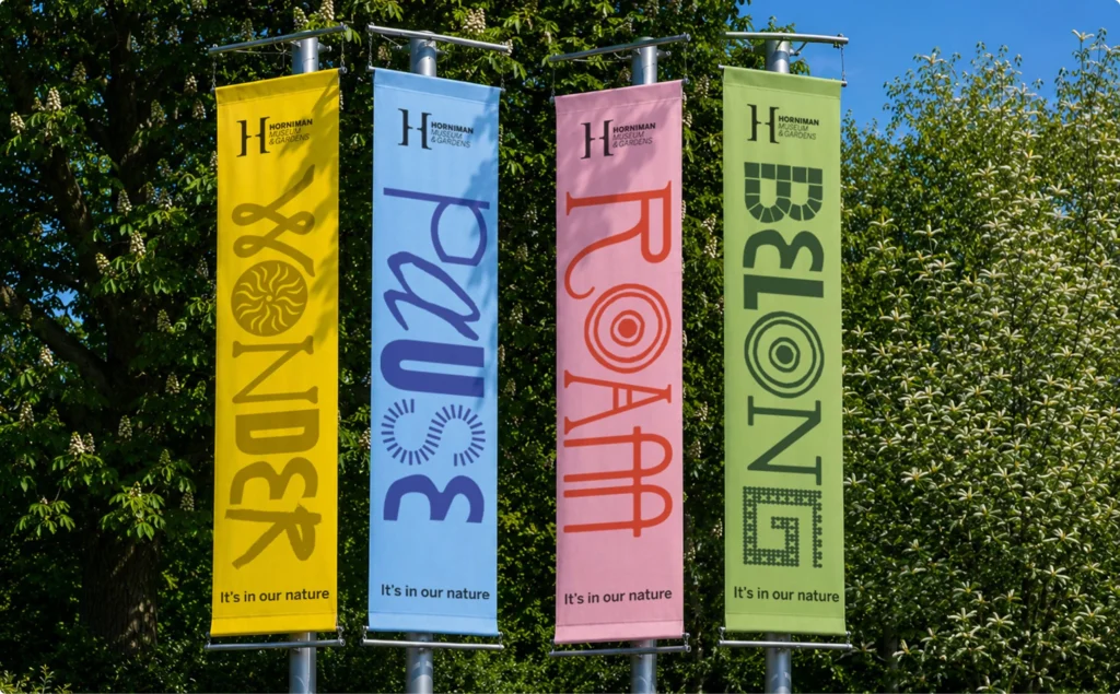
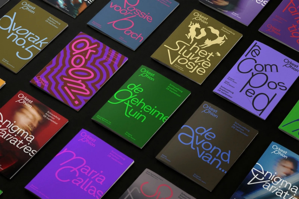
This observation reflects a deeper trend where brand identities gain resonance not through immediate, unambiguous clarity, but through deliberate contradictions, historical anachronisms, or dynamic fluidity. Across diverse sectors, from cultural institutions to consumer goods, the prevailing expectation of a perfectly cohesive and instantly legible brand is being challenged by approaches that embrace complexity. This shift suggests a departure from the traditional quest for singular brand narratives, favoring instead identities that encourage deeper engagement through nuanced and sometimes paradoxical visual signals.
The branding for Bonnie Clyde, as executed by Mouthwash Studio, exemplifies this counter-intuitive strategy. Its visual identity is explicitly noted for being “confusing” and “historically inaccurate,” oscillating between an “antiquey” aesthetic and “girly girly” elements. Conventional branding wisdom dictates that such an approach fragments brand equity and hinders market positioning by creating mixed messages. However, Bonnie Clyde’s identity cultivates a distinct, memorable profile precisely because it defies simplistic categorization. This deliberate incoherence acts as a potent cultural signal, suggesting a brand confident enough to operate outside expected norms, implicitly inviting consumers to look deeper and interpret its layered meaning rather than consume it passively. This approach directly contradicts the mainstream industry opinion that brand identities must prioritize instant recognizability and logical consistency above all else. Brands that embrace this strategic ambiguity, rather than fearing it, often develop more robust, culturally embedded equity.
This move away from rigid consistency is not merely stylistic; it is a strategic repositioning of brand equity, moving from superficial recognition to sustained intrigue. By mid-2027, more brands will consciously deploy visual identities that incorporate elements of historical inaccuracy or intentional stylistic dissonance, recognizing that these layers can build a more resilient and intellectually engaging brand narrative than one-dimensional clarity. This will particularly impact visual identity systems for challenger brands seeking to disrupt established categories, allowing them to differentiate through complexity rather than mere aesthetic novelty.
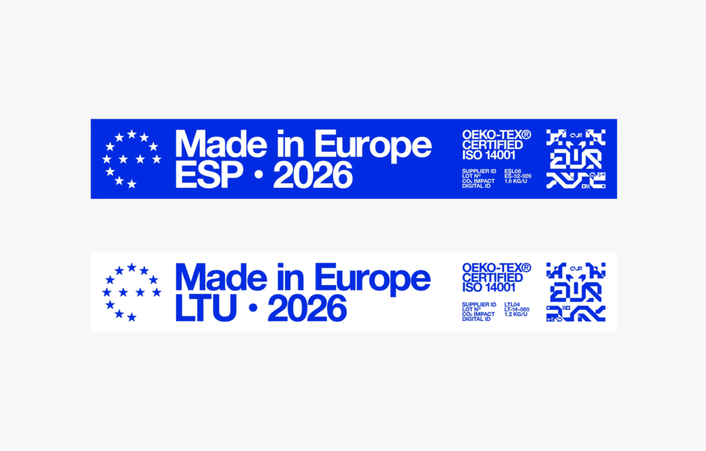
This trend faces resistance from entrenched corporate structures and marketing departments prioritizing quantifiable, easily digestible metrics like immediate recall and brand fit. The discourse around initiatives like “Can Europe Become a Brand?” highlights this opposing view, where the desire for a cohesive, unifying “Made in Europe” designation underscores a deep-seated belief in singular, universally understood brand narratives. Such large-scale, politically charged branding efforts inherently lean towards simplification and consistency, struggling to reconcile with the nuanced, sometimes contradictory visual languages emerging in more agile brand contexts.
A branding professional should, this week, audit a client’s existing visual identity system for opportunities to introduce ‘productive inconsistency’ or strategic ambiguity. This involves identifying specific touchpoints where a non-linear or historically referential visual element, even if initially counter-intuitive, could deepen brand narrative and engage audiences beyond surface-level recognition. This is not about randomness, but about carefully calibrated visual dissonance that adds layers of meaning.
TL;DR
Brand identities are becoming more complex, embracing inconsistency and historical inaccuracy to build deeper equity.
Curated References

About this editorial — This piece was developed using AI-assisted research and curation across multiple industry sources. All analysis, opinions, and predictions represent the editorial perspective of JHDD. Sources are linked in the references section above.