JHDD Branding Report — 2026.09.02
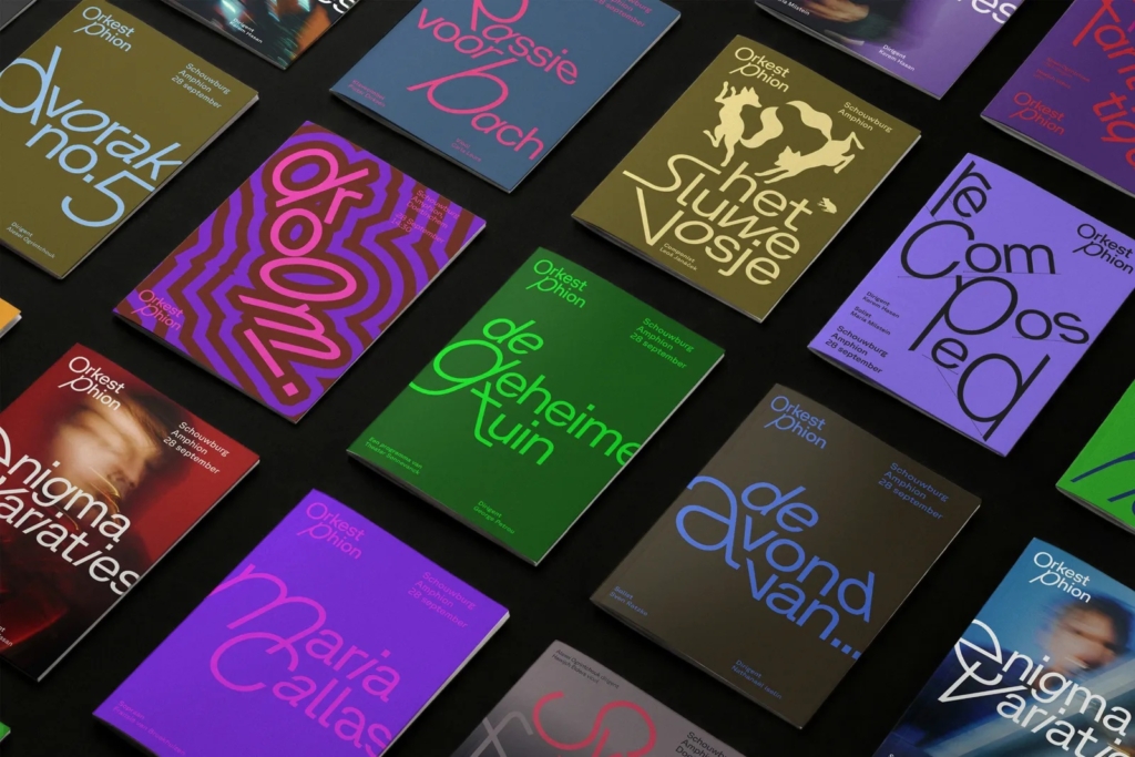
Thonik’s identity for Orkest Phion reflects a Dutch travelling symphony orchestra that performs in different cities and venues.
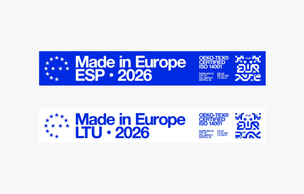
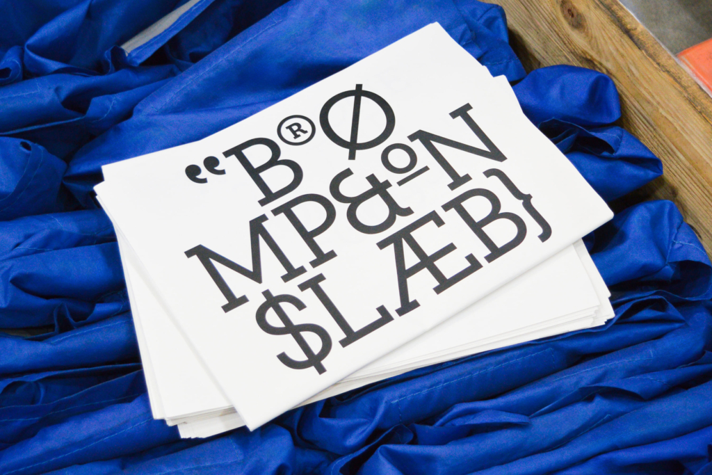
The common thread across these seemingly disparate projects is the shifting definition of brand equity. Brands are either leaning into deep, specific heritage and origin points, like Brompton’s British engineering legacy, or deliberately embracing mutable, sometimes contradictory visual identities, as seen with Orkest Phion’s itinerant programme and Bonnie Clyde’s historically inaccurate aesthetic. This indicates a divergence in how cultural signals are being strategically deployed to build market positioning.
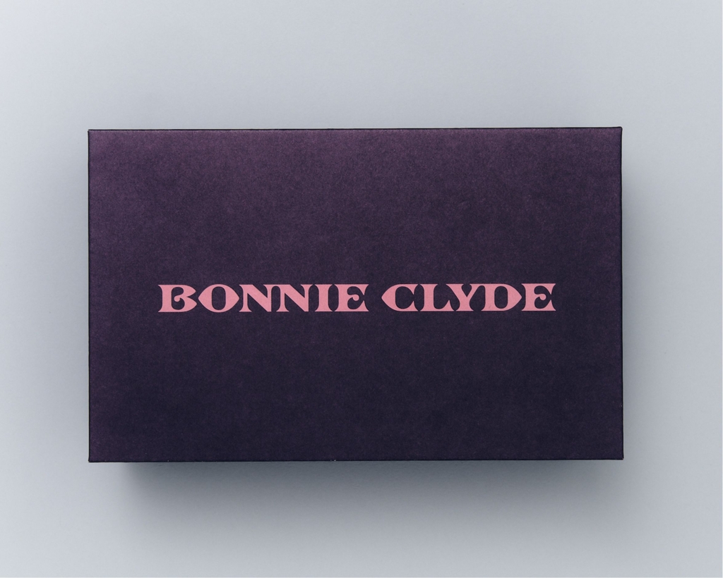
Mainstream branding often prioritizes clarity, consistency, and a coherent narrative, especially around heritage or origin. The Mouthwash Studio approach for eyewear brand Bonnie Clyde, with its “infuriatingly historically inaccurate” elements, directly challenges this. The industry frequently fears anything that might be misunderstood. However, this intentional subversion of accuracy and consistency, rather than diminishing brand equity, can cultivate a deeper, more resonant connection with specific audiences. It signals a brand that is not afraid to play, to be enigmatic, or to demand more active interpretation from its audience. This creates a stronger cultural signal for those who value authenticity beyond literal fact. By late 2027, more challenger brands will deliberately integrate minor visual anomalies or inconsistencies into their core identities, moving beyond simple playful abstraction to signal a sophisticated, self-aware brand narrative that trusts its audience to engage with complexity. This will manifest in design systems that include optional, divergent assets for specific campaign contexts.
The conventional wisdom of static brand consistency is an oversimplification. While Studio Blackburn’s work for Brompton leverages a clear British engineering heritage, creating a stable point of reference, Bonnie Clyde demonstrates the power of controlled inconsistency. The market increasingly values brands that are not always striving for universal legibility, but rather for distinctiveness that resonates deeply with a smaller, more engaged segment. This shift in cultural signal prioritizes depth over breadth in initial understanding. By mid-2028, leading global brands will begin to experiment with adaptive legacy visual identity systems, allowing different geographical or cultural markets to reinterpret specific historical brand motifs, rather than enforcing a singular, static corporate visual identity.
The primary opposing force is the operational imperative for efficiency and scalability within large organizations. Brand guidelines are often designed to simplify, standardize, and reduce error across vast marketing departments and diverse geographic teams, making any form of intentional ambiguity or controlled inconsistency appear as a liability, not an asset. Procurement processes and legal departments also resist anything that deviates from clear, unambiguous messaging, fearing misinterpretation or brand dilution.
This week, evaluate one current brand’s visual identity system. Identify a core visual element that currently aims for absolute consistency. Develop a parallel concept for that element where its visual application could subtly shift, contradict, or evolve based on specific context, audience segment, or narrative theme, without breaking fundamental brand recognition. Document how this controlled inconsistency could add depth to the brand’s story rather than dilute it.
TL;DR
Brand equity is increasingly built through a deliberate tension between heritage-driven clarity and adaptive, context-responsive visual identities.
Curated References

About this editorial — This piece was developed using AI-assisted research and curation across multiple industry sources. All analysis, opinions, and predictions represent the editorial perspective of JHDD. Sources are linked in the references section above.