JHDD Branding Report — 2026.08.28
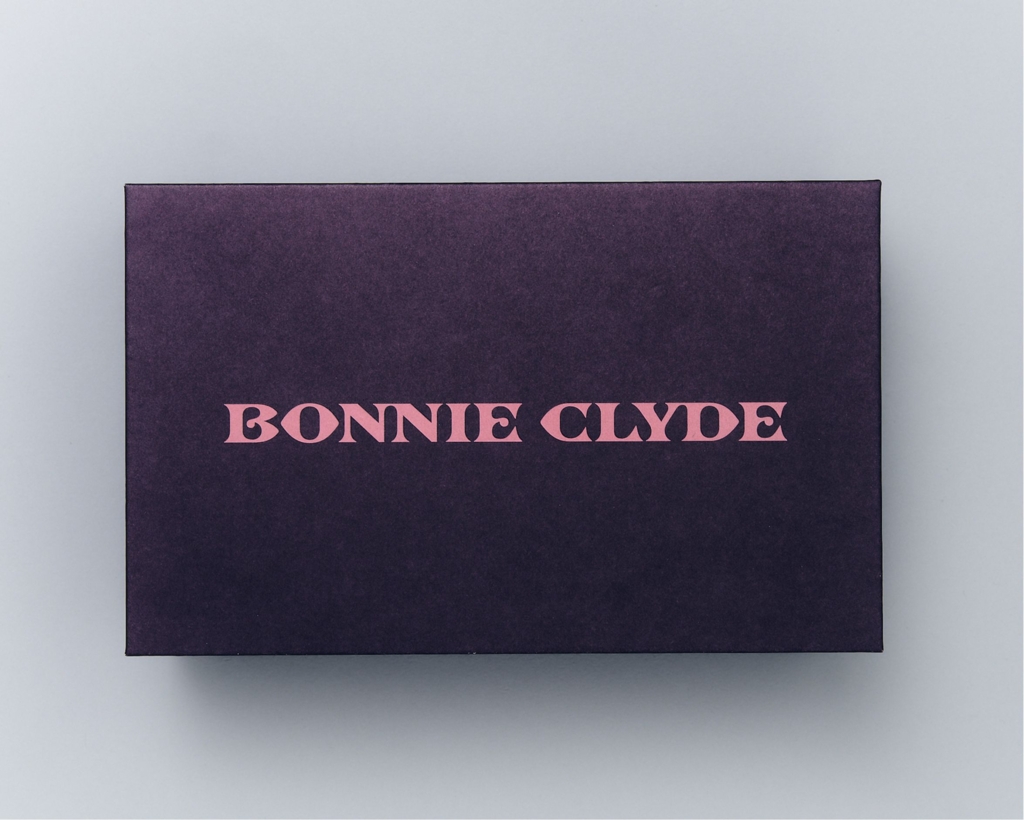
Mouthwash Studio’s identity for eyewear brand Bonnie Clyde presents an aesthetic described as both antiquey and like a “Trewley Precious lash brand partnership.”
These recent projects signal a subtle but significant shift in how brand equity is cultivated and maintained. Brands are increasingly moving away from the conventional demand for immediate clarity or a singular, historically accurate narrative. Instead, they are embracing specific, sometimes complex or even contradictory, cultural signals and visual identities. This curated nuance stands in direct contrast to the industry’s long-standing veneration of “boldness” and disruptive tactics.
The identity Mouthwash Studio developed for Bonnie Clyde, with its blend of “antiquey” styles and “dusky pink” elements, exemplifies this emerging approach. The design is explicitly called “confusing” and “historically inaccurate” by one assessment, yet “ultimately rather lovely.” Mainstream branding wisdom often dictates that a strong visual identity must be instantly decipherable, consistent, and rooted in a clear, verifiable story to build trust and recognition. However, Bonnie Clyde demonstrates that intentional ambiguity and a playful disregard for strict historical linearity can be a powerful asset. By presenting an identity that is not immediately reducible to a single historical period or stylistic trope, the brand cultivates a deeper sense of intrigue and invites engagement, rather than merely broadcasting a pre-digested message. This strategy fosters a more resilient form of brand equity, one built on curiosity and emotional resonance rather than simple informational recall.
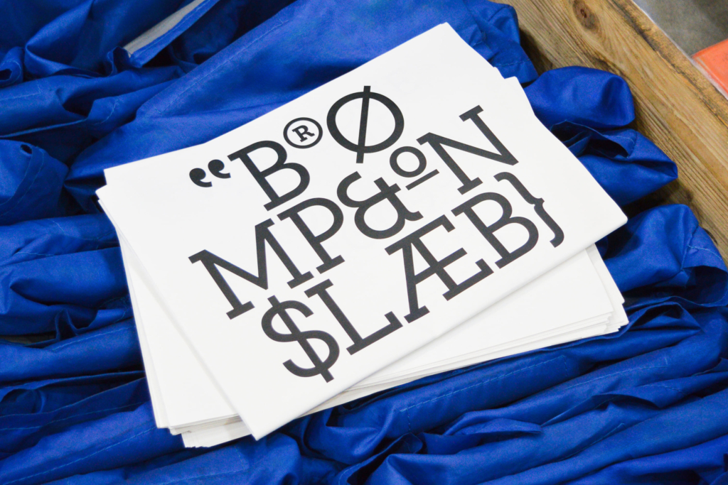
This approach challenges the assumption that clarity must always precede affection in brand building. For brands like Bonnie Clyde, the perceived “confusion” functions as an invitation, prompting consumers to explore the layers of meaning and perhaps even construct their own interpretations. This method forges a more active relationship with the brand, moving beyond passive consumption of its visual cues. Studio Blackburn’s work for Brompton, cementing the folding bike’s place in “British engineering heritage,” similarly leverages specific, deep cultural signals, albeit with historical accuracy. The common thread is a move towards rich, specific identity over generic, easily digestible tropes. By late 2027, more heritage brands and disruptors alike will prioritize deep cultural specificity or intriguing ambiguity in their visual systems over generic “bold” aesthetics, recognizing its potential to create more sticky and memorable brand experiences.
The primary resistance to this nuanced approach comes from traditional marketing frameworks and the internal pressures within organizations. Brand managers often prioritize metrics of instant recognition and clarity, fearing that any deviation from a straightforward narrative will lead to market confusion or dilution of message. This risk aversion is often reinforced by consultants who continue to advocate for “disruption” or “boldness” as universal virtues, pushing for designs that scream for attention rather than inviting contemplation. The perceived need for universal appeal also clashes with highly specific, culturally embedded visual identities.
Branding professionals should spend time this week analyzing how a client’s specific cultural signals or historical details, even contradictory ones, could be visually amplified or juxtaposed to create an intriguing rather than merely descriptive identity. Instead of striving for simplified clarity, explore the potential for curated complexity. This involves moving beyond surface-level mood boards to understand the emotional and intellectual “hooks” that specific, layered visual cues can provide, even if they challenge immediate comprehension.
TL;DR
Brands are building equity through curated ambiguity and specific cultural signals rather than conventional clarity.
Curated References
About this editorial — This piece was developed using AI-assisted research and curation across multiple industry sources. All analysis, opinions, and predictions represent the editorial perspective of JHDD. Sources are linked in the references section above.