JHDD Typography Report — 2026.06.24
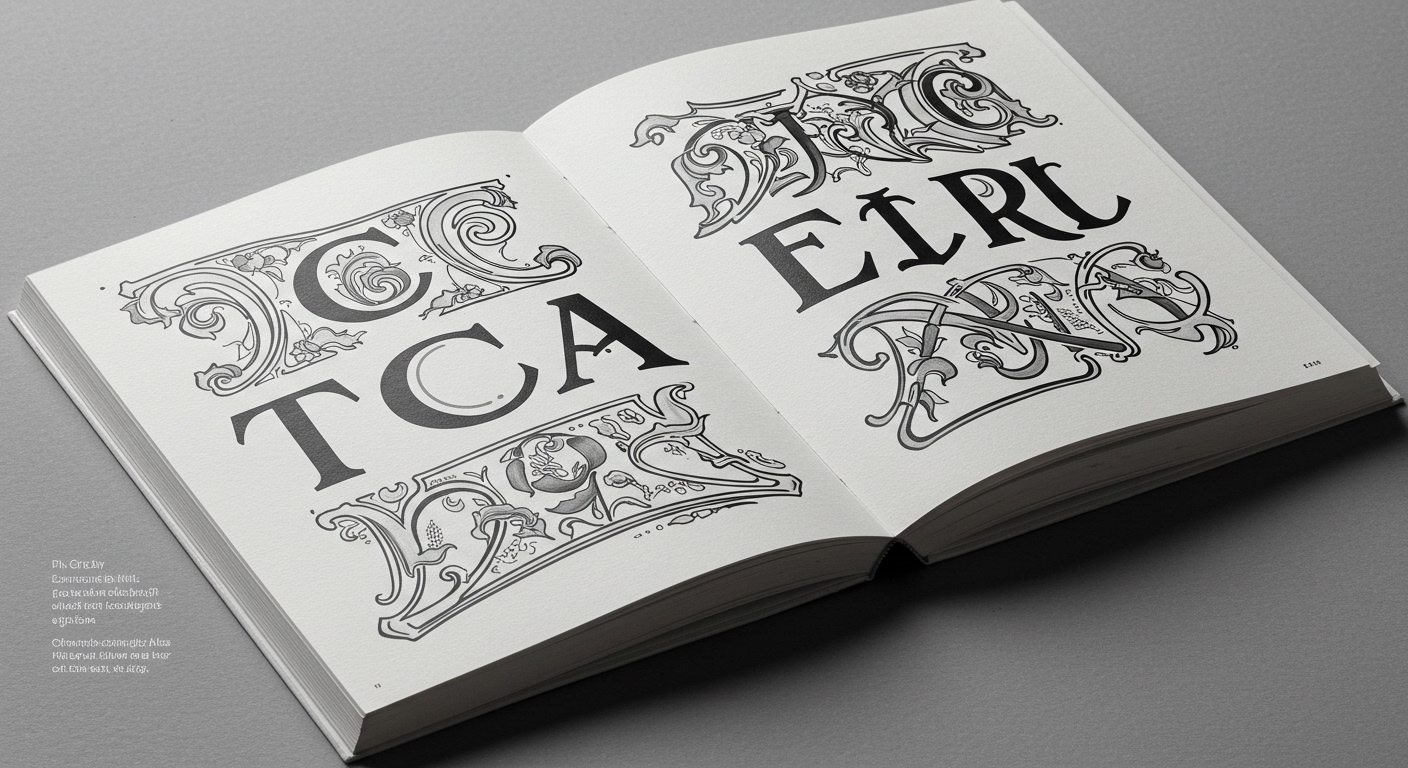
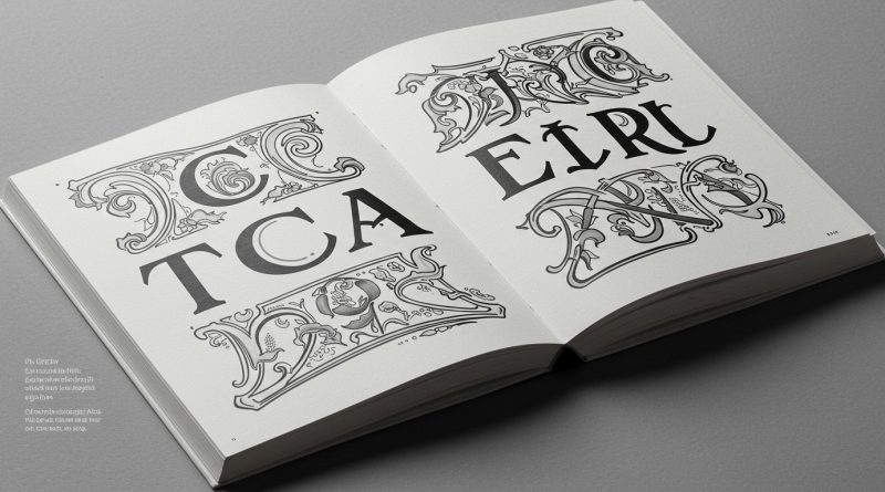
TCA Ethera demonstrates the enduring relevance of Art Nouveau’s ornamental sensibilities.
A discernible pattern emerges from contemporary design discussions, indicating a deliberate re-engagement with historical design movements and expressive forms that challenge the prevailing minimalism in digital interfaces. This movement seeks to inject greater character and conceptual depth into visual communication, moving beyond the functionalist imperative often associated with modern design systems. This trend reflects a desire for design that communicates more than just direct information; it aims for emotional resonance and a sense of unique identity.
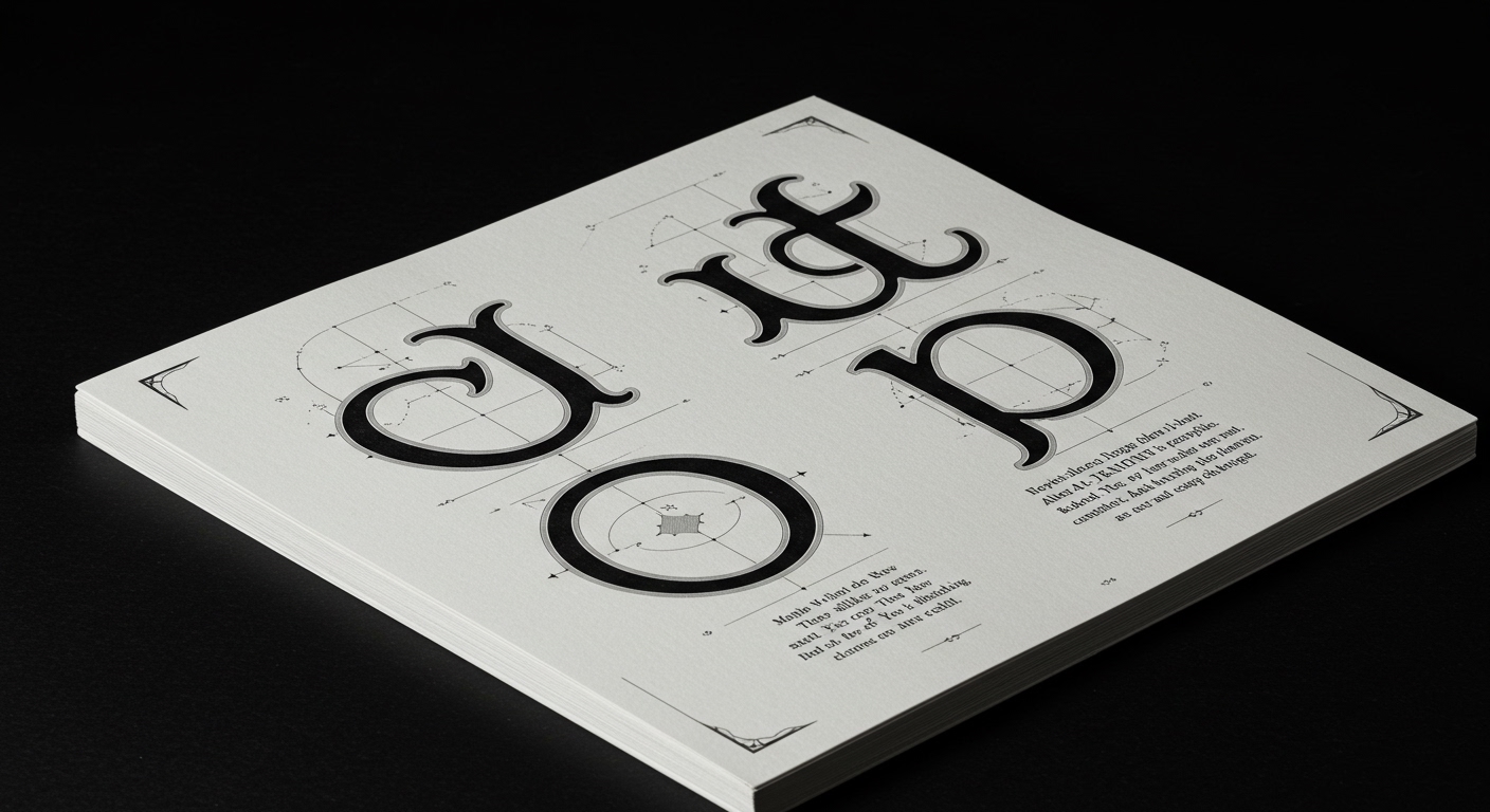
The project TCA Ethera, in its revival of Art Nouveau principles, illustrates this re-evaluation. Mainstream typography often prioritizes objective legibility, particularly in digital contexts, advocating for typefaces that facilitate rapid recognition and minimize cognitive load. This perspective generally positions highly ornamental or conceptual letterforms as secondary, or even detrimental, to effective communication. However, this conventional wisdom overlooks the powerful role of expressive typography in conveying brand personality, establishing a mood, or reinforcing a narrative. Art Nouveau typefaces, with their organic lines and integrated ornamentation, communicate more than just phonetic information; they convey a sense of craft, uniqueness, and a specific aesthetic era. The argument that maximal efficiency in reading equals maximal effectiveness in communication is a reductive one, failing to account for the emotional and mnemonic impact of distinctive letterforms.
Consideration for Art Nouveau elements, as championed by projects like TCA Ethera, suggests a shift in typographic priorities. While legibility remains fundamental, its definition is expanding to include how well type communicates meaning beyond mere readability. The work of designers such as Catalina Estrada, documented in ‘Contra la Oscuridad’, further exemplifies this by embedding natural order and intricate detail into her broader design approach, implicitly informing how her work interacts with textual elements. By late 2027, editorial design for premium brands will increasingly feature custom conceptual letterforms and micro-typographic interventions that intentionally diverge from generic readability metrics, instead focusing on creating memorable, immersive textual experiences tailored to specific brand narratives.
This push for expressive, character-rich typography faces significant resistance from the operational demands of large-scale digital platforms and content delivery systems. The imperative for universal accessibility, cross-browser compatibility, and efficient asset loading frequently leads to the selection of robust, unembellished typefaces and rigid grid systems that prioritize technical performance over aesthetic individuality. Furthermore, design-by-committee processes within large organizations often gravitate towards safer, broadly acceptable typographic choices, discouraging the bold, individualistic expressions seen in historically inspired works.
Typography professionals should identify specific areas within their current projects where micro-typographic systems can introduce controlled expressiveness without compromising core legibility or grid integrity. For example, experiment with applying a highly conceptual display typeface to pull quotes, drop caps, or even specific section titles, while maintaining a clear, highly legible body text and a disciplined grid for primary content flow. This allows for direct, empirical testing of how ornamental or conceptual letterforms can enhance semantic resonance and visual interest in a contained, measurable way, providing tangible evidence for their value.
TL;DR
Intentionality in ornate typography can deepen semantic meaning, offering a counterpoint to the prevailing focus on unadorned legibility.
Curated References
About this editorial — This piece was developed using AI-assisted research and curation across multiple industry sources. All analysis, opinions, and predictions represent the editorial perspective of JHDD. Sources are linked in the references section above.