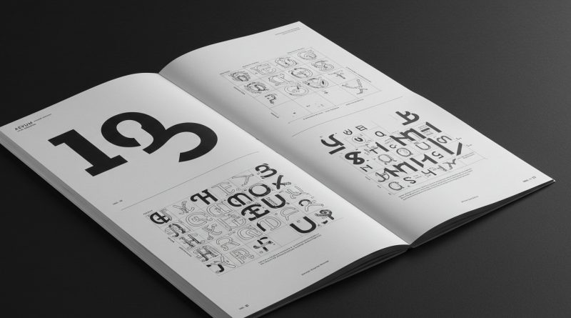
JHDD Typography Report — 2026.06.23
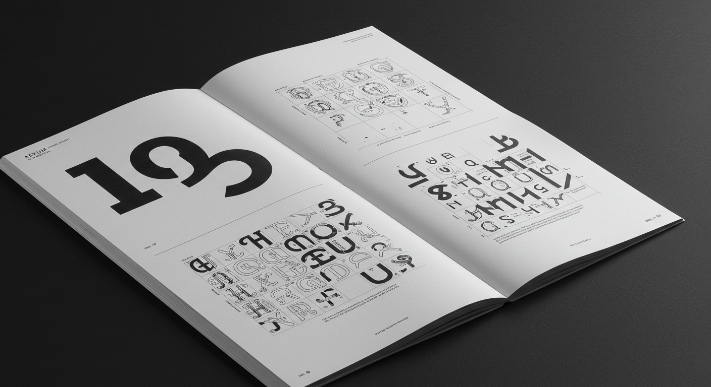
AEVUM suggests that brand identities built to outlast trends may be the smartest move for the booming wellness industry.
The disparate observations concerning AEVUM’s strategy, Steven Heller’s historical reflections on American newspapers and commercial holidays, and the enduring nature of postage stamps coalesce around a quiet but significant shift. There is a perceptible re-evaluation of what constitutes enduring graphic value, prioritizing resilience against transient aesthetic fads. This shift implicitly critiques the constant churn of novelty that often dominates design discourse, instead valorizing forms designed for longevity.
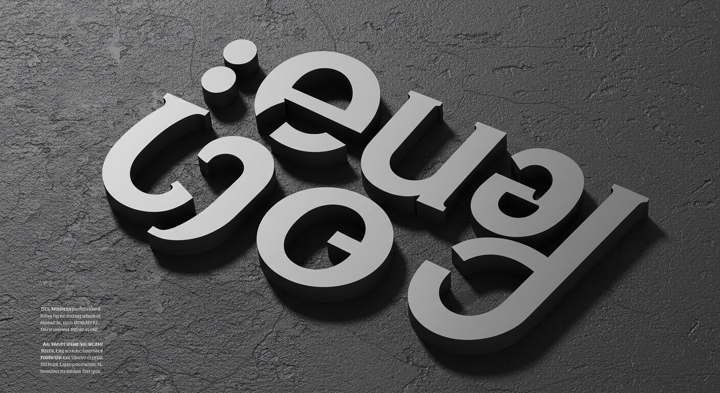
AEVUM’s assertion regarding resistance to wellness trends exemplifies a strategic pivot. Many design agencies prioritize immediate aesthetic appeal, often adopting contemporary typographic fashions to signal relevance. However, this approach risks rapid obsolescence, forcing frequent and costly rebrands. Mainstream industry wisdom often pushes for “freshness,” interpreted as aligning with current stylistic currents. This is a mistake. True strategic value in type and layout is not found in transient novelty but in forms that minimize cognitive load and maximize longevity through considered legibility and robust grid systems. The perceived “timelessness” of design often stems from its ability to remain unobtrusive and highly functional, rather than from overt historical mimicry or stylistic neutrality.
The superficial adoption of current typographic trends frequently undermines legibility by prioritizing visual distinctiveness over reading comfort. For example, highly conceptual letterforms, while visually engaging, can introduce friction in extended text settings. This problem compounds when designers neglect the subtle power of micro-typography, such as precise kerning and tracking, which sustain legibility across diverse applications. A bolder, more sustainable approach involves rigorous testing of type systems for long-term readability and adaptability across media, ensuring that the chosen conceptual letterforms support rather than detract from the message. Within two years, more brands will explicitly seek design partners who can articulate a philosophy of typographic longevity, prioritizing enduring legibility and adaptable grid systems over immediate trend adherence, moving beyond the superficial metrics of “modernity.”
The persistent economic imperative for brands to appear “innovative” or “disruptive” serves as the primary opposing force. This often translates into design directives that demand stylistic differentiation at the expense of long-term typographic stability, frequently driven by marketing teams fixated on quarterly updates rather than generational impact.
A working typography professional should dedicate time this week to analyzing the foundational grid structures and micro-typographic details of classic editorial layouts from publications with a multi-decade legacy. The focus should be on why these systems endured, rather than what specific typefaces they used, paying close attention to character spacing, line spacing, and column width relationships.
TL;DR
The design industry is quietly moving towards valuing typographic longevity and resilience over transient trends.
Curated References
About this editorial — This piece was developed using AI-assisted research and curation across multiple industry sources. All analysis, opinions, and predictions represent the editorial perspective of JHDD. Sources are linked in the references section above.