JHDD Typography Report — 2026.06.17
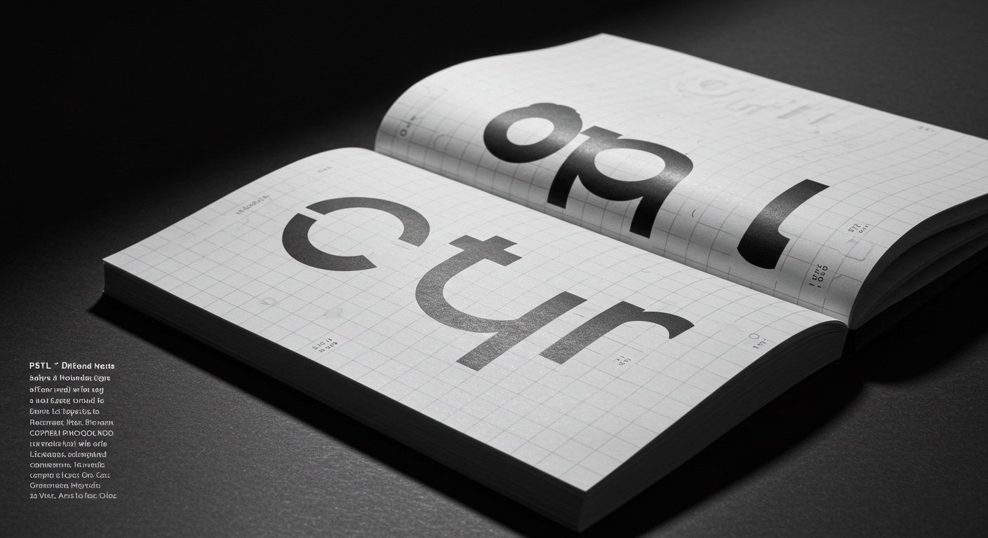
PSTL’s new rounded typeface, Detail, reveals its character through subtle curves and clever deviations rather than overt graphic statements.
This recent observation highlights a consistent pattern across contemporary design: a deliberate pivot towards foundational typographic values. Whether it is PSTL’s meticulous attention to micro-typographic nuance in Detail or JKR’s return to bold, confident typography and a recognizable core asset for KFC, the emphasis is on considered craft. This signals a departure from novelty for its own sake, instead favoring deliberate choices in letterform and structural grid systems that aim for both distinctive personality and enduring legibility.
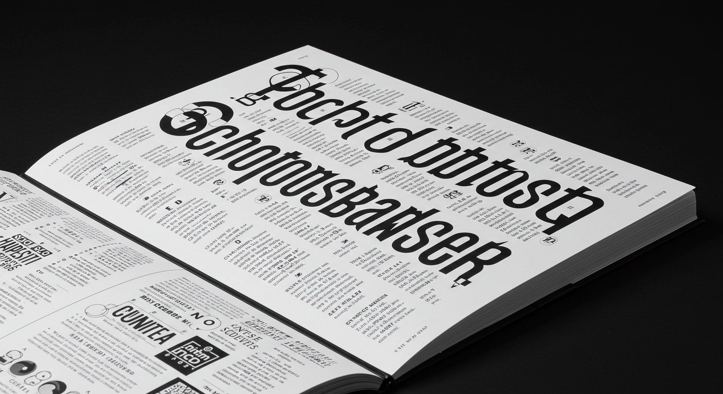
PSTL’s Detail typeface demonstrates that conceptual letterforms can achieve distinctiveness through restraint. Its “personality through subtle curves” contradicts a mainstream industry tendency to equate conceptual depth with exaggerated or overtly experimental letterforms that often compromise legibility. Many designers, eager to push boundaries, frequently mistake complexity or visual eccentricity for true innovation, resulting in typefaces that serve as fleeting curiosities rather than robust tools for communication. This view contends that the most impactful conceptual advancements in typography often derive from careful refinement and intelligent constraint, rather than maximalist expression. Detail exemplifies how a typeface can possess a strong, unique identity without sacrificing the fundamental legibility required for practical application, subtly blurring the traditional distinction between display and text faces.
The consequence of this renewed focus on refined detail will be a significant shift in typographic education by early 2028. Academic programs will increasingly integrate rigorous letter drawing, precise kerning, and micro-typographic analysis as core competencies, moving beyond surface-level font selection into the foundational mechanics of character form and spacing. This educational re-prioritization will, in turn, cultivate a generation of designers and typographers with a deeper understanding of how subtle adjustments affect overall texture, rhythm, and legibility across various media. It will also drive market demand for typefaces that not only convey a distinct conceptual identity but also perform flawlessly at all scales, from large headlines to micro-text on screens.
The primary opposing force to this trend comes from commercial pressures in specific sectors, particularly among rapid-iteration digital brands. These entities often prioritize immediate visual impact and fleeting trend alignment over the long-term integrity of their typographic systems. Custom typefaces, or even adaptations of existing ones, are frequently deployed with minimal scrutiny of micro-typographic details or the underlying grid system, viewed as transient brand elements rather than critical infrastructure. This approach, driven by short development cycles and a focus on quick market presence, inevitably leads to inconsistencies in legibility and visual coherence across platforms.
Typography professionals should, this week, select a commonly used text typeface and conduct a detailed micro-typographic audit. This involves scrutinizing the termination of strokes, the precise curvature of bowls, and the negative space within and between characters at various point sizes. By dissecting these minute details, designers can enhance their understanding of letterform construction and cultivate a more discerning eye for selecting and applying typefaces within their grid systems, directly impacting legibility and conceptual precision in their projects.
TL;DR
Effective contemporary design prioritizes careful micro-typographic details and robust grid structures over overt novelty.
Curated References
About this editorial — This piece was developed using AI-assisted research and curation across multiple industry sources. All analysis, opinions, and predictions represent the editorial perspective of JHDD. Sources are linked in the references section above.