Julian’s Typography Insight — 2026.06.14
Typography, in its most potent form, is not merely about readability; it’s a weapon and a whisper.
The resurgence of print media, coupled with the enduring power of visual communication in a hyper-digital age, underscores typography’s critical role right now. As publications like PRINT Magazine delve into the work of illustrators like Ivan Ehlers, whose political cartoons leverage type as a blunt instrument of commentary, we see a renewed appreciation for the conceptual and confrontational potential of letterforms. Simultaneously, the careful craft behind brands like Adonna Wines, where SSStudio imbues an identity with generational heritage through considered details, highlights the importance of micro-typography and intentionality. The ongoing conversation around legacy and clarity, as explored with Gordon Kaye of GDUSA, emphasizes how robust grid systems and precise character spacing contribute to both immediate legibility and lasting impact. Even ephemeral moments, like Pepsi’s limited-edition Knicks cans, demonstrate how typographic gestures can capture cultural zeitgeist and foster community. This is a moment where the functional imperative of legibility intertwines with the expressive power of design, demanding a nuanced understanding of how type shapes perception and meaning.
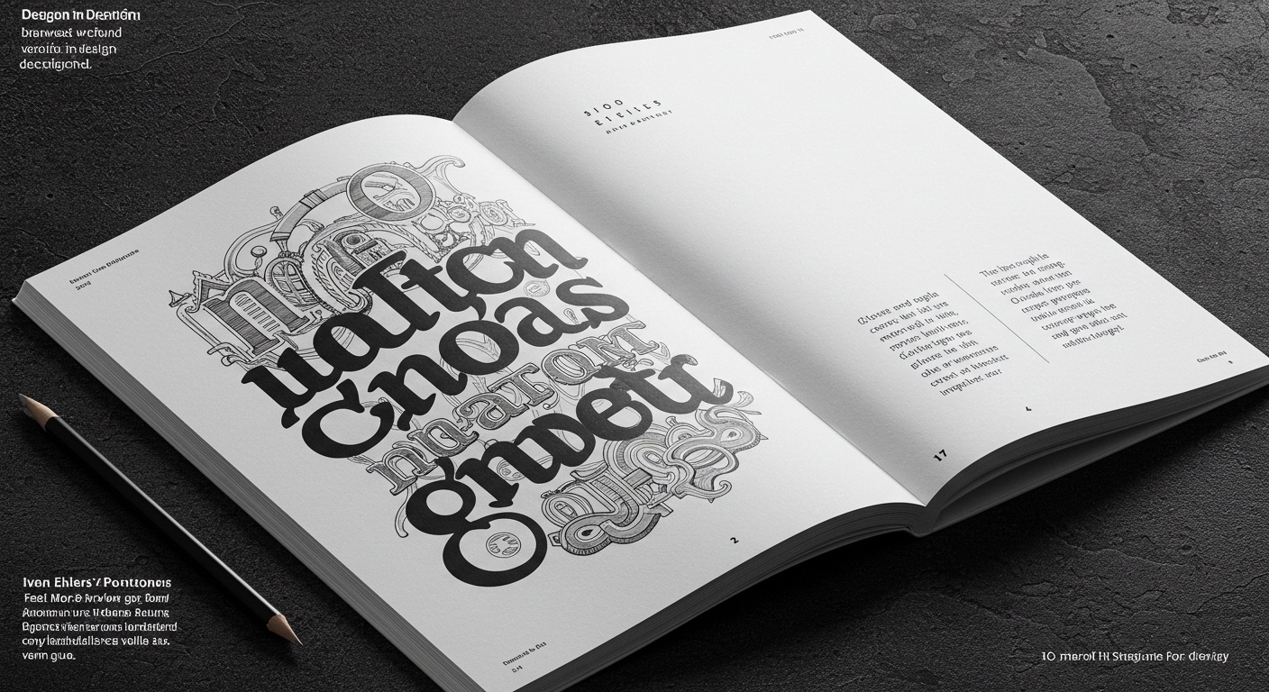
What emerges from these disparate snapshots is a fascinating dialogue between enduring craft and immediate impact. Ehlers’ cartoons, for instance, employ a raw, urgent typography to convey political messages, often relying on bold, even aggressive letterforms to punctuate his observations. This stands in stark contrast to the meticulous, almost heirloomed typography employed by SSStudio for Adonna Wines. Here, the letterforms themselves become imbued with a sense of history and place, suggesting a deliberate slowing down, a tactile appreciation for the printed word and its associated cultural weight. The discussions around GDUSA’s legacy suggest a foundational belief in the power of well-structured grids and consistent typographic hierarchies as the bedrock of good design, ensuring clarity and accessibility across diverse platforms. Yet, the Knicks cans reveal that even within mass-produced consumer goods, a clever typographic application can generate excitement and a sense of shared experience, demonstrating that intentional design can create meaningful, albeit fleeting, connections.
The inherent tension lies in the paradox of typographic universality versus specific context. While the principles of legibility, balance, and hierarchy should ideally transcend cultural and temporal boundaries, the very power of typography to convey specific meaning, emotion, and cultural resonance often relies on its embeddedness within a particular moment or tradition. Ehlers’ stark, politically charged text functions powerfully within its context of social commentary, but might feel jarring or inappropriate in a luxury wine label. Conversely, the understated elegance of Adonna Wines’ identity, while communicating quality and tradition, would likely fail to deliver the immediate punch required for a viral campaign or a political cartoon. This fundamental conflict pits the abstract pursuit of ideal form against the concrete demands of communicative purpose.
The future of editorial design will see an unprecedented integration of bespoke typeface creation for specific narrative voices. Imagine a news publication that commissions a unique, variable font for its investigative journalism section, allowing its characters to subtly shift weight and width to convey urgency or gravity, making the typographic experience an active participant in the storytelling, rather than a passive conduit for information.
TL;DR
Typography is both a tool for clarity and a vehicle for powerful, context-specific expression.