Julian’s Branding Insight — 2026.06.12
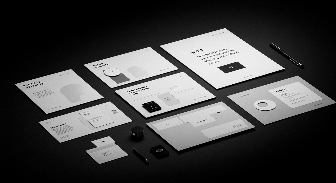
The most profound brands are the ones that whisper, not shout.
In a landscape saturated with ephemeral trends and fleeting consumer attention spans, the enduring power of a well-crafted brand identity has never been more critical. This is a moment where brand equity is not just built on product quality but on the cultural resonance and emotional connection a brand can forge. Market positioning is increasingly defined by a brand’s ability to occupy a unique space in the collective consciousness, signaled not only by its offerings but by its very visual and conceptual language. The ongoing discourse around visual identity systems, as evidenced by recent projects, underscores a pervasive need for clarity, authenticity, and a certain distilled elegance that can cut through the noise.
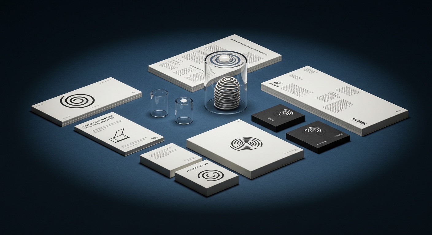
What emerges from these disparate announcements is a clear trajectory: brands are retreating from overt sensationalism towards a more considered, almost elemental approach to design. Pentagram’s work for the Museum of Narratives in Tokyo exemplifies this, utilizing a seemingly simple spiral to convey a complex, cross-disciplinary identity that seamlessly blends tradition with hyper-modernity. This isn’t about slapping a trendy gradient on a logo; it’s about a deep understanding of symbolic language and its capacity to encapsulate a multifaceted experience. Similarly, Creative Spark’s no-nonsense identity for Leo, a hair loss brand, eschews the usual anxieties associated with such products, opting instead for a bold, direct visual strategy that aims to normalize and demystify. This suggests a broader market desire for brands that are both honest and reassuring, stripping away artifice to reveal a core purpose. The reinvention of classic burger joint tropes by Another Collective for Brusco demonstrates how established visual vernaculars can be reinterpreted with a fresh perspective, acknowledging heritage while signaling contemporary relevance in the ever-shifting food scene.
The tension lies in the paradoxical demand for both profound simplicity and undeniable impact. Brands are being asked to be instantly recognizable and deeply meaningful, to communicate complex values through seemingly straightforward visual cues. This is the challenge of distillation: how to convey the richness of a brand’s narrative and its cultural significance through a concentrated, powerful visual identity. It’s the difference between a fleeting advertisement and an enduring symbol. The digital age has conditioned us to expect instant gratification, yet true brand loyalty is cultivated through sustained, authentic connection, something that cannot be manufactured through superficial design.
Looking ahead, expect a resurgence of the ‘quiet brand’ – those entities that achieve significant market penetration and cultural cachet not through aggressive marketing campaigns but through the sheer strength of their carefully curated visual and conceptual ecosystems. These brands will employ understated, sophisticated visual identities that possess inherent longevity, becoming less about fleeting trends and more about timeless archetypes. Their success will hinge on their ability to imbue simple forms with layers of meaning, fostering a sense of discovery and personal connection with their audience, allowing the brand to breathe and evolve organically in the cultural zeitgeist.
TL;DR
Brands are winning by being less loud and more meaningfully designed.