Julian’s Branding Insight — 2026.06.11
In a world saturated with sameness, brands are now daring to embrace the beautifully imperfect as their ultimate differentiator.
The present moment is a crucible for brand equity, a testing ground where cultural signals are amplified and market positioning is redefined with every visual identity system. We are witnessing a seismic shift, a departure from the polished veneer of corporate perfection towards a more authentic, relatable, and indeed, human aesthetic. This isn’t merely about aesthetics; it’s about forging deeper connections by reflecting the nuanced realities of lived experience. Brands that can masterfully weave genuine narratives into their visual language, that can translate cultural zeitgeists into tangible touchpoints, are not just surviving; they are thriving, carving out distinct spaces in an increasingly crowded landscape. The very definition of a strong brand is being rewritten, moving beyond mere recognition to profound resonance.
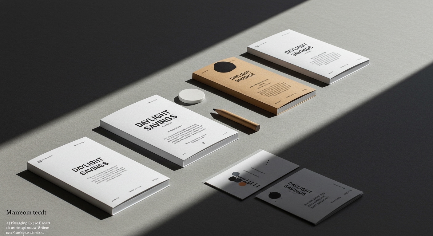
The news arriving from the front lines of design reveals a fascinating dichotomy. On one hand, we see the resurgence of the “no nonsense” identity, epitomized by Creative Spark’s work for Leo, a hair loss brand that bravely tackles a sensitive subject with boldness and clarity. This approach eschews platitudes, opting instead for a direct, empathetic visual language that seeks to destigmatize and simplify a complex personal journey. Simultaneously, Another Collective’s deft reinvention of classic burger joint tropes for Brusco demonstrates a clever engagement with nostalgia, not as imitation, but as a springboard for contemporary relevance. This isn’t about rehashing the past; it’s about understanding the enduring power of familiar visual archetypes and infusing them with a fresh, modern sensibility that resonates with contemporary consumer desires for authenticity and an elevated casual experience. Lisa Cain’s observations on Sunwink’s packaging and Bu Deli’s butter further underscore this trend. Sunwink, with its “Daylight Savings” approach, likely leans into a more relaxed, naturalistic presentation, suggesting a brand that values an unpretentious relationship with its consumer. Bu Deli, through Studio Bland’s work in “Now You See It,” hints at a packaging strategy that prioritizes transparency and clarity, allowing the product’s inherent quality to speak for itself, rejecting unnecessary artifice.
The overarching narrative is one of brands consciously shedding the illusion of unattainable perfection. They are embracing a more honest, sometimes even raw, visual identity that acknowledges imperfections, both in product and in life. This shift signals a profound understanding that consumers, bombarded by curated digital realities, crave tangible authenticity. It’s a move away from the sterile, the overly Photoshopped, and towards the tangible, the imperfectly rendered, the subtly flawed. This isn’t a regression to amateurism, but a sophisticated embrace of visual tactility and emotional honesty, recognizing that true brand equity is built on shared vulnerabilities and relatable truths, not on manufactured ideals.
The tension lies in the simultaneous pursuit of both radical simplicity and nuanced reinvention. How can a brand be both boldly direct, as with Leo, and subtly evocative of heritage, as with Brusco? The answer is in the strategic application of visual language. Simplicity, in this context, is not about a lack of detail, but about an unwavering focus on core message and emotional impact. Reinvention, conversely, is not about novelty for its own sake, but about a deep understanding of established forms and a thoughtful evolution of them to meet contemporary needs. The challenge, and the opportunity, lies in discerning where each approach serves the brand’s ultimate purpose: to connect, to resonate, and to endure.
Within the next five years, we will see a significant increase in brands adopting deliberately “unpolished” visual identities, utilizing textures, analog-inspired graphics, and even embracing subtle visual “errors” as deliberate design choices that communicate trustworthiness and a departure from mass-produced homogeneity.
TL;DR
Brands are ditching perfection for authentic imperfection, a strategic shift towards relatable visual identities that build deeper consumer connections.