JHDD Branding Report — 2026.09.11
Studio South developed an identity for Oodles that makes a noodle joint resemble a perennially hip skate brand.
A distinct pattern emerges in recent design intelligence: overlooked and historically generic categories are becoming unexpected frontiers for sophisticated brand building. This isn’t merely about refined aesthetics for aesthetic’s sake. It is about deliberately injecting potent cultural signals and elevated, often subversive, character into products and services traditionally devoid of them, challenging the long-held assumption that utility must equate to design neutrality. This represents a fundamental shift in how brand equity is generated at the retail shelf and in consumer perception.
Studio South’s identity for Oodles exemplifies this strategic shift with striking clarity. By adopting a visual language reminiscent of a cult-favorite skate brand, featuring no-nonsense stocky black lettering on a postbox red background, Oodles transcends the typical quick-service restaurant aesthetic built on speed and cheapness. This approach directly challenges the conventional wisdom that brand equity in high-volume, low-margin sectors is solely built on price, convenience, or straightforward product descriptors. Instead, Oodles prioritizes a specific subcultural resonance, transforming a functional food choice into an unexpected lifestyle statement. This deep integration of cultural signals into basic commerce not only attracts a specific demographic but also builds a resilient form of brand equity, fostering deep, non-rational connections that extend far beyond mere transactional loyalty. The brand’s visual identity becomes a badge of belonging, rather than just an indicator of product type.
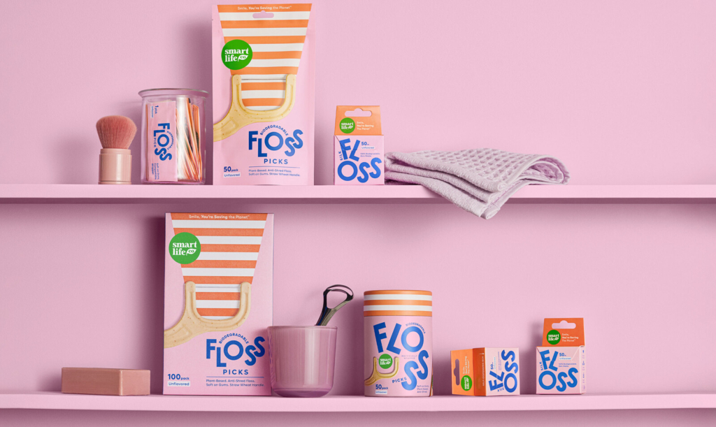
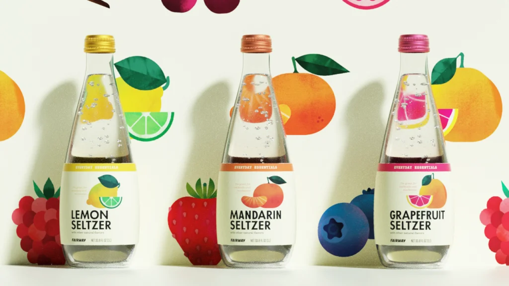
The mainstream industry often posits that brand equity in categories like oral care, which packaging expert Lisa Cain notes are often “where good design usually goes to die,” or supermarket essentials, must lean into universal appeal, functional clarity, or established cues of trust and hygiene. This prevalent view overlooks the potent opportunity for distinct market positioning through deliberate cultural niche-building and visual disruption. The true power lies in carefully alienating some consumers to deeply connect with others, rather than attempting to blandly appeal to an undifferentiated mass market. This strategic selectivity creates stronger, more passionate brand communities. By mid-2028, more regional supermarket chains will undoubtedly follow Fairway Market’s example, commissioning agencies like Mucca to imbue their private label everyday essentials with specific, curated ‘local’ or ‘challenger’ visual identities that intentionally eschew broad, inoffensive aesthetics. This proactive design strategy will transform store brands from mere value options into compelling cultural choices, offering consumers an emotional and identity-driven reason to select them.
The most significant resistance to this evolving approach comes from established legacy brands in these sectors, particularly those with deep distribution networks and decades of investment in broadly appealing, inoffensive visual identities. These incumbents are typically optimized for maximal scale and risk aversion, often operating under the deep-seated assumption that distinctiveness introduces unnecessary friction or alienates too many potential customers. Their entrenched inertia, coupled with reliance on proven, albeit generic, visual codes, acts as a powerful brake on category-wide design evolution. They struggle to shed decades of accumulated brand guidelines designed for universal lowest-common-denominator appeal, thus missing the opportunity to capture the loyalty of increasingly fragmented and identity-driven consumer segments.
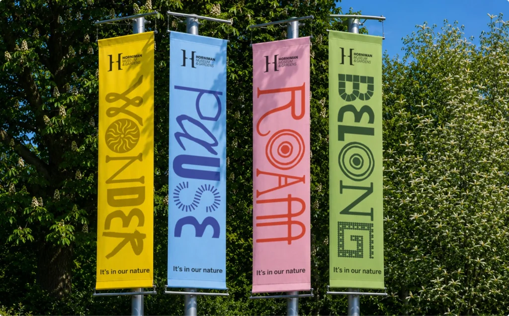
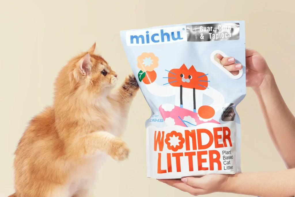
Branding professionals should actively audit their clients’ or their own brand portfolios for historically “unsexy” or functional product lines. Identify categories where current visual identity systems are generic, purely descriptive, or overly safe, such as Michu’s cat litter packaging, which Lisa Cain describes as “Packaging’s Dirtiest Job.” Propose an experimental project to inject a deliberately “misplaced” or unexpected cultural signal, similar to Oodles’ skate brand aesthetic or the Horniman Museum’s charming walrus identity from Anatomy, to a specific product within that line. Focus on how this intervention creates a unique market position and drives brand equity through distinct cultural resonance, rather than simply aiming for aesthetic improvement. This means moving beyond ‘good design’ to ‘strategic design’ that actively shapes perception and belonging.
TL;DR
Strategic brand equity is now found in elevating the mundane through counter-intuitive cultural signals.
Curated References

About this editorial — This piece was developed using AI-assisted research and curation across multiple industry sources. All analysis, opinions, and predictions represent the editorial perspective of JHDD. Sources are linked in the references section above.