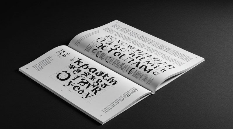
JHDD Typography Report — 2026.08.20
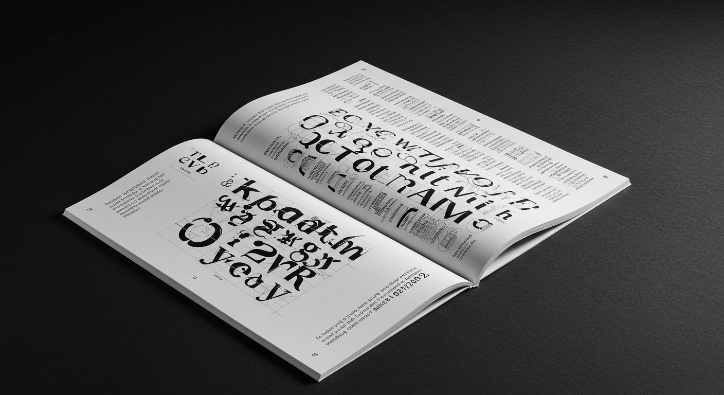
Monotype’s introduction of Gotham Variable, as explored by Sara Soskolne, marks a significant moment in the evolution of established type identities.
This development reflects a wider, unstated pattern across disparate design fields: the continuous adaptation of visual structures, from corporate branding to vernacular signage, in response to new technological capabilities and cultural demands. The drive is often to retain core recognition while expanding functional utility, whether for new audiences as seen in the 1939 New York World’s Fair branding, or for enduring relevance like Seymour Chwast’s sustained output. These instances highlight an ongoing negotiation between fixed identity and the necessity for visual adaptation.
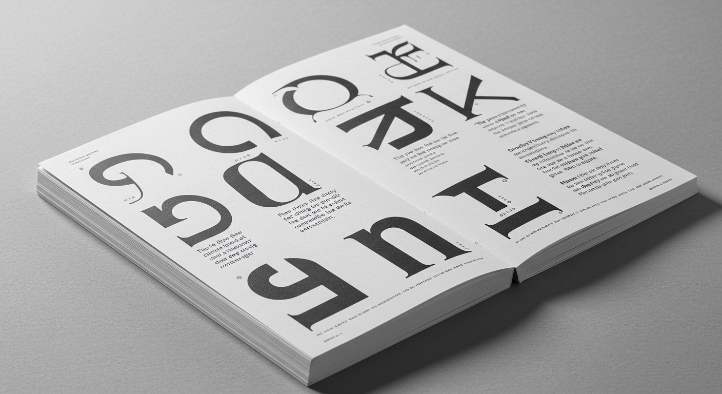
Gotham Variable exemplifies this tension and opportunity. The granular control offered by variable font technology, particularly when designers consider its integration with processes influenced by AI, extends beyond mere stylistic variation. It facilitates precise micro-typographic adjustments that can significantly impact a typeface’s performance. This is not simply about offering a broader aesthetic palette, but about optimizing legibility and information hierarchy in fluid digital environments where screens and viewing conditions vary constantly. The underlying logic that makes Gotham recognizable must now perform across an expanded spectrum of applications, demanding a deeper engagement with its optical properties.
Mainstream industry discourse often emphasizes the dramatic, conceptual letterform possibilities of variable fonts—the overt dynamism and animated type that provides a “wow” factor. However, the more critical and understated power lies in their capacity for almost imperceptible, context-aware micro-typography. True advancement is found in the granular control over parameters like optical size, weight compensation, and width for specific grid cells or reading distances, enhancing sustained legibility without drawing attention to the type itself. This subtle application of technology is often overlooked in favor of more overt, expressive uses, which can paradoxically compromise readability for visual flair. By mid-2028, successful variable font implementations will be judged less by their overt dynamism and more by their seamless, almost invisible contribution to legibility across diverse screen sizes and user accessibility needs.
This subtle, legibility-focused application is resisted by market pressures for readily demonstrable, visually striking applications of new technology. The pursuit of “viral” visual content, often prioritizing immediate impact over sustained reading comfort, frequently overshadows the meticulous work required for advanced micro-typographic optimization. The commercial imperative for immediate, eye-catching results often pushes designers away from the detailed, incremental improvements that truly enhance the user experience.
Typography professionals should, this week, experiment with variable font axes to create nuanced optical size adjustments for body text across common grid breakpoints, such as mobile, tablet, and desktop views. Focus on how minute changes in weight or width improve reading flow and character distinction, rather than exploring extreme stylistic variations. Document these subtle improvements to demonstrate the tangible benefits of micro-typography in enhancing legibility and overall user experience.
TL;DR
Variable font technology’s most impactful use lies in subtle legibility enhancements, not just overt conceptual display.
Curated References
About this editorial — This piece was developed using AI-assisted research and curation across multiple industry sources. All analysis, opinions, and predictions represent the editorial perspective of JHDD. Sources are linked in the references section above.