JHDD Branding Report — 2026.08.18
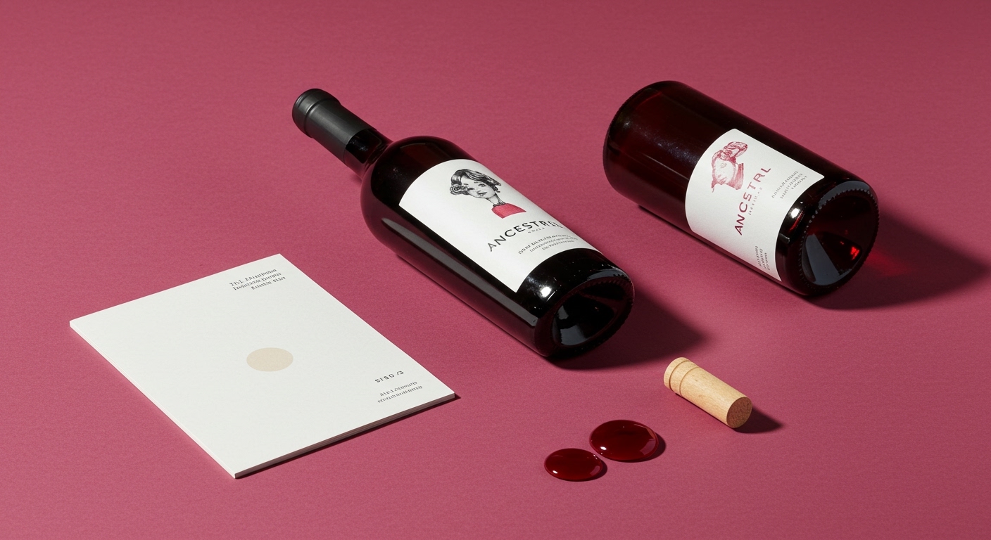
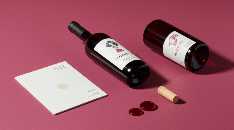
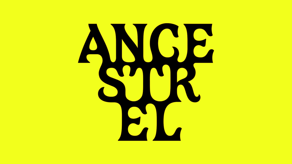
All Purpose’s “lurid” new identity for Ancestrel decisively rejects established visual tropes within the natural wine category.
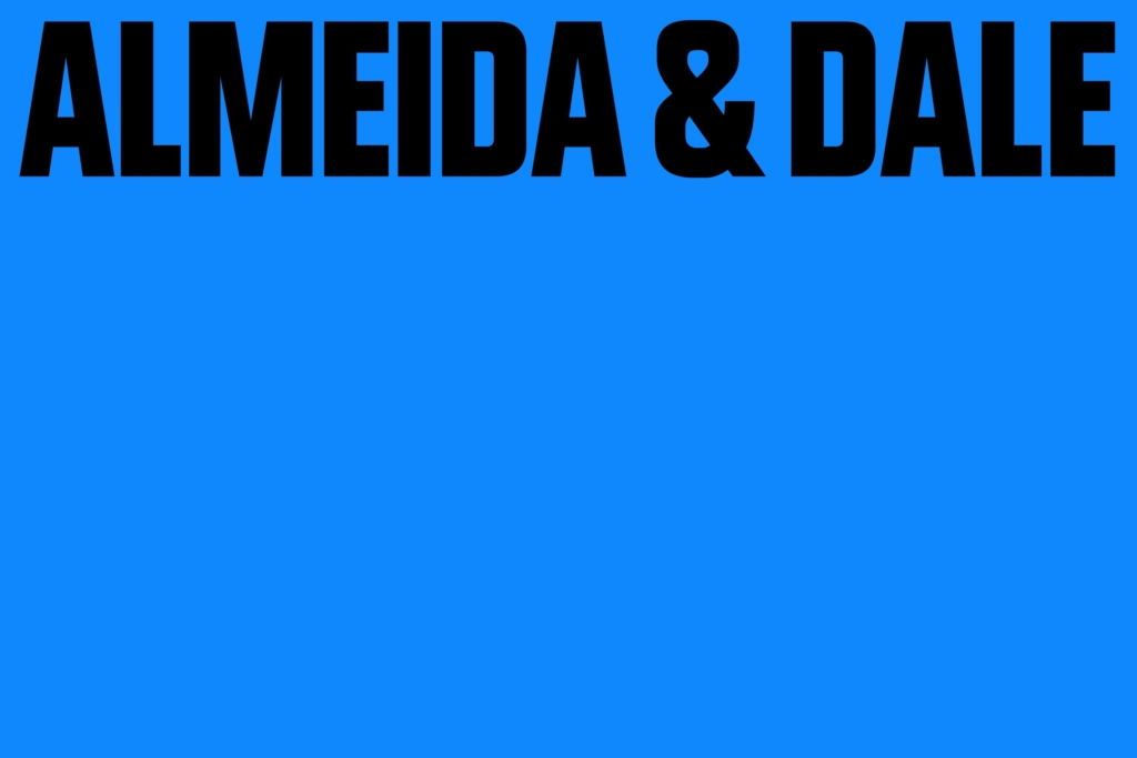
Across the diverse projects for Almeida & Dale, Ancestrel, and Vans, a specific strategic tension emerges in brand visual identity. Studios like Porto Rocha, All Purpose, and Accept & Proceed are navigating how design can either powerfully affirm existing cultural equity or deliberately signal a radical break from category conventions. For Almeida & Dale, founded in 1998 in São Paulo, Porto Rocha developed a bold yet sensitive identity that respects its established programme of exhibitions and art fairs. In contrast, All Purpose created a lurid identity for Ancestrel, explicitly ditching wine clichés to position the first UK natural wine importer. This is not merely about aesthetic choice but a calculated market positioning through design, calibrating how much an identity leans into familiarity versus forging a starkly new path to secure relevance in niche or evolving markets.
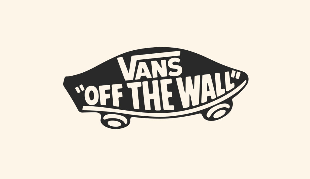
Consider Accept & Proceed’s approach for Vans. The common industry impulse, especially when a brand has global recognition and a long history, is to find ways to “modernize” or “refresh” what might be perceived as stale. This often leads to overengineered rebrands that strip away the very markers of authenticity that consumers value, failing to understand the cultural signals already deeply embedded. Accept & Proceed, however, understood that Vans did not need reinvention. Its strategy focused on refining, not overhauling, recognizing that the brand’s profound cultural capital resides in its long-standing visual codes and the genuine wear and tear on its products, as exemplified by the description of a well-loved pair of Vans. The mainstream opinion frequently conflates stagnation with consistency, pushing for dramatic visual shifts where a brand’s strongest asset is its established iconography and loyal subculture.
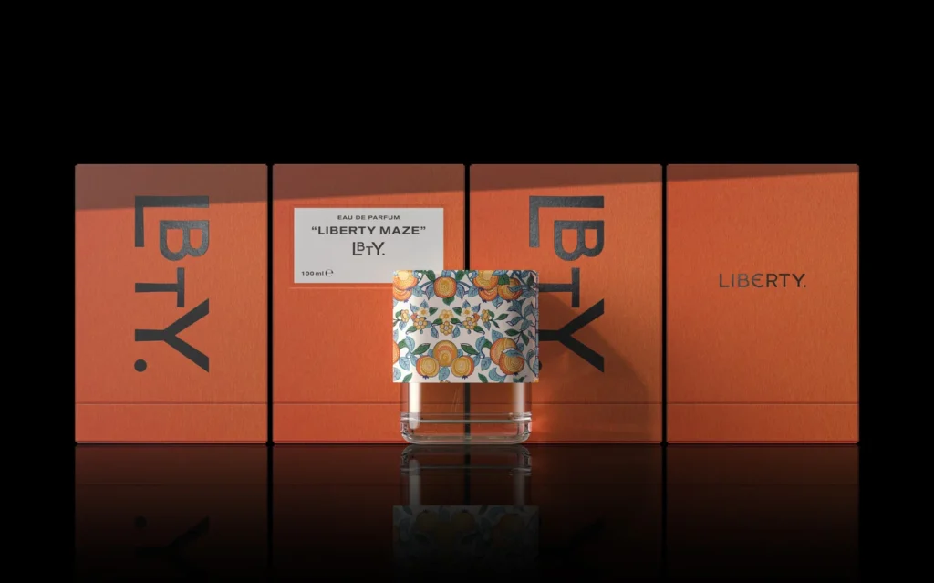
This suggests that for brands deeply embedded in specific subcultures or with multi-generational appeal, brand equity is often best served by careful stewardship rather than wholesale disruption. The success of this subtle evolution stands in contrast to the prevailing belief that brand reinvention is a prerequisite for continued growth and market positioning. Furthermore, the work by Lisa Cain on Pentagram’s packaging for Liberty fragrance brand LBTY, which focused on “packaging the essence of heritage,” underscores this point, highlighting the power of respectful refinement over radical departure. By mid-2027, JHDD expects more legacy brands to commission visual identity updates that prioritize reinforcing existing, beloved elements and cultural signals over wholesale creative overhauls, understanding that ‘less change’ can often mean ‘more equity’ and stronger market positioning. This shift will be driven by consumer fatigue with superficial visual refreshes and a deeper appreciation for authentic brand narratives reflected in stable aesthetics.
The primary opposing force to this nuanced approach remains the short-term market pressure for novelty, particularly from investment groups and marketing departments fixated on immediate spikes in engagement metrics. These entities often misinterpret market “buzz” for genuine brand health, pushing for visually dramatic, if ultimately shallow, transformations. This also includes the influence of certain design trends that prioritize sleek uniformity or abstract minimalism, detaching brands from their specific historical and cultural anchors in pursuit of a generic “modernity” that risks diluting hard-won brand equity.
A branding professional should conduct a “cultural equity audit” for their clients before initiating any visual identity project. This involves mapping specific visual elements, typography, and color palettes to deeply held consumer associations and subcultural significance, rather than simply assessing aesthetic datedness or current trend alignment. The exercise should prioritize identifying what specific aspects of the visual identity cannot be changed without eroding core brand value and its market positioning, then design within those constraints to enhance rather than replace, similar to how Accept & Proceed strategically approached Vans’ enduring appeal.
TL;DR
Strategic brand identity work increasingly prioritizes reinforcing existing cultural equity over outright visual reinvention.
Curated References
About this editorial — This piece was developed using AI-assisted research and curation across multiple industry sources. All analysis, opinions, and predictions represent the editorial perspective of JHDD. Sources are linked in the references section above.