JHDD Branding Report — 2026.08.15
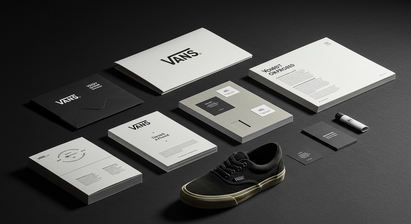
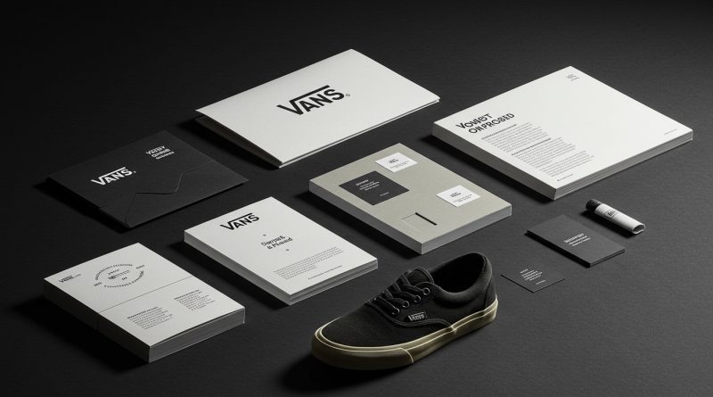
Vans’ new brand identity by Accept & Proceed retains the company’s well-loved three-hole plimsolls aesthetic, resisting wholesale reinvention.
Across these varied design projects, a distinct pattern emerges where successful brand identities demonstrate a deep, almost anthropological understanding of an existing cultural footprint. This goes beyond simple brand guidelines; it involves identifying and amplifying specific, often overlooked signals that anchor a brand in user experience or market position. Whether preserving a visual legacy, like Accept & Proceed did for Vans’ three-hole plimsolls aesthetic, or strategically discarding industry clichés as All Purpose achieved for Ancestrel, the effective approach is highly contextual. It actively rejects generic modernization in favor of resonant specificity, demonstrating a shift in how brand equity is genuinely built and sustained.
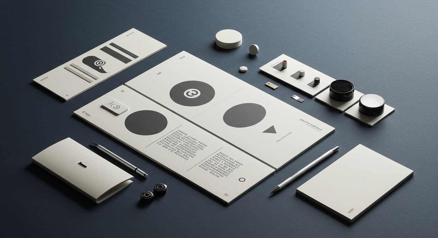
The work by All Purpose for natural wine importer Ancestrel provides a compelling case study for this nuanced specificity. Ancestrel, known as the first UK importer of natural wine, adopted a “lurid new identity” that actively ditches traditional wine clichés. This decision directly contradicts the mainstream industry opinion that challenger brands must adopt a sophisticated, often minimalist aesthetic to signal premium quality or progressive values. Instead, Ancestrel leans into an aesthetic that is purposefully disruptive and perhaps even unpolished, mirroring the authentic, often unconventional character of natural wine itself. The choice of “lurid” over “elegant” creates a strong cultural signal, distinguishing Ancestrel from both established wine brands and the often-homogenous visual language of many new-age organic products.
This strategic embrace of the unexpected, leveraging a specific subculture’s existing semiotics rather than imposing a new, generic “premium” look, builds distinctive brand equity. It cultivates loyalty among an audience that actively seeks out non-conformity. It allows Ancestrel to own a unique market position without sacrificing recognition or appearing derivative. Branding professionals often assume a new identity must cleanse the slate of “bad taste” or “outdated tropes,” but Ancestrel demonstrates the power of deliberately amplifying elements that might be considered transgressive by mainstream standards. This specific approach, where visual identity systems are crafted to embody subcultural visual codes and counter-narratives, will be increasingly central to brand equity. More established brands will be seen commissioning “anti-cliché” visual systems by late 2027 to appeal to discerning, segment-specific audiences who value authenticity over aspirational gloss.
This trend faces significant resistance from established corporate marketing departments and certain branding consultancies. Their conventional wisdom often dictates that brand identities must prioritize broad appeal, immediate legibility, and quantitative testing metrics, which frequently lead to visually safe, universally palatable but ultimately undifferentiated outcomes. The fear of alienating any segment of a potential audience often results in the smoothing out of truly distinctive or polarizing visual elements, leading to a homogenizing effect across categories.
A branding professional should, this week, conduct a deep ethnographic audit of their client’s current audience, rather than solely focusing on their target audience. Identify three specific visual cues, symbols, or even “imperfections” that are beloved by the brand’s most fervent existing users. Then, strategize how to amplify, rather than eliminate, these elements in future identity work, using them as foundations for a stronger visual identity system.
TL;DR
Effective brand identities deepen existing cultural connections rather than seeking universal appeal through generic modernization.
Curated References



About this editorial — This piece was developed using AI-assisted research and curation across multiple industry sources. All analysis, opinions, and predictions represent the editorial perspective of JHDD. Sources are linked in the references section above.