JHDD Typography Report — 2026.08.14
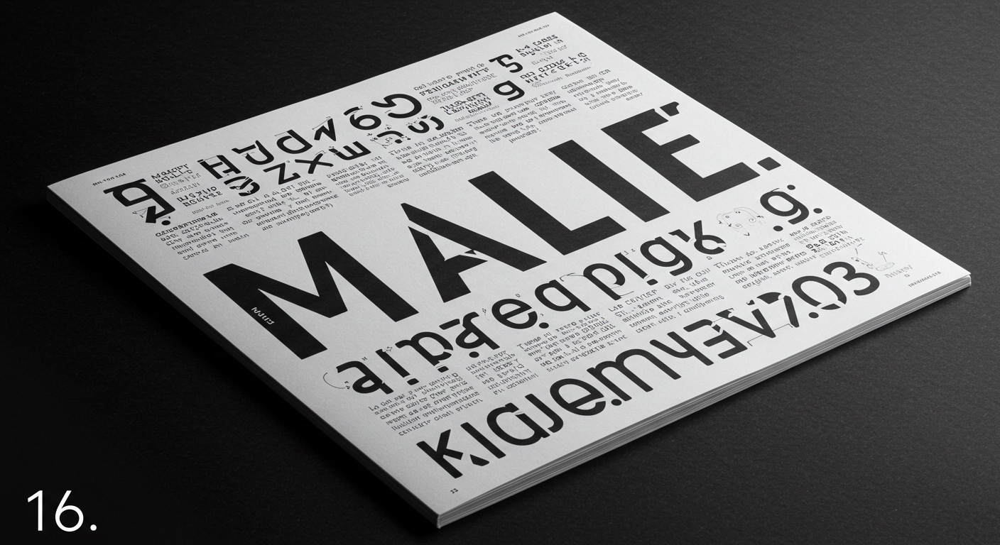
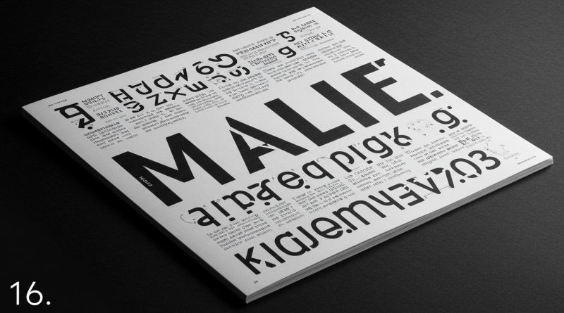
The editorial dissonance evident in ‘MALE.’ highlights an ongoing challenge in contemporary editorial design.
Across these varied accounts, from the historical showmanship of P.T. Barnum to the contemporary reflections of Justin Wong, a consistent underlying tension emerges: the increasing instrumentalization of typography for immediate conceptual impact, often at the expense of its foundational principles of legibility and systematic coherence. Designers are frequently asked to push letterforms and grid structures to convey abstract ideas or evoke strong emotions, rather than to primarily facilitate reading. This redefinition of type’s core purpose creates specific challenges for micro-typography and the integrity of established grid systems.
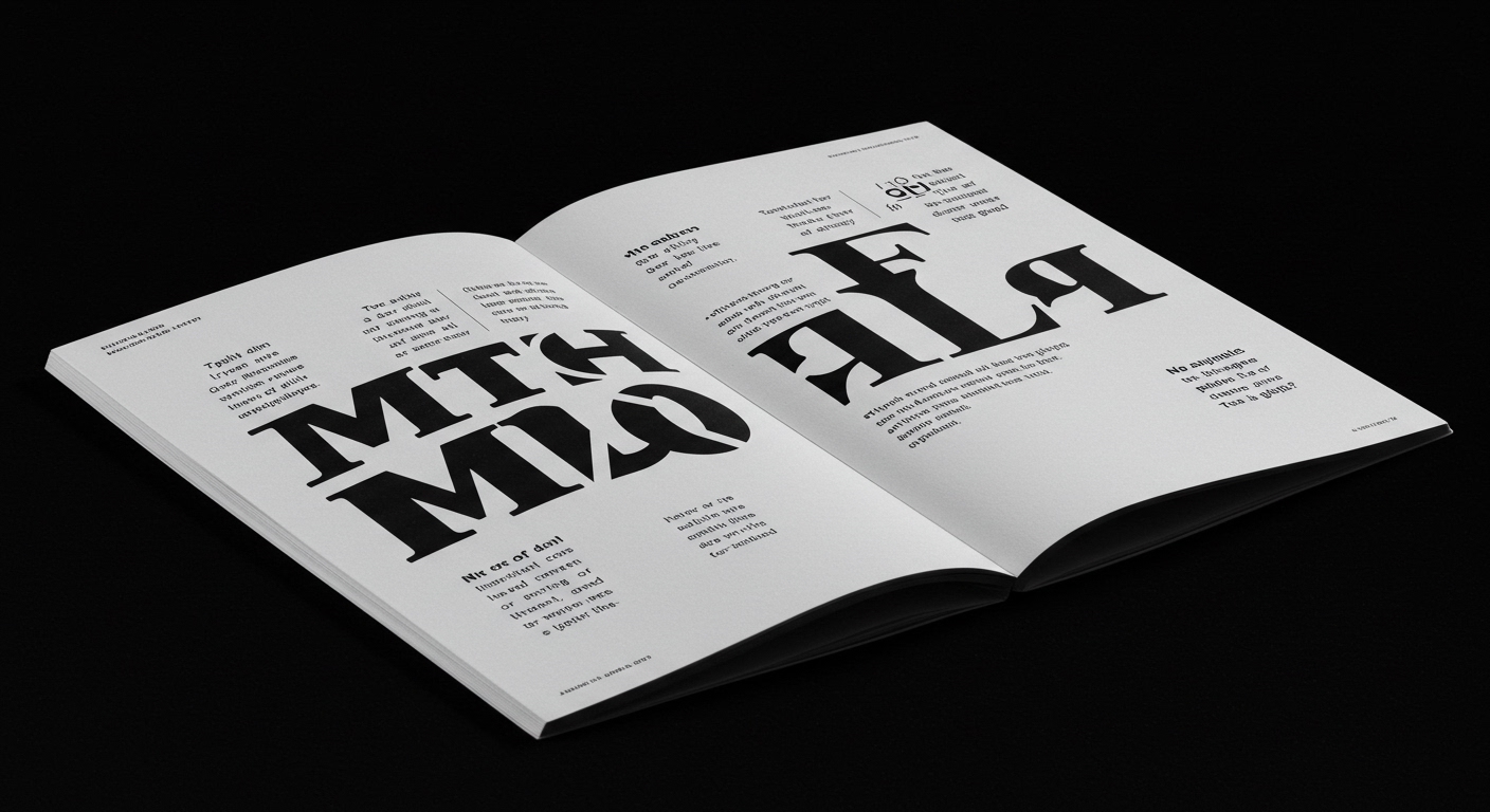
Justin Wong, as an incoming AIGA NY president, reflects on balancing his instinct to keep moving forward with an appreciation for what is happening right now. This stance subtly challenges a mainstream industry bias that tends to valorize novelty and conceptual expressiveness above all else, especially within academic and award circuits. The common industry assumption is that “forward movement” in typography inherently means pushing boundaries of form, creating increasingly conceptual letterforms, or deliberately breaking established grid systems for effect. However, a more critical perspective suggests that genuine forward momentum in typography can equally involve a deeper mastery of micro-typography within existing frameworks, optimizing for a more nuanced and sustained legibility that serves readers beyond the initial visual shock. Prioritizing legible and robust grid systems, even when employing expressive display type, constitutes a more difficult and ultimately more valuable form of innovation than merely abstracting letterforms to the point of unreadability. It acknowledges that the vast majority of typographic interactions are not about shock, but about sustained information transfer. This approach requires precise attention to detail, not just broad strokes.
The pursuit of expressive, less-legible typefaces and fractured grid systems often disguises a lack of mastery in micro-typographic controls. It is easier to justify an abstract, hard-to-read headline as “conceptual” than it is to perfectly balance character spacing, word spacing, line-height, and baseline shifts for optimal reading comfort across an entire publication. By mid-2027, the industry will begin to see a renewed focus on tools and educational resources dedicated to micro-typographic precision, driven by a backlash against the increasingly common instances of compromised readability in digital interfaces and print publications.
This re-emphasis faces direct resistance from design briefs that prioritize virality or instant brand recognition through highly stylized, often compromised, typographic solutions. Marketing departments and social media trends frequently demand a “look” that stands out in a crowded feed, inadvertently promoting conceptual letterforms and chaotic grid systems where legibility becomes a secondary or even tertiary concern. The drive for unique visual identity often overshadows the practical demands of clear communication, as seen in publications like ‘MALE.’, where design choices create undeniable “dissonance” rather than seamless information delivery.
A working typography professional should dedicate time this week to reviewing their current projects through the lens of micro-typographic fidelity. This involves rigorously checking hyphenation and justification settings, analyzing character and word spacing, evaluating optical margins, and ensuring consistent baseline grids, particularly in digital environments where default rendering often introduces subtle but significant inconsistencies. Implementing a stricter, more systematic approach to these granular details within established grid systems will demonstrably improve the reading experience, even when working with conceptually driven display type.
TL;DR
The overemphasis on conceptual typography for immediate impact undermines foundational legibility and systematic design principles, requiring a renewed professional focus on micro-typographic precision.
Curated References
About this editorial — This piece was developed using AI-assisted research and curation across multiple industry sources. All analysis, opinions, and predictions represent the editorial perspective of JHDD. Sources are linked in the references section above.