JHDD Typography Report — 2026.08.12
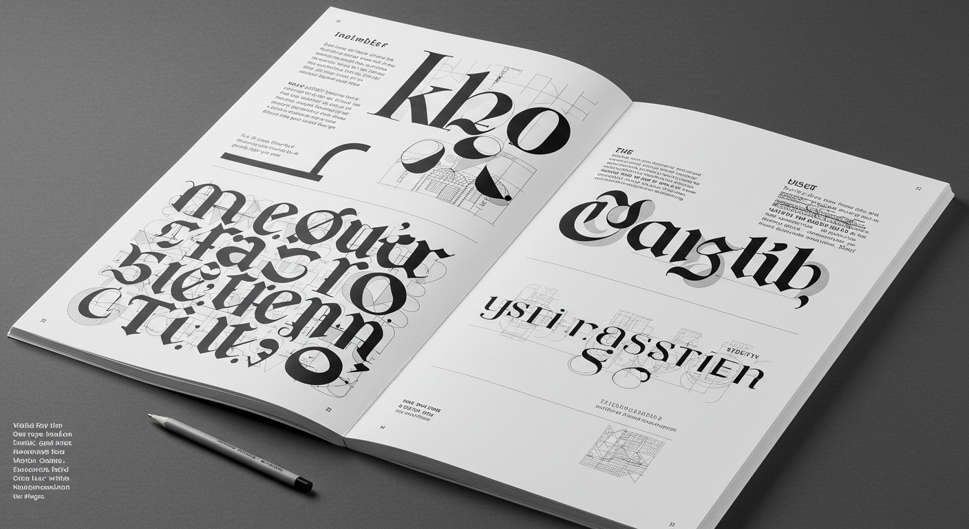
Karlssonwilker’s identity for Calder Gardens explicitly championed a slow, collaborative process for its creative solutions.
A distinct pattern emerges from recent design discourse: a quiet but firm reassertion of human-centric, deliberately paced design processes against the industry’s accelerating pursuit of AI-driven efficiency. The “Come Fly With Me” project, exploring Irish national identity through print, and the ALEX Theatre’s meticulous restoration for “The Odyssey,” both exemplify a return to deeply considered historical context and bespoke craft. These projects prioritize meaning and resonance, developed through careful exploration, over mere speed of execution.
Karlssonwilker’s methodology for Calder Gardens stands as a clear counterpoint to the prevailing industry narrative that champions rapid, AI-assisted conceptual letterform generation. The mainstream often positions AI as the ultimate tool for producing endless variations and iterating at speeds unattainable by humans, thereby streamlining grid system development. This view suggests that quantity and swiftness inherently lead to superior or more adaptable design outcomes. However, the Calder Gardens project demonstrates that truly distinctive and deeply resonant identities, which achieve enduring legibility, emerge from iterative human engagement and deep discovery. Such a process allows for micro-typographic adjustments and nuanced conceptual letterform development that algorithms frequently overlook, favoring technical perfection over optical and contextual appropriateness. A growing recognition of this value suggests that by late 2027, major cultural institutions will frequently include clauses in their design briefs explicitly valuing slow, research-intensive, and human-led creative exploration, accepting extended timelines as a necessary investment for lasting impact.
This emphasis on deliberate, human-powered design directly challenges the operational models of many venture capital-backed design technology firms. These entities often measure success by metrics of throughput, automation, and speed to market, inadvertently devaluing the time and human judgment essential for crafting nuanced grid systems and refining micro-typographic details. Their influence pushes for tools and workflows that prioritize fast iteration, potentially at the expense of deep historical grounding or unique conceptual exploration.
Working typography professionals should, this week, dedicate specific time to manually re-evaluate the optical spacing, kerning, and word spacing of their most critical display type elements across both digital and physical proofs. This deliberate, slow review, separate from automated checks, fosters a keener eye for micro-typographic detail and legibility that often defines truly excellent work, reinforcing the value of human perception.
TL;DR
Enduring design impact prioritizes slow, human-centric processes over AI-driven speed, emphasizing micro-typographic precision and contextual legibility.
Curated References
About this editorial — This piece was developed using AI-assisted research and curation across multiple industry sources. All analysis, opinions, and predictions represent the editorial perspective of JHDD. Sources are linked in the references section above.