JHDD Typography Report — 2026.08.10
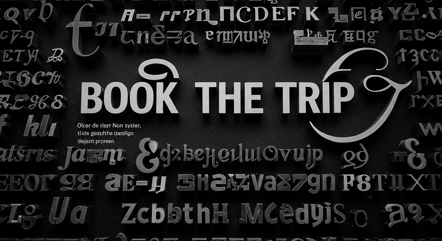
The travelogue ‘Book the Trip’ documents 700 photographs of rare and one-of-a-kind letterforms collected over three decades. This extensive collection reveals a pattern often overlooked by mainstream design discourse: a growing professional appreciation for design that resists immediate, frictionless digital generation. The underlying thread connecting these disparate stories points to a deep craving for design rooted in specific histories, geographies, and human craft, rather than the rapid, often generic, outputs that prioritize efficiency above all else.
Karlssonwilker’s identity for Calder Gardens exemplifies this shift, emphasizing that meaningful design emerges from a slow, collaborative process. This approach directly contradicts the prevailing industry opinion that faster, AI-driven solutions represent universal progress. While AI offers unparalleled speed for generating variations, it struggles to imbue conceptual letterforms with the deep cultural resonance and unique narrative that a protracted human-led exploration can achieve. True legibility extends beyond mere readability; it encompasses the ability of forms to carry contextual meaning and historical weight, something that a deeply considered, less efficient process often yields. By mid-2028, design studios demonstrating a clearly defined “design archaeology” phase within their process will command premium rates, differentiating themselves from high-volume, AI-dependent competitors.
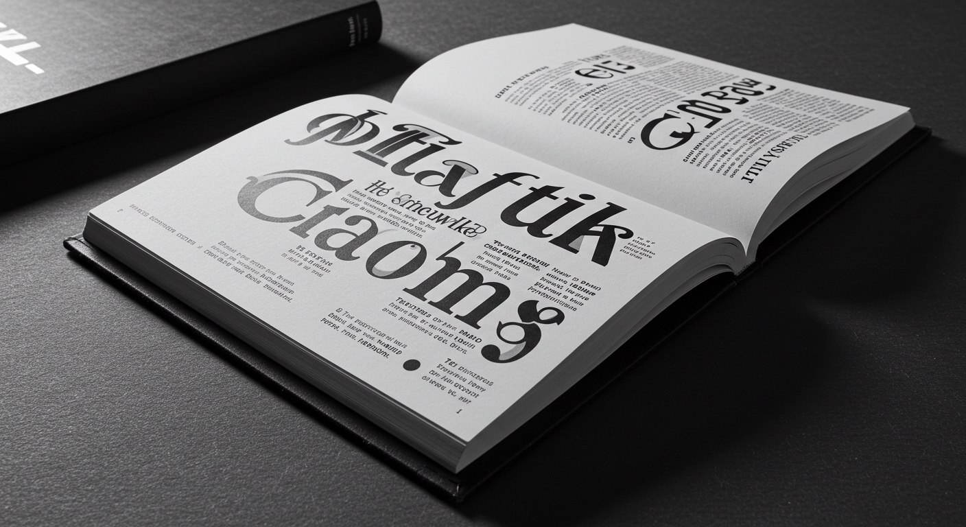
The fascination with ‘Book the Trip’s’ unique sign trawling underscores an increasing focus on micro-typography as a field of historical and aesthetic inquiry. These one-of-a-kind letterforms, often born from local craft and necessity, challenge the notion that universal, standardized typefaces represent the pinnacle of legibility. Instead, they demonstrate that character and idiosyncrasy, when thoughtfully applied, can enhance rather than detract from a message’s impact and memorability. This view opposes the commercial imperative for typefaces designed for maximum neutrality and scalability across all digital platforms. Within two years, a new wave of specialized type foundries will emerge, focusing on revivals and bespoke contextual type systems inspired directly by such archival material, moving beyond simple digitization towards reinterpreting historical forms for contemporary, nuanced applications.
The primary force resisting this movement toward deliberate, context-rich typography is the relentless pressure for rapid project delivery and cost-reduction. Clients, often unaware of the depth of craft involved, frequently prioritize the speed and perceived efficiency offered by AI-assisted design platforms and template-driven solutions. This creates a market where generic aesthetic often trumps distinctive, historically informed typographic expression.
A typography professional should, this week, dedicate specific time to local typographic fieldwork. This involves actively seeking out and documenting examples of unique, hand-painted, or custom-crafted letterforms in their immediate physical environment. Photograph and sketch these forms, paying attention to their construction, material, and context, and then analyze how their micro-typographic details contribute to their expressive legibility, rather than immediately searching for a digital equivalent.
TL;DR
The design industry is rediscovering the value of slow, contextual, and historically rooted typographic processes over rapid, generic digital generation.
Curated References
About this editorial — This piece was developed using AI-assisted research and curation across multiple industry sources. All analysis, opinions, and predictions represent the editorial perspective of JHDD. Sources are linked in the references section above.