
JHDD Packaging Report — 2026.08.09

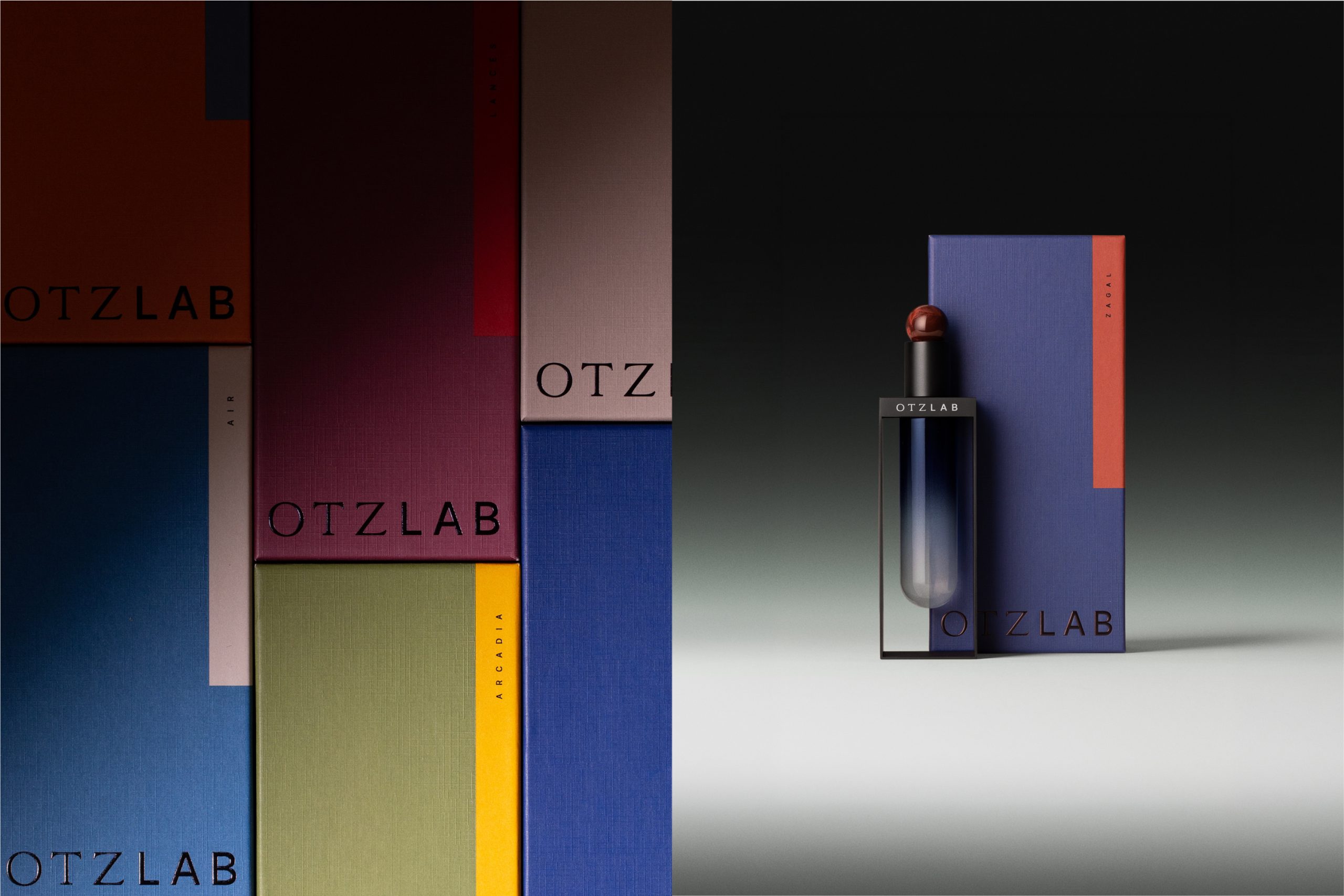
OTZ LAB’s fragrance packaging employs test tubes and matte steel, moving decisively away from expected luxury cues.
A clear pattern emerges across recent packaging innovations: brands are actively dismantling and rebuilding established category aesthetics. This involves a deliberate rejection of generalized visual language in favor of highly specific, often surprising material and color choices. The aim is to carve out distinct shelf impact and create a memorable unboxing experience that communicates brand personality before the product is even used. These designs prioritize a unique sensory engagement, challenging the notion that all consumer packaging must conform to easily digestible, universally understood tropes.

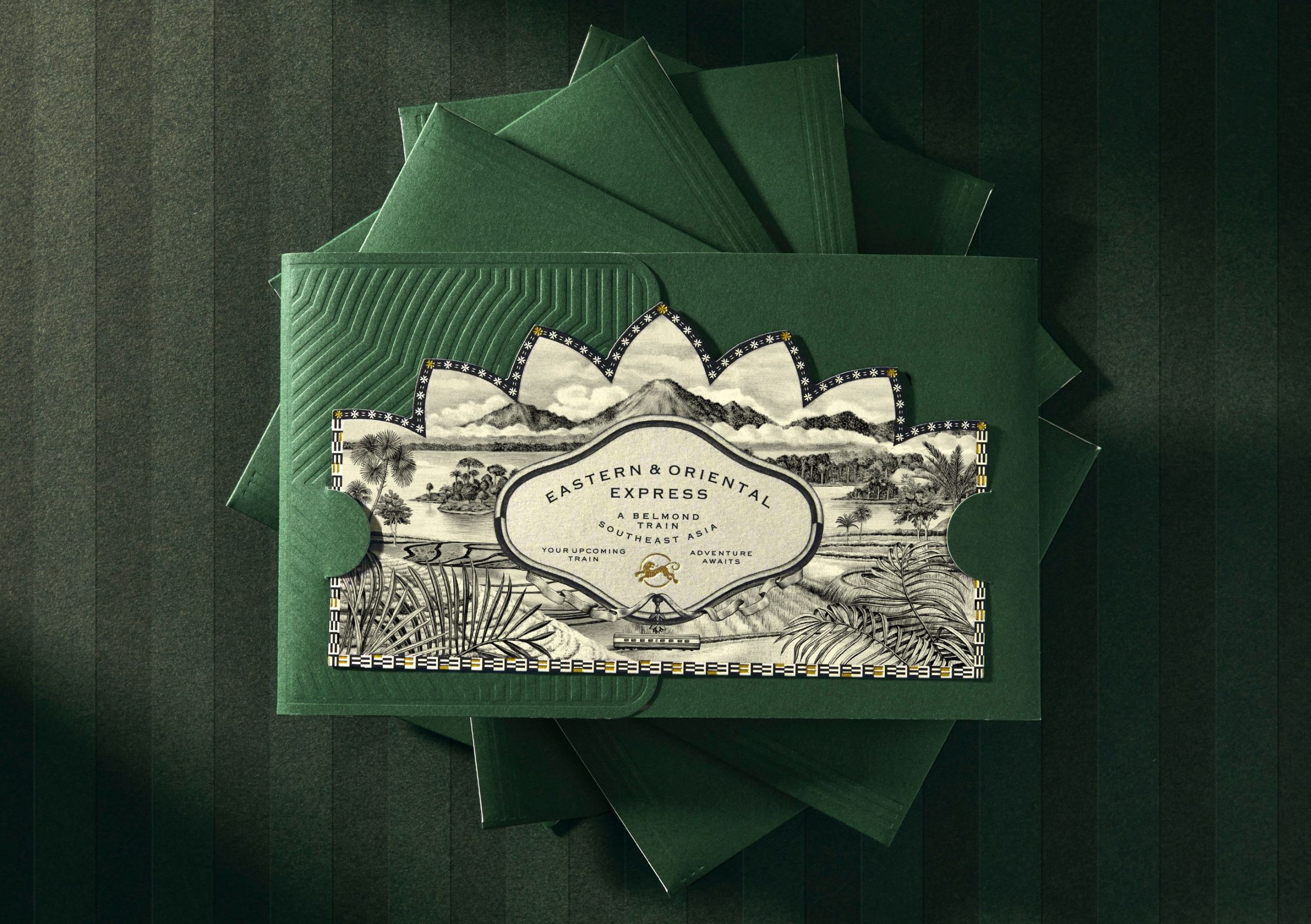
The work of Violaine et Jérémy exemplifies this shift, championing hyper-detailed illustration and artisanal materiality to create brand universes that deliberately resist digital flatness. Mainstream packaging design often prioritizes cost-efficiency and universal visual legibility, aiming for broad appeal through simplified graphics and common material choices. This approach, however, often leads to category sameness and diluted brand identity. The alternative view suggests that true brand loyalty and premium perception in physical retail stem from packaging that delivers a deeply specific, often tactile, sensory experience, even if it requires more specialized production or material selection. This differentiated approach creates an unboxing moment that feels less like a transaction and more like an intentional discovery. By mid-2028, this trend will lead to a measurable increase in demand for custom embossing dies and specialty paper finishes, as brands invest in unique haptic signatures over generic cost-cutting measures.
YOKO’s matcha packaging, with its oversized, cropped lettering and vintage sticker sheet energy, shows a parallel intent to disrupt established visual norms. It leverages color and graphic boldness to stand out against a sea of minimalist, soft-green competitors. This strategy moves beyond simply sustainable materials, focusing on how these materials, once chosen, can be leveraged to deliver a compelling aesthetic. The shelf impact is immediate and visceral, communicating a brand attitude that is distinct from its peers. This contradicts the conventional wisdom that category cues must be overtly present for consumer recognition. Instead, a strong, unconventional aesthetic can itself become the primary cue, attracting attention precisely because it does not conform.
This push towards distinctive materiality and bold aesthetic choices faces resistance from procurement departments. These teams are often incentivized by unit cost reduction, prioritizing economies of scale and readily available, standardized materials. The drive to minimize material use for sustainability often defaults to the cheapest or most common recycled options, overlooking the potential for innovative, tactile, or visually striking sustainable substrates. Furthermore, large-scale co-packers often prefer minimal variation in material specifications and structural complexity, which limits the designer’s scope for custom finishes or unique unboxing sequences.
A working Packaging professional should immediately challenge the default material specification for their next project. Instead of simply selecting the lowest-cost recycled content, research and present at least three alternative sustainable substrates that offer distinct tactile properties or visual textures, even if they come at a marginally higher unit cost. Focus on how these material choices will enhance the perceived value and unboxing experience, rather than just meeting a sustainability metric.
TL;DR
Brands find distinctiveness through bold material and aesthetic choices, defying category conventions and digital-first design.
Curated References


About this editorial — This piece was developed using AI-assisted research and curation across multiple industry sources. All analysis, opinions, and predictions represent the editorial perspective of JHDD. Sources are linked in the references section above.