JHDD Typography Report — 2026.08.08
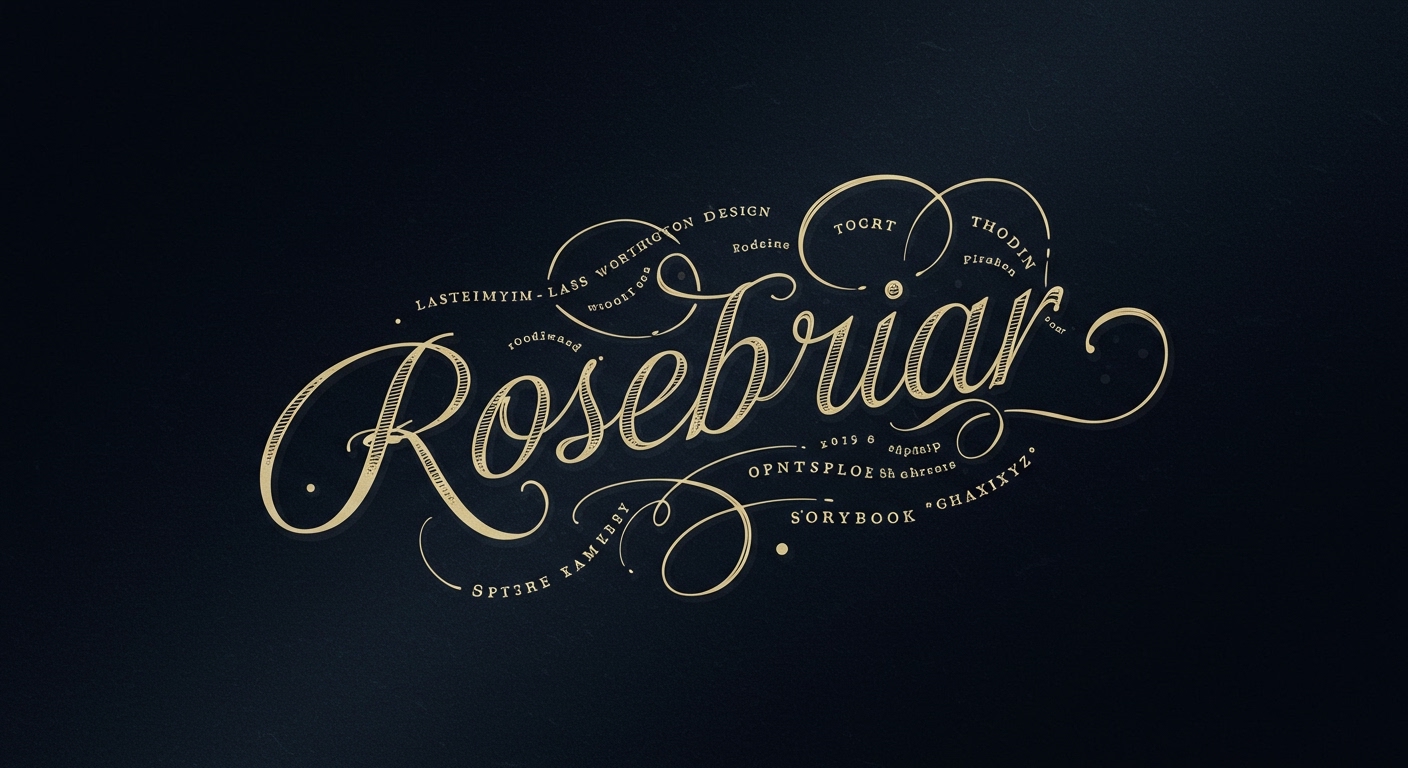
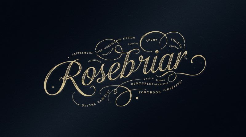
Rosebriar, from Laura Worthington Design, features modern OpenType capabilities that enhance its “storybook charm.”
This specific detail reflects a broader tendency observed across recent design efforts. Designers are not merely adopting new technologies but are actively channeling historical, vernacular, and hand-crafted letterforms through contemporary digital tools. This is a deliberate search for identity and narrative beyond universal legibility, evident in projects like “Book the Trip,” which meticulously documents rare, one-of-a-kind letterforms over three decades. The impetus appears to be a desire to imbue typographic systems with a sense of place, time, or human touch, distinguishing them from homogenized digital aesthetics.
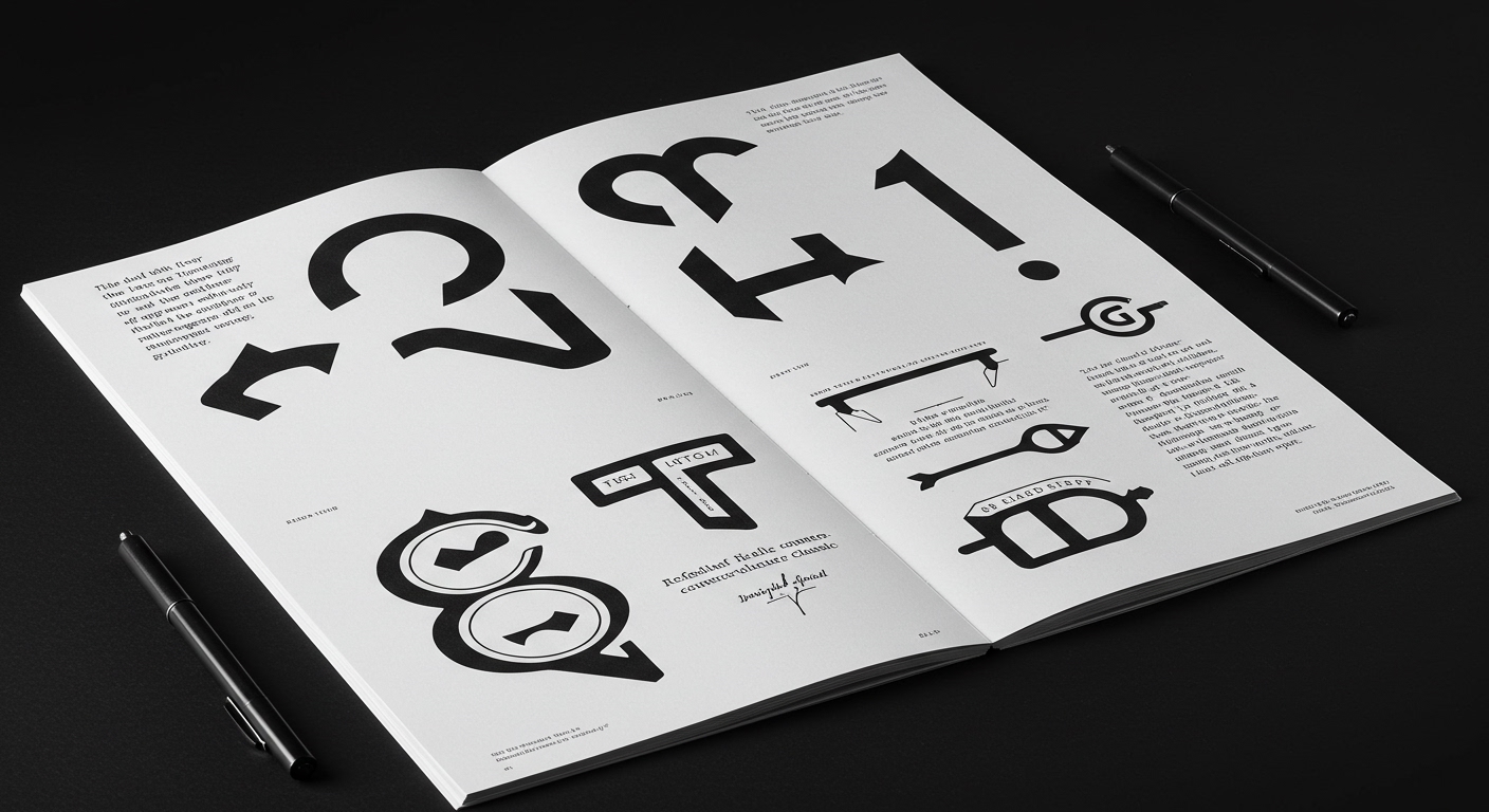
Laura Worthington Design’s Rosebriar typeface provides a salient example of this trend. Its blend of “hand-crafted elegance” and “subtle gothic ornamentation” with advanced OpenType features suggests a conscious move to embed conceptual letterforms within a legible framework. The conventional wisdom often dictates that legibility is the paramount goal, prioritizing clarity and speed of recognition above all other typographic considerations, especially in editorial design. However, this perspective overlooks the power of conceptual resonance and the emotional impact of distinct letterforms. For a publication or brand, the specific ‘voice’ conveyed by type choice and its micro-typographic execution can be as critical as its immediate readability. A typeface like Rosebriar does not sacrifice legibility but rather infuses it with character, inviting a deeper, more textured engagement from the reader. This engagement, often overlooked by purely functionalist metrics, can significantly enhance retention and brand affinity.
The real value of typefaces like Rosebriar lies in how their conceptual letterforms, supported by sophisticated grid systems and micro-typography, create an atmosphere that complements content without impeding communication. The subtle variations afforded by OpenType, for instance, in ligature use or alternate characters, can manage the visual rhythm of text in a way that is both expressive and structurally sound. Predictions indicate that by early 2028, leading editorial platforms will increasingly leverage these nuanced typographic capabilities to build stronger emotional connections with their audiences, moving beyond simple content delivery to cultivate a more immersive reading experience. This will involve designers demanding more granular control over typographic expressions.
The primary opposing force to this nuanced approach remains the relentless pursuit of perceived efficiency and a narrow definition of accessibility, often leading to oversimplified grid systems and homogenized type choices. Large corporate entities and many digital-first platforms prioritize scalability and lowest-common-denominator solutions, frequently equating simplicity with universal legibility without acknowledging the conceptual blandness it can impose. This often manifests in reliance on system fonts or generic sans-serifs, applied uniformly across diverse content without considering the unique narrative demands of specific editorial pieces.
Working typography professionals should, this week, experiment with incorporating one subtly conceptual typeface into a secondary textual element within an existing editorial layout. Focus on leveraging its OpenType features, such as stylistic alternates or ligatures, not merely for decorative effect but to subtly reinforce the content’s thematic core. Pay close attention to how micro-typographic adjustments – kerning, tracking, line spacing – can maintain legibility while allowing the typeface’s inherent character to emerge, proving that conceptual depth does not necessitate a compromise on clarity.
TL;DR
Contemporary typography balances historical character with modern tech, moving beyond pure legibility to embed conceptual meaning through careful micro-typographic control.
Curated References
About this editorial — This piece was developed using AI-assisted research and curation across multiple industry sources. All analysis, opinions, and predictions represent the editorial perspective of JHDD. Sources are linked in the references section above.