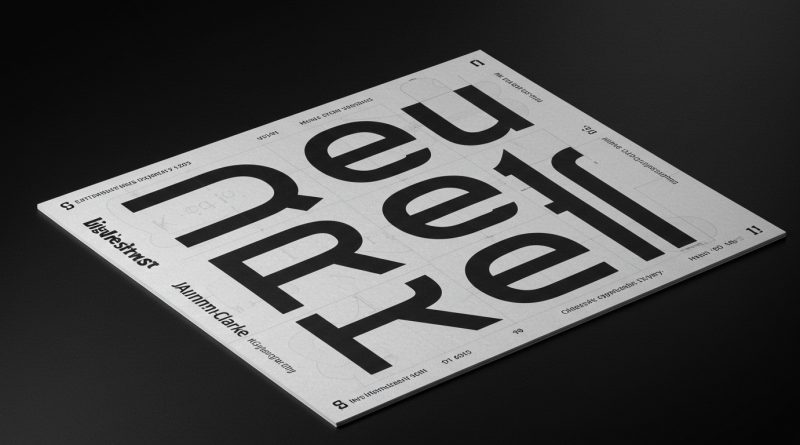
JHDD Typography Report — 2026.08.03
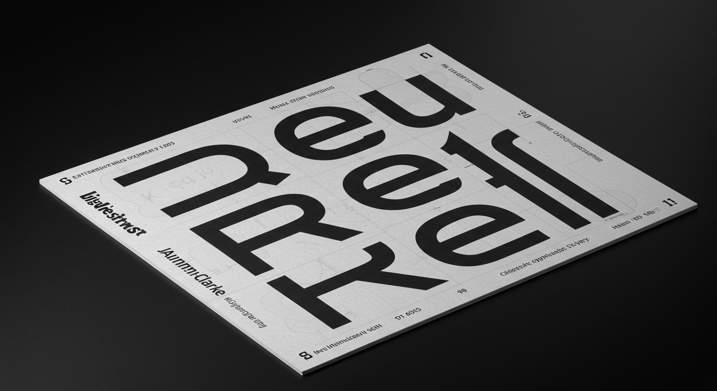
Jamie Clarke’s new typeface, Reel, represents a focal point in contemporary typographic development.
The disparate reports, from the tribute to Steven Brower’s historical work documenting graphic design to the immersive visual strategies of Sofiane Pamart’s “Movie” project, reveal a quiet but pervasive pattern. Design practices are grappling with how to balance historical typographic authority against an increasing demand for conceptual letterforms that prioritize expression over conventional legibility without explicit discussion. This tension often occurs at the micro-typographic level, impacting how grid systems are implicitly or explicitly applied.
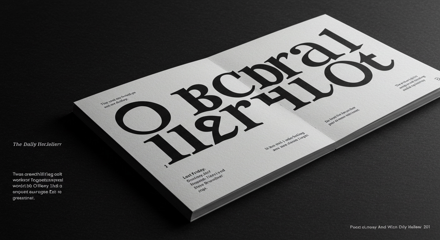
Jamie Clarke’s new typeface, Reel, presented as an exemplar of “expressive, conversational typography,” reflects a significant industry shift. While many celebrate this movement as inherently more engaging and human, a critical look reveals potential pitfalls for legibility and conceptual clarity. Mainstream opinion often equates visual distinctiveness with effective communication, overlooking the rigorous discipline required to make conceptual letterforms truly functional. The belief that such typefaces are self-idently “conversational” can lead to applications where micro-typographic details—such as precise letter spacing, optical adjustments, and consistent stroke contrast—are neglected, degrading the very message they aim to convey.
The challenge lies in how these expressive forms integrate into established grid systems and maintain their communicative power across varied scales and contexts. Historically, even highly stylized type, like that often seen in the jazz record cover designs celebrated in ‘WAIL’, was frequently composed with an implicit understanding of visual hierarchy and legibility, often by skilled designers like those documented by Steven Brower. This current focus on conceptual letterforms without a foundational grounding in micro-typography risks creating visually rich but informationally opaque designs. This practice, if left unaddressed, will by mid-2027 result in widespread frustration among users struggling to parse essential information, forcing a critical re-evaluation within the design community about the true cost of unconstrained expression.
This critical re-evaluation will be resisted by the pervasive influence of templated design solutions and automated font rendering engines. These tools often encourage superficial stylistic choices without embedding the nuanced understanding of spacing, kerning, and baseline alignment that true conceptual legibility requires, perpetuating a cycle of visually distinct but poorly executed typography.
Working typography professionals should this week review a recent project that utilized highly expressive or conceptual letterforms. They must identify specific instances where micro-typographic adjustments (tracking, leading, kerning, word spacing) could significantly improve legibility without sacrificing the conceptual intent, then implement these precise changes within the existing grid system.
TL;DR
Contemporary typography favors expression, but without rigorous micro-typographic and grid system application, legibility suffers.
Curated References
About this editorial — This piece was developed using AI-assisted research and curation across multiple industry sources. All analysis, opinions, and predictions represent the editorial perspective of JHDD. Sources are linked in the references section above.