JHDD Branding Report — 2026.08.03
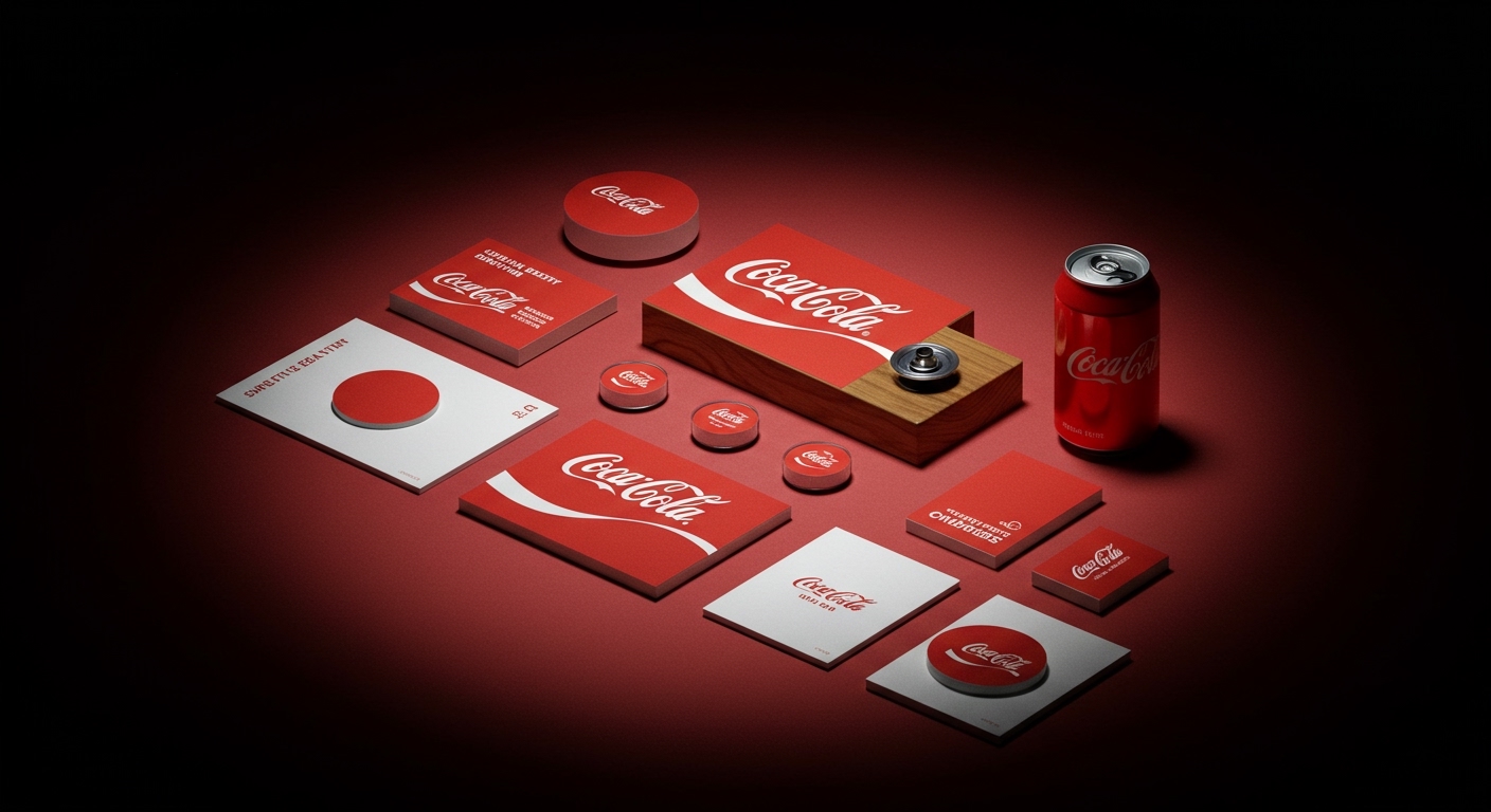
Coca-Cola’s recent identity work by JKR demonstrates a deep reluctance to alter its iconic red and white visual system. This approach, which prioritizes subtle refinement over dramatic change, reflects a broader, often unarticulated strategic shift emerging across diverse brand challenges.
The pattern connecting these stories is the deliberate calibration of visual identity to manage brand equity in contested or highly specific cultural territories. Brands are making calculated choices about what aspects of their identity to reinforce, subtly update, or radically reframe to secure a distinct position. This is not about wholesale reinvention, but rather a precise, almost surgical, approach to signaling value.
Koto’s work for Stack Overflow exemplifies this strategic calibration by giving the programmer forum a clear reason to exist in the age of AI. While mainstream industry opinion often suggests that platforms must fully embrace AI integration or risk obsolescence, Koto’s intervention reinforces Stack Overflow’s core value: human-driven, verifiable expertise. Its refreshed visual identity quietly elevates the collaborative, question-and-answer dynamic that artificial intelligence cannot genuinely replicate, effectively positioning the platform as an indispensable human counterpoint to machine-generated knowledge. This directly contradicts the notion that AI dictates an entirely new aesthetic; instead, it provides a foil against which human-centric values gain clarity and prominence, becoming more valuable because of the AI context. The visual system does not shout ‘human,’ but rather structures information and interaction in a way that emphasizes the peer-to-peer validation at its heart, thereby strengthening its brand equity. By early 2028, a significant number of B2B tech platforms will shift their visual identities to prominently feature human interaction and verified expertise, directly counter-positioning themselves against generative AI outputs that struggle with nuance and proven accuracy.
Similarly, 20(Something)’s identity for the civic software platform Open Point borrows from “museum-modernity” as much as tech aesthetics. This decision runs contrary to the conventional wisdom that software platforms, especially those in the rapidly evolving tech sector, must always present as overtly futuristic, sleek, or ‘disruptive’ in their visual language. Instead, Open Point’s visual system, characterized by clean lines and considered typography reminiscent of cultural institutions, signals stability, intellectual rigor, and an enduring authority, rather than fleeting innovation or a purely digital aesthetic. This approach strategically leverages established aesthetic codes—those that have historically communicated credibility and gravitas—to imbue a nascent technology brand with a sense of trust and permanence. It implicitly argues that for critical civic infrastructure, trust is built on continuity, clarity, and thoughtful design, not just speed or novelty. This creates a distinct market positioning, appealing to stakeholders who value reliability over mere technological advancement, thereby building a unique form of brand equity.
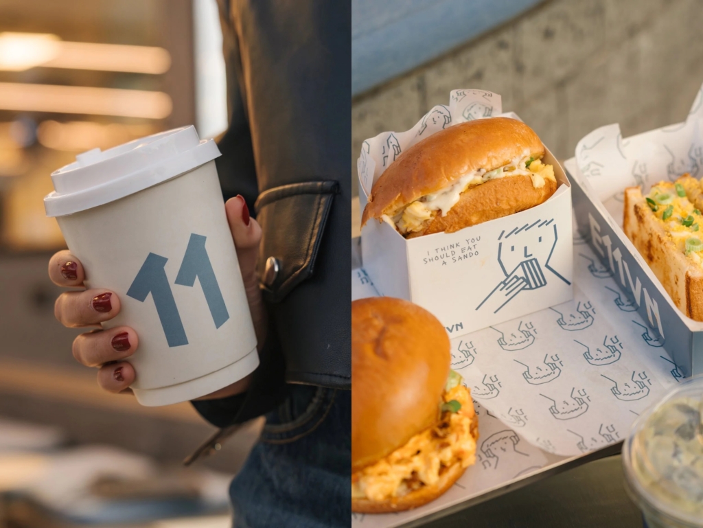
This strategic precision in visual identity faces an opposing force: the pervasive influence of ephemeral digital trends. Social media algorithms often reward novelty and stylistic mimicry, pushing brands towards short-lived visual fads, such as the generic “crisp, white t-shirt with a tonne of text” mentioned in the context of 20(Something)’s work, rather than cultivating enduring equity. This pressure makes it challenging for brands to commit to long-term, differentiated visual strategies when immediate engagement metrics often favor superficial trends, leading to a crowded visual landscape where true distinction is hard to maintain.
A working Branding professional should immediately conduct a targeted cultural audit for their next client project. This audit must move beyond internal brand guidelines and traditional competitor analysis to identify specific visual languages that currently signify “authority,” “authenticity,” or “trustworthiness” within the target audience’s broader media consumption. This includes examining non-industry sources like art, fashion, public institutions, and even subcultures. The goal is to uncover deeply embedded cultural signals and design codes that can be strategically integrated into a visual identity system, allowing the brand to communicate specific values without resorting to explicit messaging, thereby building stronger brand equity.
TL;DR
Brands are strategically using identity systems to signal specific, often human-centric, value in increasingly complex markets.
Curated References

About this editorial — This piece was developed using AI-assisted research and curation across multiple industry sources. All analysis, opinions, and predictions represent the editorial perspective of JHDD. Sources are linked in the references section above.