JHDD Packaging Report — 2026.08.02
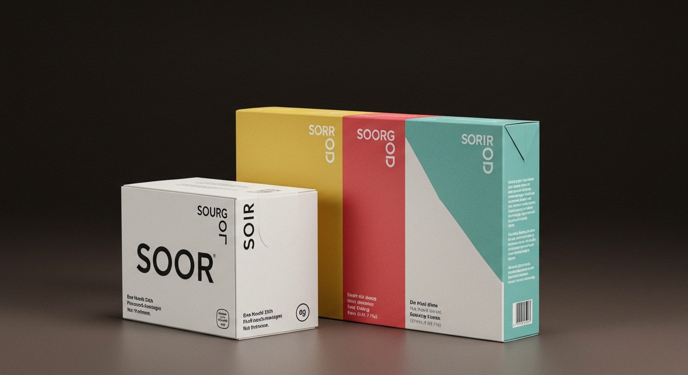
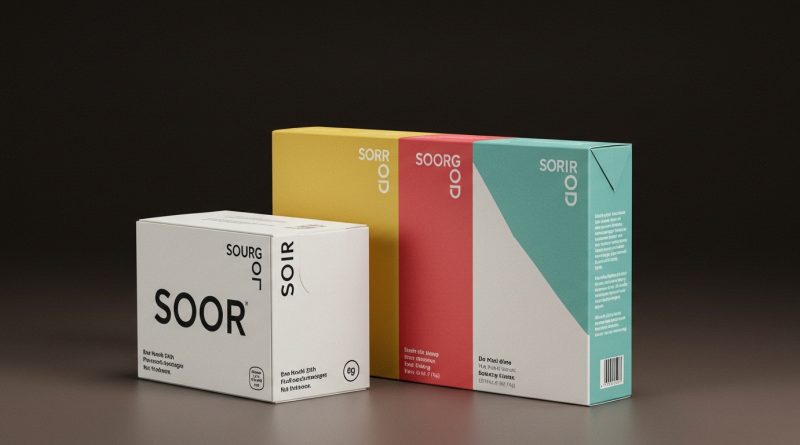
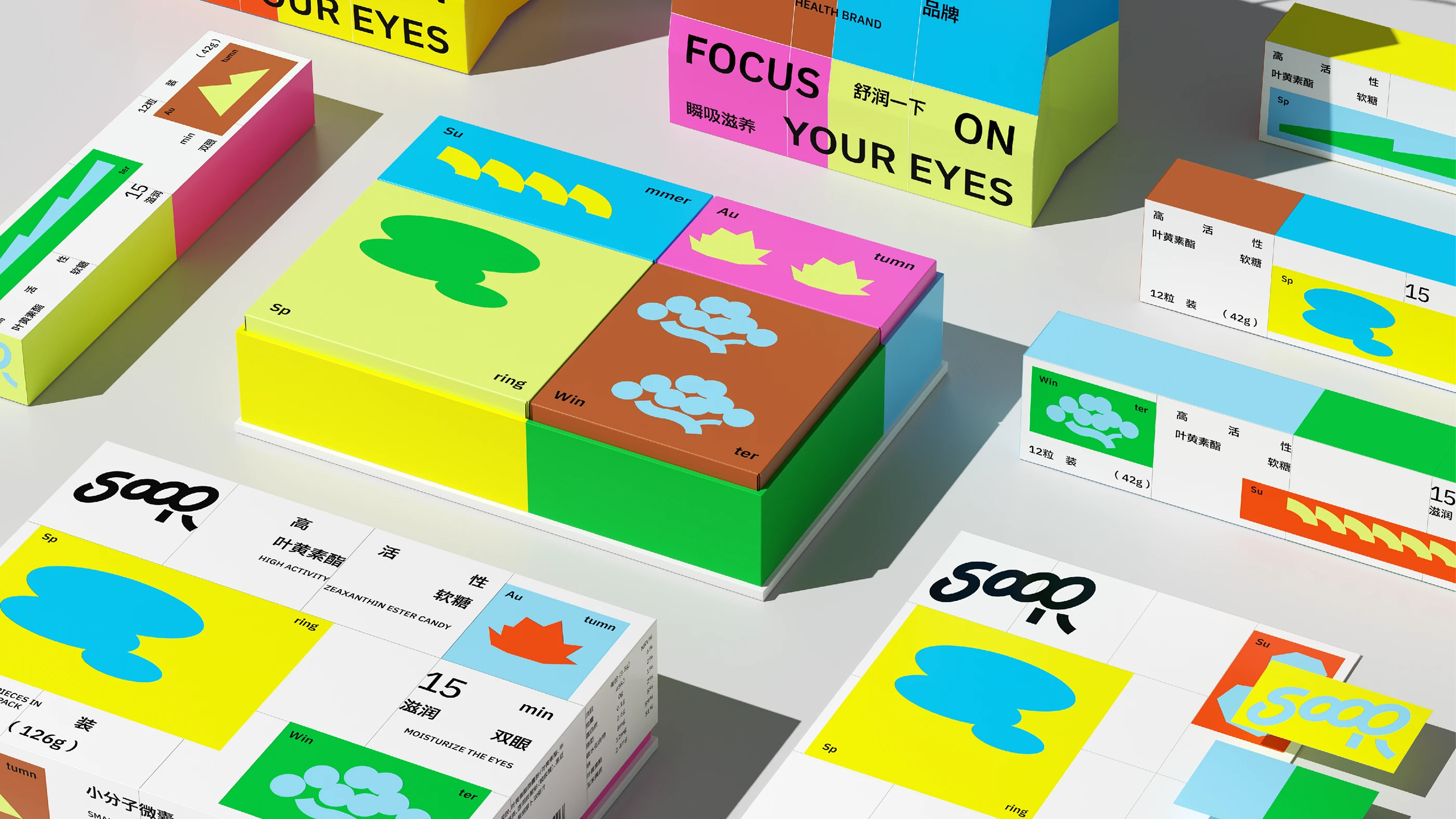
Atomerg Studio’s packaging for SOOR eye health supplements divides a simple carton into four distinct, color-blocked panels, each representing a season with its own icon and hue.
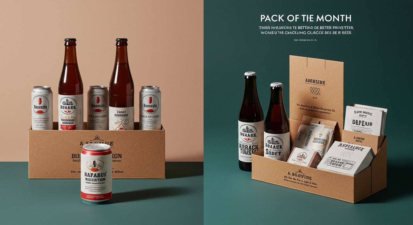
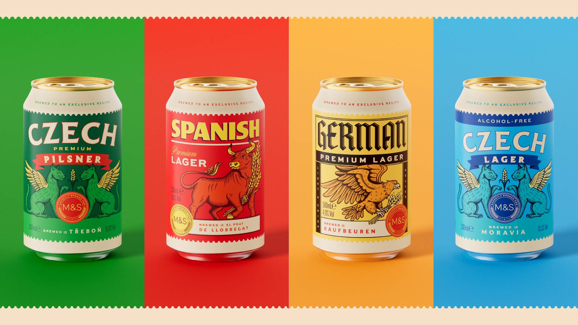
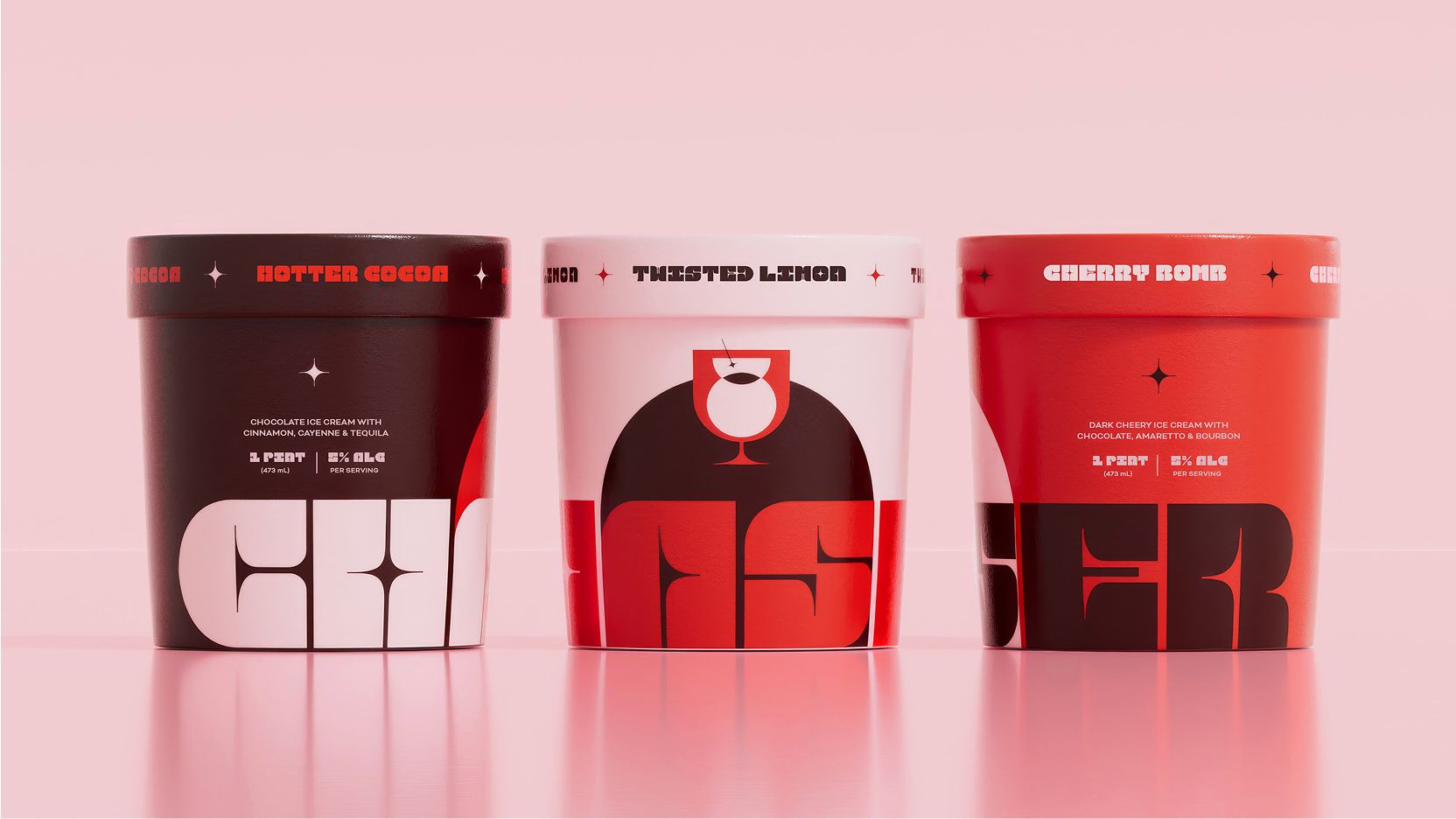
This departure from clinical uniformity, echoed by SO Dsgn’s integration of a cocktail glass silhouette into Chaser’s Boozy Ice Cream logo and Thirst’s elevation of private-label beer for Marks & Spencer, reveals a concerted effort across diverse categories to subvert conventional visual expectations. The underlying pattern is a strategic disruption of established aesthetic codes to create novel shelf impact and perceived value, extending beyond mere material choices.
Traditional packaging wisdom often dictates adherence to category tropes for immediate consumer recognition. Yet, the work for SOOR directly contradicts this by deliberately fracturing the expected pharmaceutical aesthetic. Instead of soft blues and clinical whites, it offers a sculptural, block-like appearance that looks more like stacked building blocks. This strategy is not merely about standing out; it creates a tactile curiosity and encourages interaction, transforming a supplement box into a miniature art object. Mainstream thought prioritizes fast visual processing; however, designs that encourage a moment of pause, a double-take, or even a tactile investigation, cultivate a deeper, more memorable engagement. This sustained interaction builds brand loyalty that fleeting recognition cannot match.
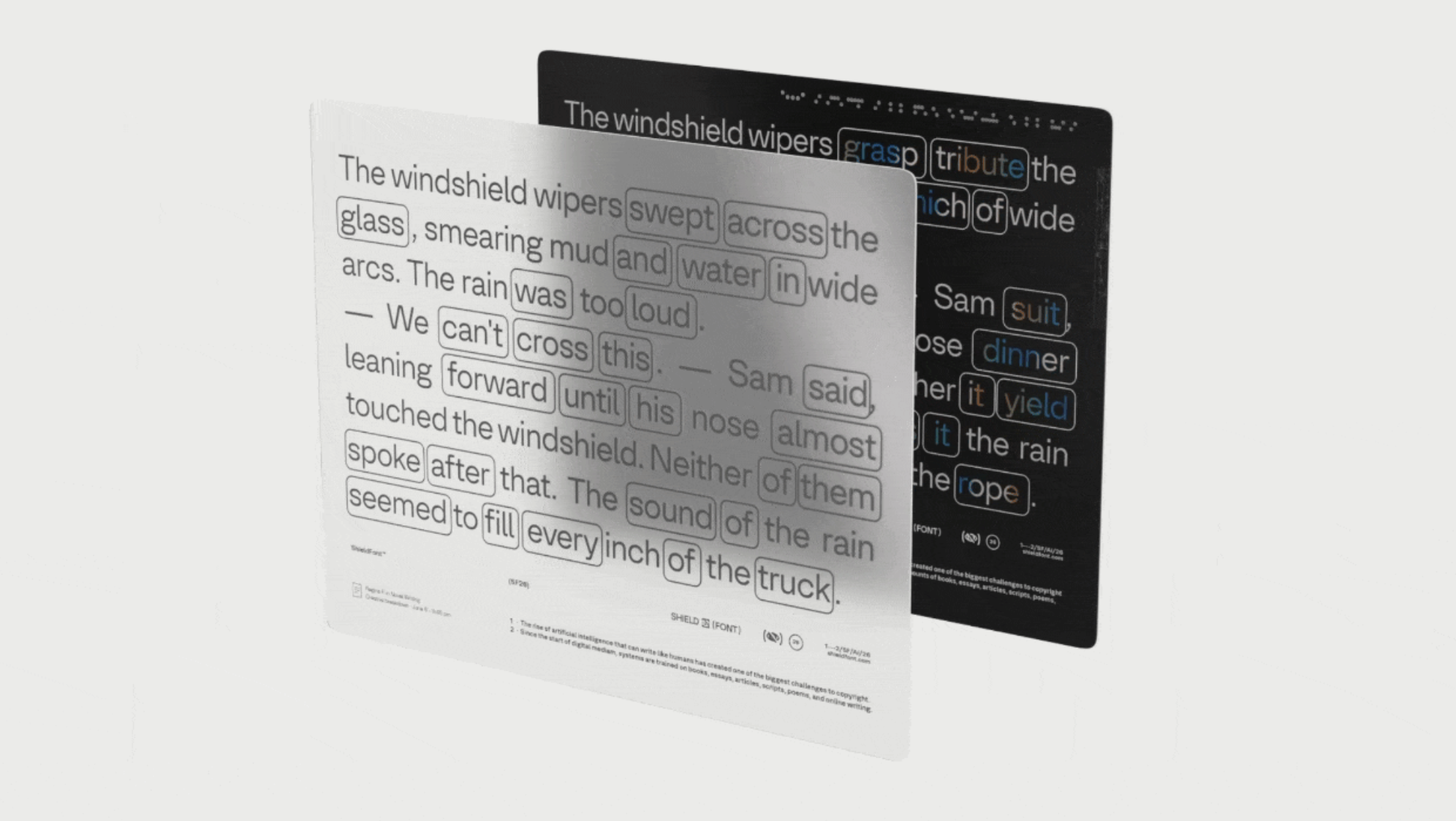
This deliberate aesthetic disruption also extends to the digital realm. Consider the implications of S&A and Playtype’s ShieldFont, which renders normal text for human readers while feeding nonsense to AI scrapers. While not directly a packaging material, the principle of layered information – one for the human, one for the machine – holds significant future potential for smart packaging. By mid-2027, packaging designs will increasingly incorporate visible elements that delight the human eye and touch, alongside embedded or subtle digital markers that offer filtered data streams, or even AI-resistant brand protection, during a physical unboxing experience. This will allow brands to curate who sees what data about their products.
The primary resistance to this innovative approach stems from entrenched manufacturing logistics and the conservative nature of established retail chains. Complex designs that deviate significantly from standard die-cuts or material handling can introduce production inefficiencies and increased costs. Furthermore, retailers often prefer predictable shelf layouts and easily categorized products, viewing anything too unconventional as a potential disruptor to their inventory management and merchandising systems. This prioritizes operational efficiency over the nuanced consumer experience.
A packaging professional should immediately reassess a current product line’s category conventions and identify one element that could be deliberately subverted or transformed into a tactile, interactive feature without increasing material use. This might involve exploring structural innovations that allow a simple carton to appear multi-faceted or to have a secondary life beyond its primary function, moving past superficial graphic changes.
TL;DR
Packaging innovation is now about strategic subversion of category norms and intelligent layering of information for human and machine perception.
Curated References
About this editorial — This piece was developed using AI-assisted research and curation across multiple industry sources. All analysis, opinions, and predictions represent the editorial perspective of JHDD. Sources are linked in the references section above.