JHDD Typography Report — 2026.07.31
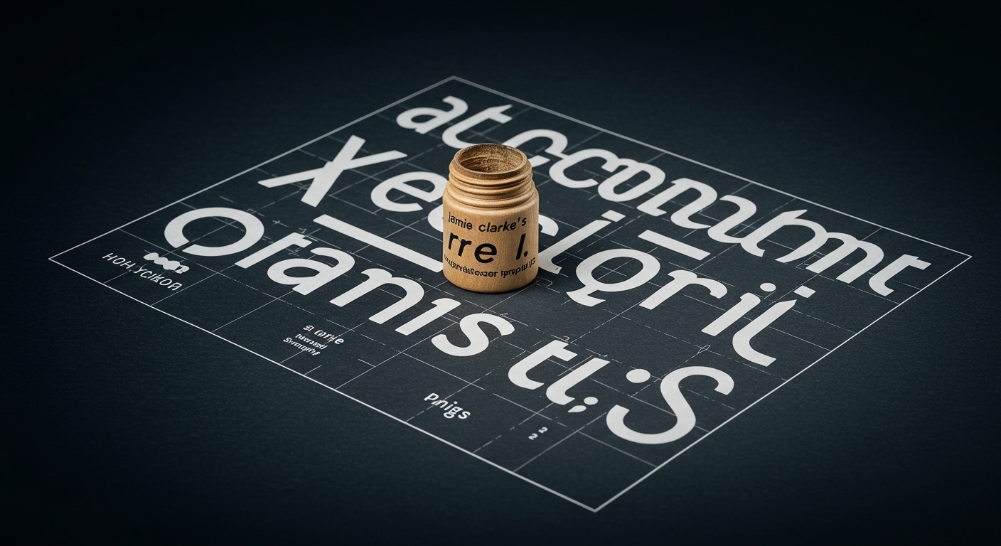
Jamie Clarke’s new typeface, Reel, represents a shift towards conversational typography. The design choices in Pianist Sofiane Pamart’s immersive visual worlds for his “Movie” project and the historical re-evaluation of ALL CAPS indicate a unified drive: typography is being asked to perform beyond pure legibility. Designers are now crafting letterforms as foundational elements of a larger, integrated sensory or conceptual environment, rather than solely as text carriers.
Jamie Clarke’s typeface, Reel, exemplifies a move towards ‘expressive, conversational typography,’ which challenges a long-held reliance on ALL CAPS for emphasis or authority. The conventional industry perspective often maintains that uppercase provides a strong, unwavering voice, a typographic shorthand for gravitas or official pronouncement. This view overlooks the critical distinction between legibility and the nuanced perception of a message. Overuse has diminished ALL CAPS’ impact and eroded its precision, rendering it a blunt instrument incapable of conveying specific emotional or hierarchical weight. When everything shouts, nothing registers distinctly.
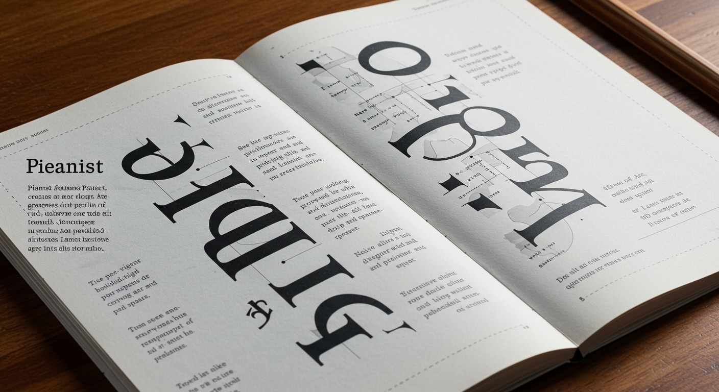
The real challenge now lies in how micro-typography and grid systems are employed to build this new conceptual language. A system built on precision, using subtle shifts in weight, spacing, and rhythm, can achieve far greater expressive range than brute-force capitalization. This involves meticulous kerning, tracking, and leading, aligned within dynamic grid structures that guide the reader’s eye through varied expressive densities. Within two years, studios will routinely abandon default uppercase settings for primary messaging, opting instead for custom-designed expressive typefaces or carefully modulated mixed-case typography supported by adaptive grid systems that enhance conceptual clarity without sacrificing legibility.
This push towards nuanced, conceptually rich typography faces significant resistance from automated typesetting systems and content management platforms that prioritize default settings and ease of input over granular typographic control. The prevalence of quick template usage by non-specialists, combined with a widespread reliance on quick fixes like uppercase for emphasis, solidifies a baseline of typographic mediocrity. This inertia stems from a lack of understanding that type’s emotional and conceptual impact is directly tied to its micro-typographic execution, rather than merely its character count.
Typography professionals should, this week, audit their project templates and client-facing style guides for instances where ALL CAPS is prescribed for hierarchical emphasis or perceived authority. Replace these directives with guidelines that mandate the exploration of varied weights, contextual sizing, and precise micro-typographic adjustments (kerning, tracking) within a flexible grid system to convey differentiation. The goal is to articulate emphasis through sophisticated visual structuring, rather than relying on a blunt shift in casing that sacrifices the letterforms’ intrinsic expressive potential.
TL;DR
The shift from ALL CAPS signals a demand for typography to function as an expressive component of integrated experiences, requiring nuanced micro-typographic control within flexible grid systems.
Curated References
About this editorial — This piece was developed using AI-assisted research and curation across multiple industry sources. All analysis, opinions, and predictions represent the editorial perspective of JHDD. Sources are linked in the references section above.